When designing an ecommerce website, it is important to note who the buyer is. Are you selling to a business, or a consumer?
Both Business-to-Business (B2B) and Business-to-Consumer (B2C) websites need to be clear and concise, need an aesthetically pleasing design, and must offer details about the product or service.
However, the needs of a consumer and the needs of a business tend to differ. As such, the amount of detail, and the UX and design needs are not consistent between B2B and B2C sites.
As a design and development shop, the company where I work, Codal caters for both B2C and B2B, coming across issues and questions all the time. From our experience, here are some of the most significant factors that you must take note of when designing a website for a consumer versus a business.
Purchase Process
A B2C purchase process is much more simple than B2B. Typically, the transition time from being ‘just interested’ to making a purchase is much shorter. Consumers look for a convenient, smooth buying process.
Users do not want to have to register to buy something. Instead, they would prefer to put their information in and click buy. Consumers have many options in terms of where to buy something, so your website and product must stand out among competition.
A business-to-business purchase process is always a lot more complex than B2C. It has multiple stages, such as filling out a form, personal interactions, evaluation of proposals, approvals, etc. Most companies have a specific set of protocols and guidelines that must be followed. As a B2B business, we see this all the time. In order for another business to purchase from us, they need as much information as possible to pass along to others.
Unlike B2C, you should expect to always have some type of personal interaction somewhere in the process before a final purchase is made.
Psychological Factors
B2C purchases are routinely associated with emotions.
Emotional triggers often guide a consumer to make a purchase. It is the feeling that the product or service gives the consumer which leads them to complete a purchase. For example, Apple’s iPhone may have the exact same features as a Samsung Galaxy phone, but it is the feeling that Apple’s branding gives the user that makes it a trendier phone.
Branding is a huge factor in driving emotions, much more so in the business-to-consumer world, than in B2B sales.
B2B purchases can be emotional; but in a different way. People are more afraid to make a decision, because it can affect their entire team, or company. Risk aversion, and fear are two emotions that are typically associated with B2B purchases.
One bad experience can lead to a bad reputation, an unhappy team and could possibly affect other clients’ decisions through reviews and testimonials.
Pricing Models
B2C pricing is consistently very straightforward, clear, and upfront. Costs do not differ from consumer to consumer, unless someone has a discount code. The only hidden fee there ever is, is shipping, which is usually expected and listed somewhere on the website. Upselling and cross-selling products or services is also another common thing among B2C websites, which is very important to take note of.
B2B pricing is not as straightforward as B2C, as it can differ from company to company depending on the needs of the client. A business-to-business website usually does not list costs associated with the product or service. Commonly, B2B websites have distinct plans and various options for different types of companies, catering for a large array of sizes and industries.
B2B services and products are more challenging to price upfront on a website, considering that costs are usually customized based on company needs. Not only are costs customized, but there are often implementation, maintenance or set-fees that may not be mentioned on the website. This can sometimes be frustrating to the user because of budget approvals within a company.
Having some sort of pricing on a website can sometimes lead to a happier customer and save your sales representatives’ time by not wasting time with low-budget users.
Buyer Decision Making
When dealing with a business-to-consumer website, your website is only interacting with one person: the buyer / decision maker. The decision maker does not need anyone to justify their decision, or get permission to make that decision. When it is a consumer making a purchase, more likely than not the user will make an impulse decision, not necessarily planning the purchase ahead of time.
When a user is on a B2B website, there is almost always a team of people behind that individual. The multiple people involved also occasionally have to follow a set of procedures, resulting in a long and complex decision making process. B2B customers will start their research months before making a purchase.
Commonly, B2B services and products are priced higher than something listed on a B2C website. Since things tend to be pricier on a B2B website, decision makers need to be sure that the product or service will fit into their current system and workflow.
How Does This Affect Design?
B2C Web Design
When designing a B2C website, you need to make sure the content strategy is up to par. The site will need catchy and compelling headlines. Short, yet appealing to the customer. Since the consumer is not looking for a ton of information, you do not want to overload the website with content. Minimal content, and large images will do the trick.
Since a consumer may be able to purchase a similar product on a different website, your design must be unique, and stand out among competition. The usability and user experience should consistently be updated, offering the most smooth checkout process possible.
The important journey between the user clicking ‘buy’ and actually making a payment, must have a minimal amount of steps. Product/service information must be upfront and clear, or no consumer will want to make a purchase. Keep in mind that most consumers will make their purchase on one of their first few visits, so first impression is as important as ever.
A great example that does B2C right, is American Apparel.

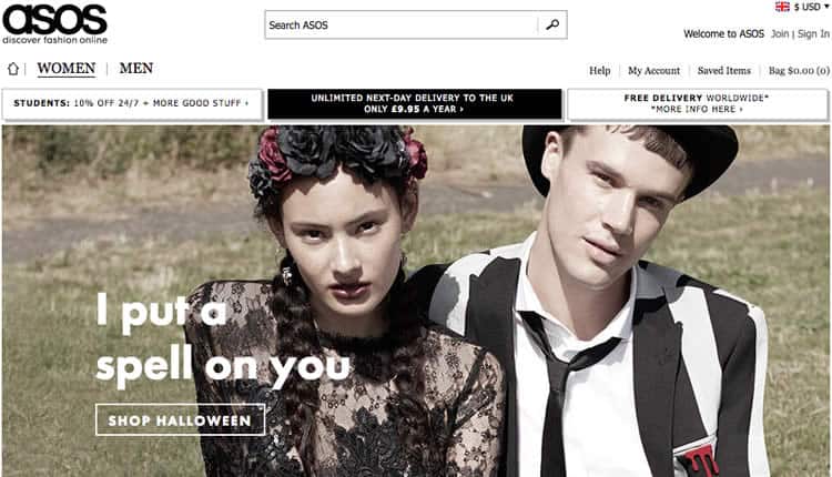
They offer large images, with catchy and compelling headlines that are sure to make their users convert. Another great example is ASOS. With more large images and compelling headlines, they know what they are doing in the B2C world.

B2B Web Design
Users on a B2B website are looking for as much information as possible. Your user has to completely trust the website before converting. If your website does not have valuable information and look trustable, your conversion rates will remain low.
Having a unique design is less important when it comes to a B2B website. Your design should be more focused around the content and information, making sure that the user stays informed throughout their entire journey on your website.
The design should also include a lot of CTA’s, and not just one type. Your CTA’s should include a little bit of everything: live chat, phone number, text message, and email address. Your CTAs must include some type of personalized interaction.
Your content strategy on a B2B website should also include various types of content: whitepapers, explainer videos, testimonials, podcasts, blogs, FAQ’s, webinars, and recorded product demos. Having multiple variations of information will really help the user understand the problem that you are solving.
A purchase almost never happens on a first visit, or interaction on a B2B site. Business-to-business leads tend to need more nurturing, which is important to take into account in the design process.
Some of your content should include compatibility and integration information to assure your user that your product or service is the right fit for their company. According to the Neilsen Norman Group, this is extremely important; to include technical specs, API info, and integration details.
Lastly, no matter how complicated your pricing may be, you should try to get some type of pricing model up. Even just a simple ‘Estimated Pricing Calculator’ will result in happier customers.
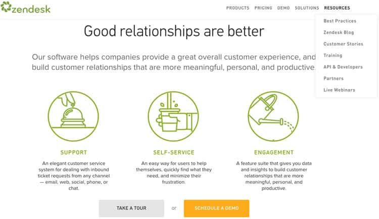
If you are looking for a great example of a website that does B2B right, check out ZenDesk.

ZenDesk truly has informative information, various amount of different types of CTA’s, and features many different forms of content; webinars, blogs, demos, tours, developer information, FAQ’s, and more. They also offer the user the opportunity to view their complex pricing models.
Conclusion
B2B and B2C websites have different audiences, with distinct needs.
When designing for a B2B website, you must support a long, complex buying cycle with as much information as possible. On the other hand, your B2C website should have top tier visual design, UX and usability.
While these things are important on every website, there should be more emphasis on them on a B2C website. Lastly, whenever you can, communicate prices and costs as clearly as possible.
Want to learn more?
Want to get an industry-recognized Course Certificate in UX Design, Design Thinking, UI Design, or another related design topic? Online UX courses from the Interaction Design Foundation can provide you with industry-relevant skills to advance your UX career. For example, Design Thinking, Become a UX Designer from Scratch, Conducting Usability Testing or User Research – Methods and Best Practices are some of the most popular courses. Good luck on your learning journey!
(Lead image source: JuralMin – Creative Commons)
