Everyone else can split hair all they want, and they may be right. Perhaps I’m generalizing. But UI design is no different than web design, at least not in the Design-Utopia of my dreams. The UI ‘niche’ (which used to be strictly software/electronic products domain) has extended way beyond those confines. And that is as it should be. To get some focus and limelight, you have to direct it all at the users first.
While UI designers continue to bask in greater scope and opportunities of this incredibly amazing wave in Industry 4.0, there are some hidden challenges that can take all the fun right out of it. I’m not talking design patterns or reminding you to A/B split test it all. I am talking challenges so seemingly trivial they often escape notice, but niggle at you till the project end and beyond.
See for yourself:
1. The New, ‘Rad Looking’ GUI Elements
There’s no end to new trends in designing Links, Buttons, Scrollbars, etc. for the web. We have ‘Hamburger’ menu icons, horizontal scrolling, ghost buttons, and more. While they look and feel amazing, you have to take a moment to ask yourself: “Are they making users’ lives difficult?”
If the answer happens to be ‘yes’, then congratulations dear UI designer: you have just lost yourselves some users.
As someone who is paid to keep users and usability in mind at all times, UI designers have to ensure their products are usable, accessible, and pretty: in that order. Buttons are for immediate action and should be clearly visible. Horizontal scrolling may be used in specific context, but with the unavoidable side-effect of confusing the heck out of users. So be warned.
I hate to quote an unconscionably evil character, but Dolores Umbridge’s words in this context are absolutely appropriate. “Progress for progress’s sake must be discouraged”. By all means, be trendy, but don’t suddenly become Gwyneth Paltrow and lose all sense of reality in the progress.
2. Looking Like a Link (and Not Being One)
This is related to the first point up there.
We know users have little-to-no time or patience for wacky antics, even if they’re looking for cat pictures and other silly memes. Even if your website is solely based on prank-products, puns, and jokes, do not prank your own users with design.
This should be a no-brainer, really.
We’ll often come across websites with text that looks like a link. We take the cursor on it and it changes slightly too, of course it’s a link. We click on it and… nothing. Absolutely nothing happens. Why did it pretend to be a link if it isn’t one?
That’s a trick question. The very act of making unclickable text look like links is a trick. There may be some contexts where its use won’t irritate a majority of your users, but I honestly don’t know what they might be.
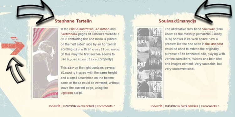
Here’s one culprit:

Now, to be fair, the links are included inside posts and distinguished with underlines. That’s not really much of a consolation. Users will end up thinking the site or connection is broken.
So do yourself a favor: Design and visualize your links and buttons properly. They have significance above the rest of the text and content. Make them look the part too.
3. Mythbusters: Navigation ‘Must-Haves’
Given enough time, the usage and necessity of anything will be blown wildly out of proportion.
Cases in point: Hamburger menu and infinite scrolling. Both patterns are popular and used with abandon by scores of websites; whether their information architecture needs it or not.
We see infinite scroll used by some very popular platforms: Google Images, Facebook, Twitter, even e-commerce websites, and we think it’s the solution to waning user interest and dumb navigation. But ask yourself this: How will your users locate/ mark content? How do they move back and forth from content they like? How will they cope with the sheer amount of information you’re throwing at them?
Then there’s Hamburger menu: a magical icon that makes navigation troubles disappear! It’s easy to see why you may be tempted (or already working with) a hamburger menu. It’s progressive disclosure, man.
Hamburger menu is the design equivalent of stuffing all your furniture in the attic to make your home minimalistic.
Let me present the other side of that coin to you.
Users tend to skim through the websites. Whatever’s apparent to them in those few precious seconds gets (somewhat) absorbed, while the rest can sit in the dark and gather for all they care. Hamburger menu is the design equivalent of you stuffing all your furniture in the attic to make your home minimalistic. NBC News tried and failed, so maybe try and learn from their mistakes. Instead of pushing everything out of sight, make your menu visible with tabs: 4-5 is the sweet spot. And if you can’t compress everything into just a handful of categories, you need to take another look at your content and hierarchy.
4. May the Forms be with You
Any conversation about UI design is incomplete without mentioning forms. But don’t worry. I won’t be harping about inline validation (do) or progress bar (do) or form resets (don’t) or placeholder text (depends on your audience).
All the basics, (and really they should be form basics by now) aside, I want talk about tone.
I’ve said this before: forms should use conversational tones and focus on ‘what users need to provide’ instead of ‘what you need from users’. Ask a question in place of form field label.
A simple change shifts the focus from you to users, simplifies, and ‘humanizes’ a dead-boring and tedious task.
5. Clash with the Clients
This looks like a non-issue until you find yourself seriously questioning why on earth you decided to be a UI designer. It happens most often when clients and stakeholders are dismissing your ideas and squashing in their own.
Now, the more egoistic, aggressive designer will cuss and whip up a rage-storm before reminding The Man that the client(s) hired him/her and not the other way around. The calm, professional one will try to see things from clients’ perspective before listing off alternatives and logical argument.
But sometimes, despite all your experience and best efforts, your design (and you) will still get rejected because communication failed between you and the clients. In those cases, accept defeat and move on.
In Essence
Challenges for UI designers can come from the most unexpected sources. I hope I left you 5-point wiser than before in this regard. Here’s the TL; DR version:
- Appearance of GUI elements: Standard is safe (and tested and better in general).
- Don’t tease your users with elements that appear to be GUI elements (but aren’t).
- Consider your information architecture before blindly going for patterns like hamburger menu and infinite scroll.
- A conversational tone in forms can lessen the pain considerably.
- Communicate with clients and understand their motivations as best as you can.
Want to learn more?
Are you interested in the intersection between UX and UI Design? The online courses on UI Design Patterns for Successful Software and Design Thinking: The Beginner’s Guide can teach you skills you need. If you take a course, you will earn an industry-recognized course certificate to advance your career. On the other hand, if you want to brush up on the basics of UX and Usability, try the online course on User Experience (or another design topic). Good luck on your learning journey!
(Lead image: Depositphotos)
