Conversions. Everyone’s talking about them. How to get them, who to target, how to convert quickly, you name it. As a User Experience Designer (UXD), you may feel that your role as an agent of conversion optimization ought to be minimal – that’s what Inbound Marketing is for, after all. Right?
That’s not 100% true.
Yes, Inbound Marketing teams across the world have undertaken sweeping campaigns to learn the most effective conversion techniques. And yes, many of the most effective conversion techniques are rooted in copy optimization and the effective use of web analytics.
However, don’t get lost in the illusion that Inbound Marketing and User Experience Design do not play on the same field. Here are some of the things that you didn’t know were (and weren’t) converting your users.
1. Instant Proof
Converting an individual from a user, to a paying customer, requires trust. Unbacked claims can only get you so far. Social Proof and other “check the box” items are instrumental in making sure that users feel comfortable paying you money.
As a UX Designer, there are a number of ways in which you can build up the trust of your users. Granting prominence to such elements as previous clientele, testimonials, and, for example, a summary of the problems you’ve helped solve, can go a long way. Granting prominence to these elements is the key, here.
It’s not enough to tuck the testimonials away at the end of the landing page, or on your “About” page. It takes 50 milliseconds for a user to form an opinion about your organization once they’ve landed on your page.
UX Designers: Ensure that the proof you provide your users is instant, by granting it prominence. Move the proof close to the top of the page—be aggressive. There’s a reason that people use the old adage, “confidence is sexy”.
2. Content Organization
Before addressing content organization, you ought to ensure that your team has procured some good content. This guide will assume that you already have a talented copywriter who knows how to create conversion copy, or another form of media asset already in your possession.
In order to organize content in a way which maximizes the conversion rate, UXDs ought to consider that screen real estate becomes less valuable, the further away from your headline you get. This is the case most of time, except where industry leading design and content is concerned.
Consider the following outline of a sample page:
- Headline
- Subheadline
- Image
- Video
- Call to Action
- Body Copy
- Testimonials
- Call to Action
UX Designers: Content placement ought to be altered to reflect a particular conversion strategy. High value assets can be placed “higher” on the outline for added effect, or “lower” in the outline for a more consistent level of value throughout the page.
3. Visual Stimulus
There are so many case studies available online that illustrate the effects of image choice and placement on conversion rates this article has quite a few.
Not only does imagery offer potentially enticing visual stimulus, it is also an excellent tool for the communication of ideas that are hard to put into words. The placement of powerful imagery in critical locations on your page, such as near calltoactions, can be positively correlated with conversion rates.
Visual stimulus doesn’t necessarily have to come from imagery, either. The size and shape of an asset can also have a profound effect on its ability to convert users in sufficient quantities.

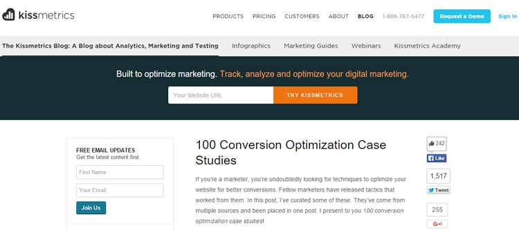
UX Designers: Consider that Kissmetrics, a global thought leader in the field of Inbound Marketing, placed a visually prominent CTA and large signup form in the header, above any blog content.
4. Compelling CalltoActions
Compelling CalltoActions (CTAs) are the bread and butter of conversion optimization. They are also among the most elusive page elements. You might be thinking huh? I use those everywhere.
No you don’t.
There is a small but powerful distinction between “CTA” and “Compelling CTA”. Granted, there might be a fine line separating one, from the other. It is often difficult to pinpoint the specific characteristics that make a CTA compelling.
There is an abundance of CTA research available online, and in print.
Consider that two ads which possess similar copy, image background, or form style, may perform very differently based on the particular combination of assets used. That is to say, you cannot assume that one type of asset will have a positive effect on conversion rates in 100% of cases.
UX Designers: Remember to do your research and keep records of the CTAs that you’ve created. Crafting a compelling CTA is more than designing a beautiful CTA.
Want to learn more?
Are you interested in the intersection between UX and UI Design? The online courses on UI Design Patterns for Successful Software and Design Thinking: The Beginner’s Guide can teach you skills you need. If you take a course, you will earn an industry-recognized course certificate to advance your career. On the other hand, if you want to brush up on the basics of UX and Usability, try the online course on User Experience (or another design topic). Good luck on your learning journey!
(Lead image: Depositphotos)
