Sometimes the best way to test a product doesn’t involve the product at all. Decontextualized tests, or tests that do not involve the product, are generally geared to testing users’ attitudes on the product, or in generating ideas. But just because they may be more conceptual does not mean they are any less valuable as a source of data.
In this piece, we will focus on card sorting and interviews as two popular and cost-effective decontextualized testing methods. On a related noted, we will also discuss heuristic reviews. We have included it in this discussion because while someone is interacting with the product, it is not the end-user — instead, a group of experts reviews the features based on established best practices.
1. Card Sorting
The idea is so simple yet so meaningful.
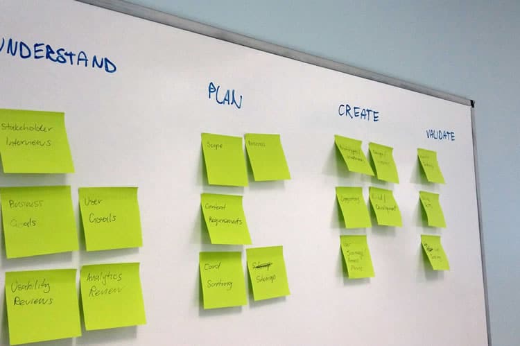
As we have previously stated, in card sorting you write the different elements of your product on note cards or post-it notes, then have your participants organize them in a way that makes the most sense to them.
If you’d like to go paperless, you can also choose a usability testing tool like OptimalSort for quick analysis of common groupings. Regardless of analog or digital, the result gives you a solid understanding on your product’s information architecture (IA), a big term than means simply how you organize the elements of your product.
Card sorting mostly deals with issues of navigation, organization, labelling, and grouping. This test is similar to the tree testing that we discussed in The Guide to Usability Testing. The main difference is that card sorting helps you understand how users categorize content while tree testing shows you how they directly interact with an existing IA to complete tasks.

Card Sorting Variations
There’s more to card sorting than it seems. Donna Spencer, card sorting expert and Founder of Maadmob, believes that while card sorting might not provide a final structure, it does provide a rare glimpse into users’ mental models.
For such a simple activity, there’s plenty of variation and controls that will affect the kind, and validity, of data you receive. For starters, there are two different styles of how you can conduct it:
- Open Sorting: Users are provided only with the elements, and are left to group them however they see fit. Once grouped, users are asked to give names to the groups themselves. This is recommended for generating new ideas since you can work backwards from users’ natural thought processes.
- Closed Sorting: As with open sorting, users are given the elements; however, they are asked to categorize them into predefined groups. This is recommended if you’re working within the restrictions of pre-existing categories, for example, when updating an already developed website structure.

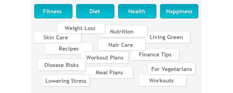
The above image is an example of a closed card sort. In this case, you can see the four categories in blue and the cards below. Users are then asked to place the cards under whatever category seems best to them. If this were an open card sort, you’d simply remove the blue categories and ask users to create their own.
Aside from open and closed, other variations include groups or individuals, and remote or on-location. Groups allow users to work collaboratively, for better or worse, and can help you learn about multiple users at once; however, group dynamics might affect your results. Remote location testing — for example, using an online software tool, allows you to test more users in a faster time, yet you’re unable to directly observe their decision-making processes. On-location gives you a fuller understanding of how your users came to their decisions, but requires more planning and scheduling.
Card Sorting Guidelines
While every card sort is different depending on the cards, William Hudson, UX Strategist and Consultant, suggests some general benchmarks for card sorting. Specifically, he lists the approximate times it will take people to sort a given number of elements:
- ~20 minutes for 30 elements
- ~30 minutes for 50 elements
- ~60 minutes for 100 elements
Using this time structure, you can plan out in advance how long the tests will take to administer, once the cards are written or the software established. From our experience, these guidelines can be quite generous — one of our closed card sorts involved 47 cards and four categories, but only required an average of three minutes to complete.
When naming the cards, simpler is better. Avoid big words (many syllables) and technical jargon. While this is good advice in general for the language usage of a product, it is essential for card sorting since overly complex labeling will disrupt the natural thought processes.
Pierre Croft, IA and UX expert for Decibel Digital believes that card sorting can help deflect the bad ideas of HIPPOS (highest paid people in the room) who might not know how to build a good website. Card sorting is cheap, useful, and quick, so we’ve included a few pointers:
- Don’t mix parent and child categories: In other words, use categories from the same level, or else you will confuse your participants.
- Provide some blank cards and pens: While this is standard procedure for open card sorting, it’s also quite useful for closed card sorting. After the formal testing is done, you can provide a couple blank cards for participants to write down additional categories. While the information might be “off-the-record,” it could bring to light some useful insights.
- Don’t intervene: After giving the instructions, try your best to sit back and observe the participants (unless they ask for help). Intervention will obscure the data.
- Accept that sometimes users don’t group everything: A lack of grouping can be just as telling as a structured sorting. If this happens, make sure you ask the user why. If you’re running a closed sort and not everything is sorted, you can also provide blank cards to see why the existing categories weren’t chosen.
- Set time limits: This makes scheduling easier in general, and gives the participants an idea of how much time to spend on their tasks.
If your website has hundreds or even thousands of pages, you can choose only first and second-level pages to keep things manageable. For example, “Contact Us,” “Terms of Agreement,” and other utility pages can be omitted since they can be found on almost all websites out there (so you wouldn’t really be testing anything unique to your site).
2. User Interviews
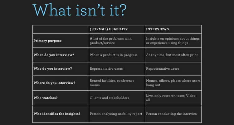
If you want to know what users think, sometimes all you have to do is ask. As discussed in The Guide to Usability Testing, interviews directly connect you with your target audience and give you a high degree of control over what data you collect. On the other hand, your research is mostly qualitative and limited by the participant’s self-awareness and articulation.

The nuances of interviews lie in what to say and how you say it. Kate Lawrence, UX Researcher at EBSCO Publishing, offers some great insights into these areas. When asking questions, it’s best to center around the participant’s perspective of the environment in which your product will exist. Here are a few great interview questions that apply to any product:
- What are five websites/apps/products that you use on a daily or weekly basis?: Knowing what similar products people are using will help you understand their motivations behind using them, and generally what they’re looking for.
- What is your usual process for searching/shopping/evaluating products like ours?: It’s helpful to know how users interact with other similar products so you can design yours to meet or exceed their expectations.
- What do you like or dislike about the Internet/apps/products in general?: The answer to this question can be incredibly revealing, but you may need to read between the lines.
- How would you describe your ideal experience with our product?: A little on the nose, but the answers will tell you exactly what your users like. While you may not want to follow their responses word-for-word, try to notice any commonalities with the answers from other interviews.
With the right questions and the right atmosphere,you can mine a lot of usable data from interviewees. But you also need to know how to behave in a way that won’t bias the results while putting interviewees at ease.
Google Ventures gives 16 practical tips for running a usability interview. For example, make sure you also write down interviewee body language and always ask follow up questions.
When it comes to usability interviews, the same people skills you would use at a party still apply, just with laser-focused purpose. With the right mood and the right questions, the interview will be productive and maybe even fun.
3. Heuristic Evaluations
Think of heuristic evaluations as a scorecard for your product’s usability. Heuristics breaks down the broad category of “usability” into manageable sections so that you can rate each individual section and see where to improve and where to stay the course.
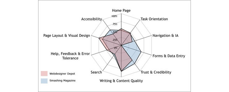
Once you have a working prototype, a heuristic evaluation (or usability review) can be a low-cost method of checking against usability best practices. Heuristic evaluations are also helpful for competitive benchmarking since you can compare competitors against the same criteria (as you’ll see below).

Heuristic reviews can even be carried out by people who aren’t UX experts, as long as you’ve reviewed and walked through the usability scenarios. But as we emphasized in The Guide to UX Design Process & Documentation, while heuristic reviews are cheap and usually only require a day or two, they don’t actually tell you the usability of a system (since you’re not testing with real users). They can also suffer from inconsistency and subjectivity since they’re carried out by different people.
That being said, they are a still a great reality check since you’ll be able to catch glaring UX violations. While heuristics evaluations can be conducted by anyone, you could also hire a team of heuristics experts to evaluate your product thoroughly and professionally. As Foolproof Labs suggests, make sure you follow a thorough process of completing a heuristic evaluation:
- Plan the evaluation: Establish your usability goals so that you can communicate them to the evaluators. If you want to know specifically about the dialogue windows on your website, don’t be afraid to mention that.
- Choose your evaluators: If you’re on a limited budget, even inexperienced evaluators will find 22-29% of your usability problems — so a novice evaluator is better than none. Five experienced evaluators, on the other hand, can uncover up to 75% of usability issues.
- Brief the evaluators: If you choose not to go with experts, make sure you brief your evaluators on Nielsen’s ten heuristic checkpoints so that they know what they’re looking for. If you’re reviewing a website, you can start with a more concrete 45-point website usability checklist [Excel File].
- Conduct the evaluation: While it’s recommended that each evaluator conduct their examination individually so that they can fully explore the product on their own terms, sometimes group evaluations are better for time since they can all happen at once. Whether it’s performed individually or together, it’s best to have 3-5 people. (Note: Jakob Nielsen suggests that each evaluation session lasts between one and two hours. If your product is especially complex and requires more time, it’s best to break up the evaluation into multiple sessions.)
- Analyze the results: Unless you’re going with a professional firm, you may need to compile and analyze your own responses. Remember that a high score doesn’t mean your product is actually usable, only that it should be usable.
To give you a better idea of how this works in real life, we’ll explain a few examples. Oracle uses a streamlined 10-point list of heuristics gauging everything from application complexity to frequency and helpfulness of error messages.
Usability issues are categorized as either “low,” “medium,” or “high” severity with supporting notes. The team then isolates the top ten most important issues for immediate fixing. If you’re curious about what a full heuristic report may look like, check out this full heuristic evaluation of Apple iTunes.
Takeaway
Decontextualized tests tend to focus more on abstract and conceptual areas, so if those are what you are looking for, one of these tests may apply for you.
For analyzing a site’s navigation from a design perspective, card sorting is the best usability method (tree testing works better for testing existing information architecture). Some people prefer a more human connection with their users, and for this, interviewing has been the standard in user research since long before the digital era. Different but related are heuristic evaluations, which puts your product’s usability evaluation in the hands of others.
For explanations and practical tips for 20 different types of usability tests, check out the free 109-page The Guide to Usability Testing. Best practices are included from companies like Apple, Buffer, DirecTV, and others.
Want to learn more?
If you’d like to…
- get an industry-recognized Course Certificate in Usability Testing
- advance your career
- learn all the details of Usability Testing
- get easy-to-use templates
- learn how to properly quantify the usability of a system/service/product/app/etc
- learn how to communicate the result to your management
… then consider taking the online course Conducting Usability Testing.
If, on the other hand, you want to brush up on the basics of UX and Usability, then consider to take the online course on User Experience. Good luck on your learning journey!
(Lead image: Depositphotos)
