
Like mac and cheese. Or gin and tonic. Or crisp white shirts with classic blue jeans. Some things are beautiful in their simplicity. What ups their fab quotient a notch higher is that these are things that combine their undisputable beauty with great functionality.
Landing pages have their version of the PB&Js as well. Here’s a look at some landing pages that take care of all the key principles of a good landing page and yet manage to pack a punch aesthetically and functionally.
1. Geico Auto Insurance
Geico has a knack for getting their marketing frustratingly right nearly all the time. Here’s an example of that same marketing flair at work.
This simple but totally functional landing page borrows its striking, yet completely self-explanatory headline from Geico’s commercials (+1 for brand consistency) and does away with the need for any accompanying copy.
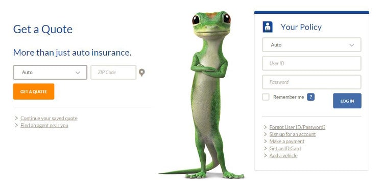
The call to action is clear and direct – Get a Quote. Now.
They even offer the user multiple ways of getting in touch with them to complete the conversion. The simple pre-selected drowpdown and a search for local insurance agents by Zip Code is extremely powerful since through it potential customers can select any of Geiko’s product / agent combination without being distracted by unnecessary links. #Win.
2. AIG Direct Life Insurance
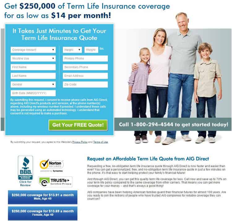
Unlike Geico’s ode to minimalism, AIG goes into a little more detail for their life insurance landing page. Right off the bat it has four great things going for it:
- A great form: This simple form performs a dual role – it functions as an instant insurance premium calculator and then doubles up as a database collection tool. The best part? It does this without dragging on and on about unnecessary personal details from the user.
- Trust Building: The form is followed up with easily recognizable trust marks that reassure a user about the security of the information they give in the form.
- Contact Information: The contact number is offered not once but twice on the same page, to reinforce the message and make sure it is not missed.
- No Navigation Bar: The landing page is a self-contained one with no navigation bar or drop down menus or links to the main website to distract the customer from the main purpose of their visit – to get a life insurance quote.
3. BestBuy
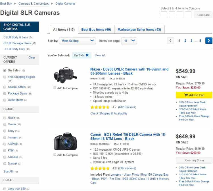
Instead of taking the user to a single product page, BestBuy takes the user to a search results page that offers the choice of the same product from different sellers, thus leaving the freedom of choice in the user’s hands.
To make the user’s decision making process even easier, BestBuy offers detailed product information within each product snapshot, customer ratings and a link to in-depth reviews. The CTA for each product snapshot is highlighted in a bold yellow button and the reasons to buy are brought under the spotlight in a colored cell next to each product.
BestBuy even tries to tap into a search user’s bargain hunting behavior by highlighting the ‘Regular Price’, ‘Sale Price’ and ‘Savings’ to make the offer even more attractive.
4. Vanguard Mutual Funds
Financial products are seen as complicated, scary things by the average user, something that most people would happily delegate to their accountant or financial consultant.
WhichTestWon.com offers an interesting case study of Vanguard THAT tries to break the mould of finance = complicated, by pictorially showcasing a simple 3 step investment process, with a clear and unmissable CTA. The CTA does not simply say ‘Submit’ or ‘Know More’ like most pages, instead it uses action oriented copy to prod the user along the conversion curve.
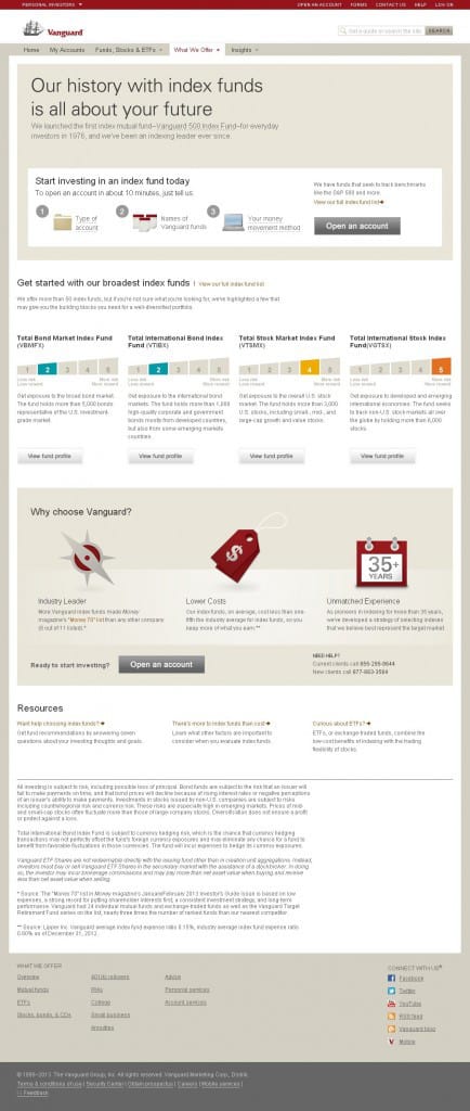
The page educates users about the various mutual fund products available to them and then convinces them about the merits of choosing Vanguard. They add the same CTA at the end of the ‘Why Choose Vanguard’ section to increase chances of click throughs.
This thoughtful content hierarchy is what makes this page the winner it is. It does this in 3 simple steps:
- Uncomplicated the financial investment process
- Educate the user about financial products available
- Convince them that your product would be the best way to go
5. Optimizely
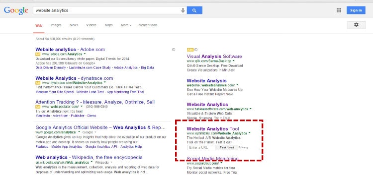
The gurus of conversion testing, Optimizely gets on the conversion train from the word ‘Go’. Right from their PPC ad on Google that has a built in A/B test tool, to their carefully thought out landing page that (but, of course!) follows the key principles of a great landing page, here’s a brand that’s getting its act just right.
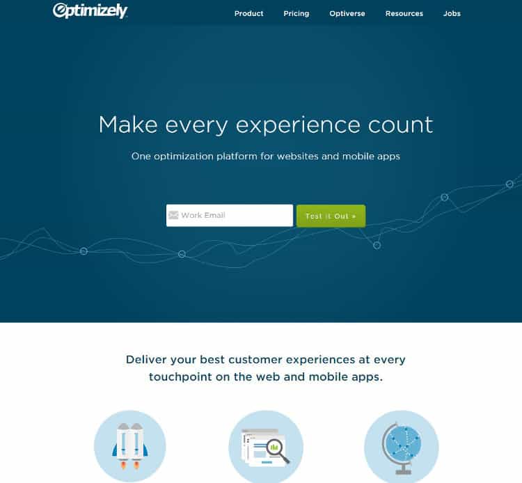
The landing page keeps it simple and classy. A bare-bones form captures user data and offers a test run of the tool in one shot. The ample white space allows users to focus their attention on the core message of the page without unseemly distractions.
The copy presented in bullet format allows impatient skimmers to gather all important details in a quick glance. A quote from an existing customer about their experience with Optimizely supported by an impressive showcase of marquee clients rounds off the social proof for trying out Optimizely.
6. HootSuite
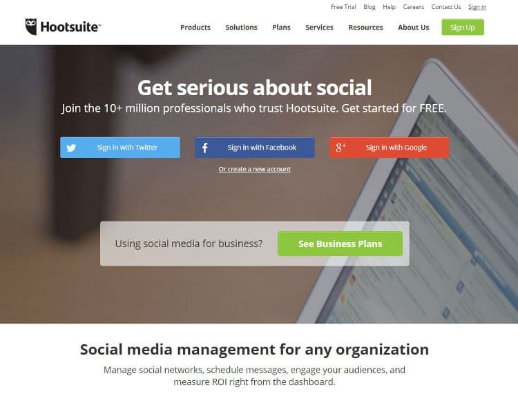
If you thought that Hootsuite was all-encompassing from a product perspective, their landing page sits at the other end of the spectrum by epitomizing minimalism and brevity. The simple headline tells the user exactly what the product does. The sub head qualifies a step further.
The multiple large and bold CTA buttons (social media and product sign ups) jump out at the user by being the only colorful element on the otherwise monochromatic page, hence the reason why they are all strategically placed in the banner area. Their objective is one – to get the site visitor to sign up.
Copy is offered in simple bite sized chunks by telling users very specific benefits they’ll derive from Hootsuite instead of rattling of fifty different features that the user would not know from Adam.
In Closing
A landing page is not your homepage. It is not some random page on your website. The rules that apply to an average webpage don’t all apply to a landing page.
Remember that a landing page is a carefully crafted accompaniment to an ad, email or any other communication about a very specific product. Treat it as such and you’ll see the difference in your results automatically.
Want to learn more?
If you’re interested in the intersection between UX and UI Design, then consider to take the online course UI Design Patterns for Successful Software and alternatively Design Thinking: The Beginner’s Guide. If, on the other hand, you want to brush up on the basics of UX and Usability, you might take the online course on User Experience (or another design topic). Good luck on your learning journey!
(Lead image: Depositphotos)
