![]()
Cutting to the chase, this article can be useful for you if you’re dealing with one of these two (or both) situations:
- You’re still working on or have just launched the site. You’re suffering from poor traffic which makes split testing inapplicable. At the same time you’re very ambitious for testing things out, mostly to cool things down in the office and actually start backing your design decisions with data.
- You generate a lot of traffic to your website and do A/B testing, although you’re still below the industry standard conversion rate. You’d like to have stronger hypothesis when split-testing but don’t have time for qualitative research (you work with charts and heat maps).
![]()
Still here? Great! The conversion rate is not the only Key Performance Indicator (KPI) you should look at when optimizing your website. You can take a deeper look into the psychology of your user and use sophisticated tools to measure the whole AIDA cycle (Attention, Interest, Desire, Act). If you’re doing just A/B Testing, you are only looking at the Act part, which is indicated by the conversion rate. If you’re Amazon.com, you can test your button colors just to eek out a 0.01% conversion increase, because you get millions of views to work with every day.
Otherwise, you have to test big changes to get meaningful results – and in aftermath you cannot really say why something worked out. Was it the attention-grabbing colour, an engaging copy or a tempting value proposition? How do you know which elements need improvement and which should be left alone, because they’re performing just great? There are two indicators that strongly support the conversion rate and can help you develop a stronger approach to what to do with your website:
- Attention Rate (AR): The number of people who just looked at a particular element.
- Engagement Rate (ER): The number of people and their time looking at particular element.
Those two are the indicators of Attention Economy of your website and help you understand how people look at it. Now, there are couple of tools you can use to get those metrics. Eye tracking studies are probably the most accurate but also the most expensive and take a lot of time to conduct. Then, a so-called predictive eye tracking can be a budget solution, but gives very misleading results. Just take a look at the screenshot below. Do you really think that’s a valid prediction of how people will look at this picture?

Then there is also a tool called Attensee which gives more credible insights (it captures real human behavior in form of interactive studies) while still being affordable for freelancers and small agencies. Take a look at the example studies we’ve made with Attensee in order to optimize the attention and bring more conversion. You should be asking yourself the following questions:
Am I driving enough attention to the elements that convert?
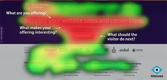
People don’t read websites. People scan websites looking for valuable information. The faster you give it to them, the more probable they will stay to read more and do what you intend them to do (subscribe/sign up/buy). Your page has to be able to instantly answer these 3 fundamental questions in the following order:
- What are you offering?
- What makes your offering interesting?
- What should the visitor do next?

Take a look at the example above. You want these three areas to have a high engagement rate – so a lot of will pay attention to your copy and spend time reading it. I believe Visual Website Optimizer did a pretty good job here. You can see this study from a respondents’ view.
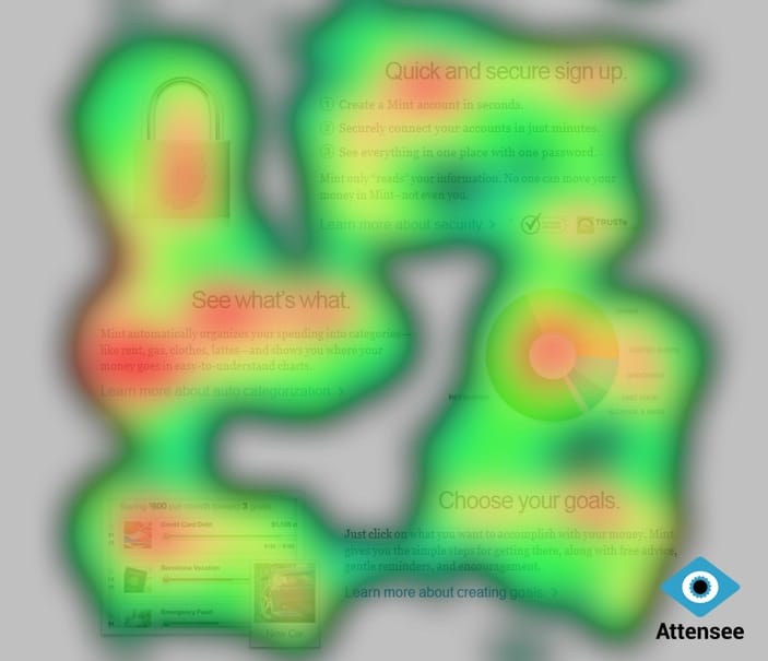
Do I have any unnecessary attention-grabbers on my website?
De-cluttering your layout from elements which carry no marketing message makes people draw more attention to the messages that actually persuade. Please take a look at this example of minimalistic design at Mint.com website. Every element here has its purpose and tells us something great about the product.

Do people understand what I’m offering at first glance?
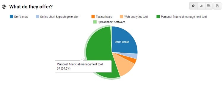
Once you get people’s attention you have to make sure that you’re making the most of it – that users actually know what your product is about. That’s why you should combine quantitative and qualitative data. Attensee has got some pretty cool ready-to-use templates you can add to your study to answer some basic questions like the one below:

The chart is referring to Mint.com as well. Despite a well designed attention distribution, you can see that only the half of people answered correctly, while almost one quarter of respondents didn’t know at all what those guys were selling. This is a big room for improvement of their value proposition.
By they way, please notice that you can use all of these tests to put your foot in a door of valuable prospects. Why not to make a quick study over some company’s website and send them your CRO offer with suggested improvements? You can try Attensee for free with a 7-day trial.
Disclaimer: The opinions expressed in this article are as provided by the company’s PR agency. Regardless, I only publish reviews of products or services that I believe will be good for my readers. I am disclosing this in accordance with the Federal Trade Commission’s 16 CFR, Part 255: “Guides Concerning the Use of Endorsements and Testimonials in Advertising.
Want to learn more?
If you’d like to…
- get an industry-recognized Course Certificate in Usability Testing
- advance your career
- learn all the details of Usability Testing
- get easy-to-use templates
- learn how to properly quantify the usability of a system/service/product/app/etc
- learn how to communicate the result to your management
… then consider taking the online course Conducting Usability Testing.
If, on the other hand, you want to brush up on the basics of UX and Usability, then consider to take the online course on User Experience. Good luck on your learning journey!
