World Usability Day 2013 will be celebrated this Thursday 14th November. In this annual event which has been celebrated since 2005, a common theme is selected to be covered by usability enthusiasts from all parts of the world. Topics that have already been discussed during World Usability Day include education, sustainability, transportation and communication. Healthcare was a theme of World Usability Day 2007 and comes back this year as an ever-important issue for usability experts. (Lead image source: World Usability Day)
In WUD, W stands for World
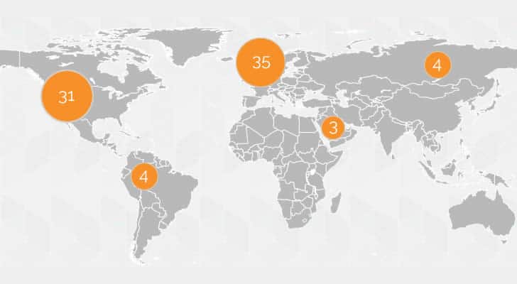
Every country participating in World Usability Day (WUD) is facing different challenges as the healthcare and usability in healthcare are developed on different levels. According to the official website of World Usability Day 2013, 77 events are scheduled in 26 countries. The types of event vary from conferences and seminars to workshops.

Making life easy
Healthcare is a field in which time is of the essence and where a mistake is extremely costly. Medical errors rank fifth among leading causes of death in the USA. Improving efficiency of the health organization can increase both patient satisfaction and the bottom line of healthcare industry – safety. At the end of the day, usability in healthcare is literally a matter of life and death.
The value of usability
Incorporating usability ideas in healthcare will increase:
- Organization efficiency, that is especially important in multi-level and multi-field industry like healthcare
- Effectiveness and user satisfaction for the individuals benefiting from healthcare
The underlying values are the main goals of usability in general. In healthcare, however, additional focus is on safety that can be greatly increased by means of user-centered design. In this way human behavior can be optimized and human error (that often appears in conditions of rush and stress) can be decreased. Let’s take a look at the real-life example:
The wall outlets for medical gases are color coded (yellow – room air, green – oxygen). The adapters attached to the tubes used to be color-coded as well (see the image below). The tubes where often mismatched – yellow adapter would be put into green (oxygen) wall outlet and vice versa. There were accidents where hospital staff were tubing in the wrong gas as they would look at the color of adapter not the outlet.

The solution was to introduce clear, plastic adapters that would force the medical staff to look directly at the wall outlet and focus more on choosing the correct tube. As a result the errors decreased.
Learning from past mistakes
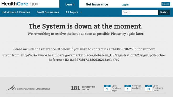
During the last couple of weeks, the fiasco of the Obamacare website was the talk of the town. There were primarily a number of infrastructural problems that prevented people from successfully using it, such as slow page load or error alerts.
Apart from that, however, the website had serious issues with usability. Among these one can definitely distinguish problematic web forms. The text fields were not described properly and the password conditions were not precise. On top of that, fields that are typically not included in initial registration forms (e.g. security questions) increased the likelihood of drop-offs.
These issues are in line with other widely recognized healthcare usability problems, such as:
- Poor usability of health record bases
- Not considering low-literacy users
- Non-optimal design of medical devices

As you can see, the issues are not confined to the IT realm. Healthcare systems have many working parts and errors can appear on many levels. This is why focus on usability and user-centered design are so important on all of these levels.
How can you take part in the change?
Obamacare website was only tested for two weeks and the contractors themselves admit they should have run it for months before launching.
Simple web form analytics can help identify problems with form fields, including the data about how much time people need to fill every field and how many people dropped out from a given field.
Usability tests, visualizing user behavior by means of visitor recording can be helpful for optimizing healthcare online and offline solutions. You can check the findability of crucial information on the websites and in e-databases.
What is more, knowing people’s opinion is of utmost importance in healthcare as patient feedback can help develop empathy and the sense of being in the user shoes.
That is all I have to say for now. Until next Thursday, may I take this opportunity to wish you a happy World Usability Day 2013!
Save money and improve usability at the same time

Online tools as the ones described above are provided by UsabilityTools, a platform you may remember from this review.
To celebrate World Usability Day 2013 the good folks at UsabilityTools are offering a 40% discount on all pricing plans at UsabilityTools to all UsabilityGeek readers.
In order to claim your discount sign up at https://usabilitytools.com/promo/ and enter the promo code: WUD2013
The discount is valid from the 14th to the 30th of November 2013.
Want to learn more?
Want to get an industry-recognized Course Certificate in UX Design, Design Thinking, UI Design, or another related design topic? Online UX courses from the Interaction Design Foundation can provide you with industry-relevant skills to advance your UX career. For example, Design Thinking, Become a UX Designer from Scratch, Conducting Usability Testing or User Research – Methods and Best Practices are some of the most popular courses. Good luck on your learning journey!
