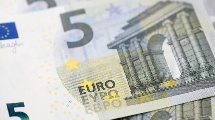
Very often we associate usability with websites or applications. Unfortunately, this is a very limited view. Usability encompasses anything that we interact with, such as household appliances, electronics, gadgets, tools and all the things which reside around us. And what is one of the things that we use on a daily basis? … yep, money!
This train of thought went through my head when I was given the new five euro banknote as change during a recent purchase. I actually stared at it because I noticed that there was something quite odd about its look and feel. You see, that is the problem with money – we all work hard for it, we save it and we use it every day but how many of us actually stop and have a look at the coins and banknotes that we use? (Lead image credit – Toxrima)
As most of you know, I am from Malta, a tiny 122-square mile island in the middle of the Mediterranean Sea and the smallest state in the European Union. In short, our currency is the Euro. I remember hearing several complaints (and I actually had mine too) way back when our old Maltese Lira currency was replaced by the Euro. This was because our coins were radically different from each other both in size, look and feel, while the Euro coins were less distinguishable. Thus the elderly as well as users with visual impairment were finding it harder to distinguish between the different coins and banknotes. And this is where the whole thought about usability comes in.
Usability of the New Five Euro Banknote
Discussing about currency usability would lead to an analysis that would stretch way beyond the objective of this article. So I will narrow it down to an analysis of the usability thoughts behind the new five euro (€5) banknote. Launched on the 2nd May 2013, the new five Euro banknote is the first banknote from the ‘Europa Series’ and it benefits from advances in banknote technology.
First of all, let us refresh our memories with the ISO Definition of Usability – Usability is “The extent to which a product can be used by specified users to achieve specified goals with effectiveness, efficiency, and satisfaction in a specified context of use.” Applying the definition in this context, the usability of the five euro banknote is affected by the degree to which it can be used by the people using it in all the 28 member states with effectiveness, efficiency and satisfaction.
There are of course various ways one can interpret the usage but I personally think that usage starts from the moment the person looks for the banknote in his/her wallet. If the five euro banknote is usable, then it would be easy for the person to notice it, understand that it is a five euro banknote and identify it from other banknotes.
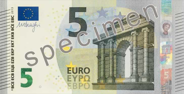
So inevitably this leads to a discussion about user interface characteristics. The most distinguishing feature of the new five euro banknote is an eye-catching, large number ‘5’ that changes colour from emerald green to deep blue and displays an effect of the light that moves up and down. This, of course makes it easier for the user to identify the banknote from the others.
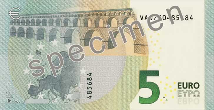
In line with modern design trends that we associate with web design, the five euro banknote is less cluttered and has (slightly more) white space than its predecessor. In addition to this, the imagery depicting European architectures are sharper and more identifiable. And speaking of imagery, the banknote is more European than ever – with various design and security features depicting the Greek goddess ‘Europa’ (hence the name ‘Europa Series’).
Since we are dealing with currency, security is of course a priority so balancing between a pleasant and usable interface with security can be an issue. However, certain security traits present in the new five euro banknote, such as the raised printing actually improve its usability.

The Distinguishing Characteristics of the New Five Euro Banknote
So as to balance between usability and security, the new five euro banknote features the following distinguishing characteristics (Source):
- Watermark: The portrait of the Greek goddess Europa is visible when the five euro banknote is held under a normal light source
- Security Thread: In addition to the above, holding the new five euro banknote against the light changes the security thread into a dark line. The Euro symbol and the number 5 can also be seen in tiny white lettering in the security thread
- Portrait Hologram: The silver-coloured holographic stripe shows the portrait of Europa when the five euro banknote is tilted. The stripe also shows a window and the value of five euro.
- Emerald Number: Once again, when the five euro banknote is tilted, the number 5 displays an effect of light that moves up and down. As previously stated, the colour of the number changes from emerald green to deep blue.
- Raised Printing: The front left and right edges of the new five euro banknote have a series of raised lines. The main edge of the banknote, the lettering and the large number five also feel thicker.
- Microprint: Using a magnifying glass reveals tiny letters which should be sharp (not blurred).
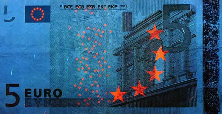
- Ultraviolet Ink: The stars in the European flag, the small circles, the large stars and other parts of the front of the five Euro banknote shine when it is placed under UV or UV-C light. On the reverse side, a quarter of the circle in the centre as well as several other areas glow green. In addition to this, the horizontal serial number and a stripe change the colour to red.
- Infrared Light: The emerald number 5, the right side of the main image and the silver stripe are visible on the obverse of the new five euro banknote when it is placed under infrared light. On the back, only the denomination and the horizontal serial number are visible.
Final words
This is of course just a train of thought that can lead to interesting discussions. Surprisingly enough, when I conducted a couple of searches, I found very little about usability in the design of currency. So, if you have any feedback or thoughts, please do share them via the comments system below!
Disclaimer: This is a “sponsored review”. I am not affiliated in any way with the company behind it. Regardless, I only publish reviews of products or services that I believe will be good for my readers. I am disclosing this in accordance with the Federal Trade Commission’s 16 CFR, Part 255: “Guides Concerning the Use of Endorsements and Testimonials in Advertising.
Want to learn more?
If you’d like to…
- learn all the details of Usability Testing
- get easy-to-use templates
- learn how to properly quantify the usability of a system/service/product/app/etc
- learn how to communicate the result to your management
… then consider to take the online course Conducting Usability Testing.
If, on the other hand, you want to brush up on the basics of UX and Usability, then consider to take the online course on User Experience. Good luck on your learning journey!
(Lead image: Depositphotos)
