User Interface (UI) design serves as the critical link connecting users with digital products, culminating in seamless and delightful experiences. UI design is more than just entertaining visuals; it’s the magic wand that transforms digital interactions into seamless and pleasant experiences. Whether you’re a seasoned UI design expert or someone just beginning to explore this captivating field, we invite you to join us on a less-traveled path. In this article, we delve into exquisite UI design website examples that vividly exemplify the profound impact of meticulously crafted interfaces.
UI Design: The Artful Fusion of Form and Function
UI design is beyond mere aesthetics; it is the intricate craft of forging digital experiences that seamlessly blend beauty with functionality. Every button, color palette choice, and text snippet adorning your website or app possesses a purpose – to ensure your digital exploration is as effortless as a gentle breeze. The ultimate objective? Creating an intuitive interface that you navigate without even realizing it’s there.
The true magic of UI design lies in making complexity appear simple, transforming intricate functionalities into elegant, user-friendly experiences that leave a lasting impression. The journey from aesthetics to functionality is an artful dance, and UI designers are the choreographers, orchestrating the symphony of elements that make digital interactions delightful and unforgettable.
UI Design Website Examples
Enough theory; it’s time to venture on an expedition with delectable UI design website examples. We’re not adhering to the typical structure; instead, we’re taking you on an excursion where each website is a distinctive destination. Whether you’re a seasoned designer or someone who revels in the digital vista, fasten your seatbelts because we’re about to traverse the extraordinary landscape of UI design.
1. Apple
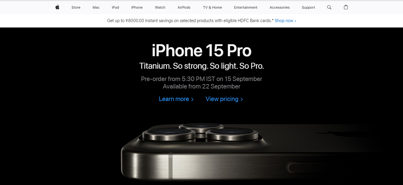
Apple stands as the embodiment of minimalist and elegant UI design. When you enter their digital realm, you’re greeted with a symphony of clean lines, high-resolution images, and a meticulously organized layout. It’s akin to encountering a digital Marie Kondo, where every element sparks joy. The generous use of white space and consistent typography contribute to the overarching sense of sophistication. Apple’s UI design philosophy revolves around placing the user at the forefront, simplifying navigation, and presenting their products and services in the most favorable light.
Furthermore, Apple’s dedication to user-centric design extends beyond aesthetics. Their commitment to seamless hardware and software integration elevates the user experience to new heights. Whether you’re swiping through your iPhone’s intuitive interface or exploring the sleek macOS environment, you’re met with unparalleled cohesion. Apple’s minimalist approach isn’t just about appearances; it’s about creating a harmonious digital ecosystem where form and function coalesce effortlessly.
2. Airbnb
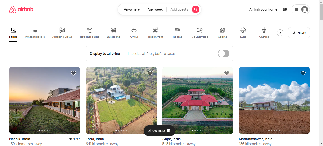
Now, let’s go on an adventure with Airbnb. Their website is a masterclass in immersive visuals. When you land on their homepage, you’re transported to various corners of the globe through stunning images of accommodations. The intuitive search and filter options serve as your compass, guiding you toward your dream destination. Airbnb’s UI design isn’t solely about booking; it’s about kindling wanderlust and empowering users to begin their journeys of exploration.
Airbnb’s UI design encapsulates the essence of its brand – a global community of adventurers, wanderers, and hosts coming together to explore the world. Whether planning a weekend getaway or an extended vacation, Airbnb’s immersive design ensures your holiday starts when you visit their website.
3. Slack
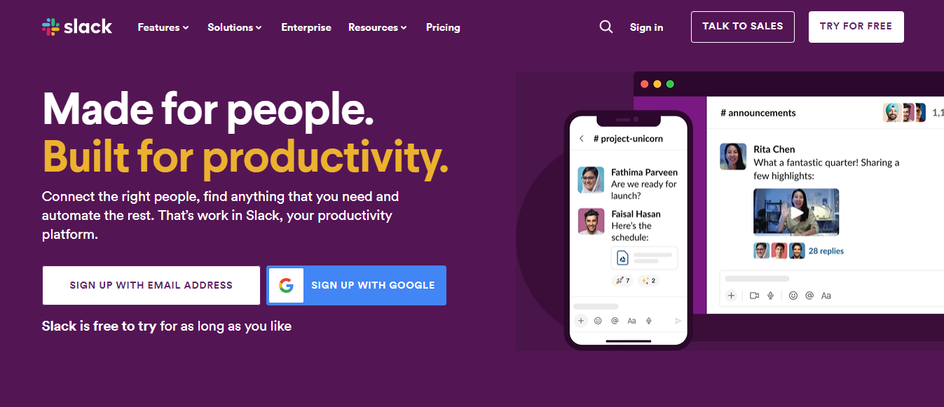
Slack serves as proof that even complex productivity tools can be user-friendly. Their website orchestrates a seamless blend of concise messaging and captivating graphics. Vibrant colors infuse a sense of vivacity, transforming work into a more enjoyable endeavor. Slack’s UI design centers on simplifying complexity, and its website accomplishes precisely that.
Slack’s user-friendly interface isn’t just about appearances; it’s a catalyst for efficient teamwork. In a digital age where remote work and global collaboration are the norm, Slack’s UI design plays a pivotal role in bridging distances and fostering productive conversations among team members, no matter where they are.
4. Dropbox
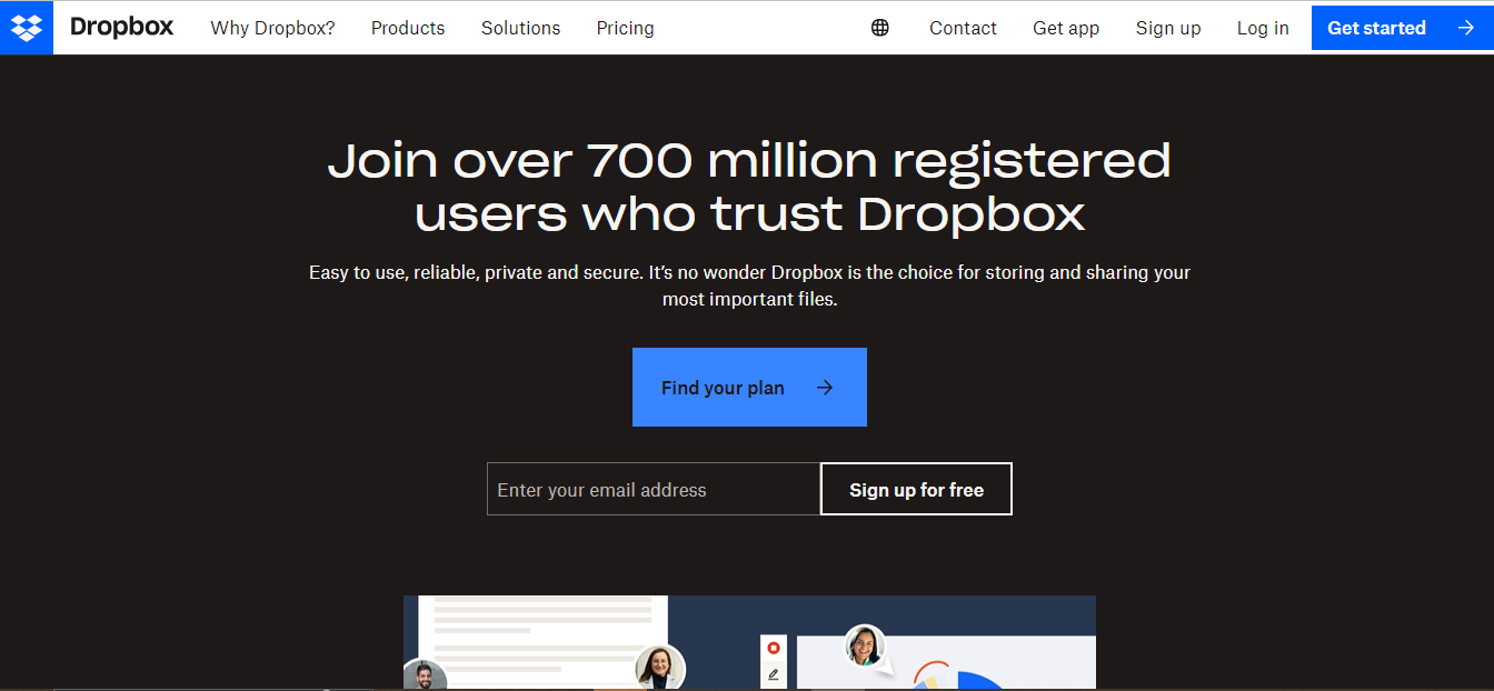
Dropbox comprehends the inherent value of clarity and simplicity. Their website stands as a testament to this very philosophy. It features clear calls to action and concise explanations of its features. What’s truly remarkable is their adept use of micro-interactions, engaging users without overwhelming them. It’s a digital ballet, where each movement is purposeful and graceful.
In addition to its seamless user interface, Dropbox takes the concept of simplicity further by integrating effortless collaboration into its design. Sharing files, folders, and documents is as straightforward as a few clicks. This approach transforms a mere cloud storage service into a versatile collaboration platform.
5. Google Workspace
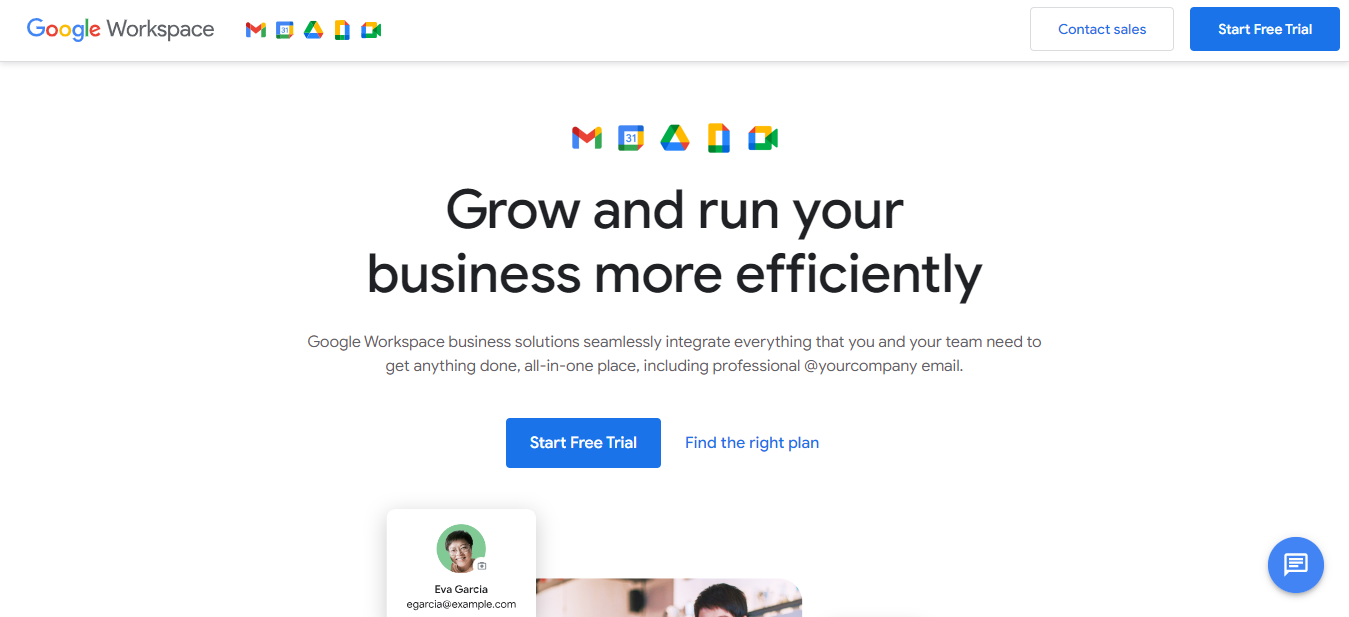
Now, let’s visit Google Workspace (formerly G Suite). Google’s UI design aligns seamlessly with its brand – clean, efficient, and reliable. The website’s layout is meticulously organized, providing easy access to information about each tool. They maintain consistency through familiar icons and color schemes. It’s akin to visiting an old friend who consistently delivers dependability.
Google’s UI design doesn’t steal the spotlight; the reliable supporting actor ensures you can focus on what truly matters – your work and communication. It’s a prime example of UI design that understands its role and enhances the user’s journey without unnecessary distractions.
6. Trello
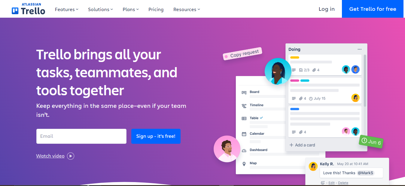
Trello revolves around the principles of simplicity and organization, much like its task management service. The website’s card-based layout mirrors the product’s interface, making it understandable. Bold visuals and clever color coding facilitate swift navigation and task tracking. Trello’s UI design is analogous to a well-arranged desk, where everything occupies its rightful place.
Beyond its visual harmony, Trello’s design philosophy extends beyond aesthetics; it’s about empowering users to take control of their tasks and projects. The user-friendly interface makes it accessible to anyone, from seasoned project managers to students organizing their coursework. Trello’s UI design sets a gold standard for functionality and ease of use in task management.
7. Netflix

Netflix has mastered the art of personalized UI design. Their website is a showcase of content tailored to your preferences. When you log in, you’re greeted with enticing movie posters and series thumbnails that know your taste. The seamless navigation and categorization make binge-watching sessions a breeze. Netflix’s UI design is about making your entertainment choices feel like they were just handpicked for you.
But Netflix’s brilliance in UI design extends beyond personalization. It’s a platform that understands the value of a consistent and intuitive user experience. The easy-to-use interface ensures that the transition is seamless whether you’re using a smartphone, tablet, smart TV, or computer.
8. Nike
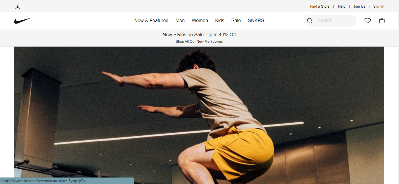
Nike’s UI design is a testament to the fusion of e-commerce and storytelling. Their website doesn’t just sell shoes and apparel; it tells the stories behind the products. Interactive videos and immersive visuals bring the brand’s ethos to life. The intuitive shopping experience with customization options makes you feel like you’re co-creating your sportswear. Nike’s UI design is about selling products and dreams simultaneously.
Nike’s UI design is built for performance. Like their athletic gear, their website is optimized for speed and efficiency. Quick-loading pages and a seamless shopping cart experience ensure that you can easily find and purchase your favorite products.
9. Asana

Lastly, we encounter Asana. Their UI design places functionality at the forefront while preserving visual appeal. The website is a conduit for communicating how their project management tool streamlines workflows. Clear headings, concise copy, and interactive elements deftly guide users through the advantages of Asana’s platform. It’s akin to having a knowledgeable tour guide in productivity.
The user-centric approach is evident in features like drag-and-drop task organization, real-time collaboration, and customizable project views. With Asana’s UI design, the path from ideation to execution becomes a smooth and satisfying experience, making it an indispensable tool in project management.
UI Designs Inspire and Connect
These exemplary UI design website examples stand as beacons of inspiration. They serve as a reminder that UI design consists of perpetual learning and evolution. UI design transcends pixels and code; it’s about invoking emotions. When a user interacts with a well-designed interface, they should forge a connection. At its core, UI design is a user-centric symphony, a composition that harmonizes every element – from layout to color choices to interactions – in a manner that profoundly resonates with the user. It’s about understanding their needs, desires, and pain points and then sculpting an experience that speaks directly to them.
It’s about making a positive impact on how individuals navigate digital spaces, irrespective of their scale. So, as you venture forth into the domain of UI design, bear in mind that you’re not merely crafting interfaces; you’re weaving memories, one click at a time.
Where to Learn More
There’s no longer a need to postpone your expedition into the world of User Interface (UI) design. Take that pivotal first step today by enrolling in IxDF UX courses. The path toward becoming a proficient UI designer is within arm’s reach. Seize this opportunity to nurture your growth and excel in UX and UI design.
Enroll in UI Design Patterns for Successful Software and Mobile UI Design with design experts to learn more about how to create the best UI design for your users.
You can also learn more about the intricacies of UI design in the article Support Recall Instead of Recognition in UI Design from the Nielsen Norman Group.
Hero image source: Image by rawpixel.com on Freepik
