Within the digital realm, faster is almost always synonymous with better. Whether its an internet browser boasting faster loading speeds or a new mobile app that offers a quicker way to order food, when it comes to our digital experiences we want our goals completed as soon as possible.
In the UX world, this holds true often enough. Designers dedicate so much of the SDLC to streamlining user flows or simplifying processes, usually with the intent of making things easier, friendlier, and faster.
So while most designers know there are exceptions to the ‘faster = better UX’ rule (the benefits of injecting friction to an experience are well-documented), fewer grasp the role that speed, and more fundamentally, time, plays in an experience.
In fact, timing is so crucial to UX design that the usability gurus at NNG have crafted an entire ‘powers of ten’-based system for it.
So how can you ensure an experience you are crafting has user-friendly timing? How do you know if a digital product is responding too slow (or, more intriguingly, too fast?) And how can you design experiences while keeping timing in mind?
Times To Remember
Jakob Nielson’s ‘powers of ten’-based system for timing in UX design runs the gamut from 0.1 seconds to 100 years, and while the design takeaways get a bit more abstract on the higher end of the scale (I do not think any UXer is designing with the next 100 years in mind), it is earlier entries are essential to remember.
One-tenth of a second, for instance, is the amount of time it takes for users to make overarching decisions on the appeal of a website. One-tenth of a second: that is all it takes for a user to form a broad opinion on the product they are interfacing with.

Though it seems miniscule, this time frame also serves as the longest amount of time an experience can respond to a user’s action, to make it look like the user directly caused that action. Anything more prolonged, and you shatter the illusion that the user is directly causing experience – once it is clear the computer (or phone) is the one responsible, the veil is lifted, and the user experience suffers. It is crucial for experiences to respond in one-tenth of a second or less.
Some other key times to remember, from Jakob Nielsen’s UX Powers of Ten:
- 1 second: maximum time limit for a new page to display
- 10 seconds: max length of user’s attention span when waiting for an experience to respond (i.e. if it takes ten or more seconds for the page to load, the user will abandon the interaction)
- 1 minute: roughly the amount of time it should take for users to complete simple tasks
While you do not need to keep a stopwatch on your desk when UX designing, it is essential to follow these time limits in mind when analyzing digital experiences and crafting your own. They serve as excellent benchmarks when checking an experience’s timing for user-friendliness.
It Is All Relative
Nielsen may have crunched the numbers to give us concrete UX benchmarks, but it was Dave Malouf who offered an alternative way to think about timing in usability. Back in 2007, he posited that timing was one of the four foundations of interaction design, and that time itself could be subdivided into three sub-foundations.
One of the most directly actionable of these sub-foundations of these is the pace of an experience, which describes how much the user can accomplish in a span of time.
It was once reported that when asked to explain his theory of relativity, Einstein replied “An hour sitting with a pretty girl on a park bench passes like a minute, but a minute sitting on a hot stove seems like an hour”.
I cannot comment on the validity of the quote, or how well the metaphor works, but it does nicely illustrate a concept that we all know to be true: how we perceive time is often very different than how time actually is. That discrepancy is the key to designing an experience with good pacing.
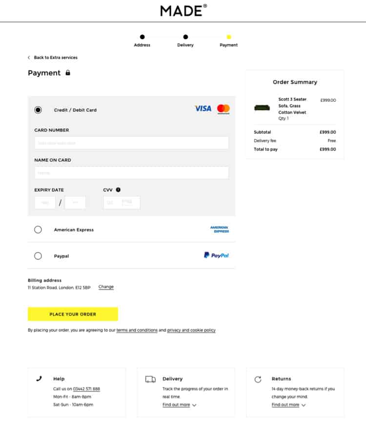
Using checkout as an example, Malouf describes how two processes that take the same amount of real time to complete can still feel differently to the user. Even though both checkout processes require the same amount of actions, placing all of the form fields on a single page will feel like it takes longer.
That is why it is best practice to split the checkout process into more digestible chunks. It improves the pacing of the user’s workload, even though it might actually take the user more time than if it were consolidated onto a single page.

Pacing manifests itself in other ways in a user experience too. Design a carousel or slideshow that moves too quickly, and the user cannot absorb the information it has before it disappears off the screen. Make it too slow, and you risk the user not realizing it is a carousel at all.
Toying With Time
Just like in sci-fi movies and physics classes, time in user experience can be tricky. It is hard to pin down rules of thumb or rock-solid maxims that will always hold true because it is so highly dependent on the use case.
So instead of trying to reference a list of rules, try designing with timing at the forefront of your mind. Viewing a user experience through a temporal lens may seem odd, but it offers a fresh perspective on usability and adds another tool in your toolbox for designing engaging user experiences, every time.
Want to learn more?
Are you interested in the intersection between UX and UI Design? The online courses on UI Design Patterns for Successful Software and Design Thinking: The Beginner’s Guide can teach you skills you need. If you take a course, you will earn an industry-recognized course certificate to advance your career. On the other hand, if you want to brush up on the basics of UX and Usability, try the online course on User Experience (or another design topic). Good luck on your learning journey!
(Lead image: Depositphotos)
