
Whenever it is time to pick the next subject for Codal and UsabilityGeek’s long-running UX Case Study series, I find myself searching in the same places. I aimlessly swipe through the App Store, flicking between categories and eyeing the download charts. I needle my coworkers, asking what apps they use on a day-to-day basis and what their preferences are.
However, it recently occurred to me that my cursory methods for selecting the perfect candidate for a UX case study needed a change. In fact, I should not think of the app as a candidate for the case study at all. This is because when it comes to reviewing the usability of experience, I should select an app that I am the perfect candidate for. For our purposes, this means something that I know absolutely, positively, nothing about.
UX designers often emphasise the importance of experiences being ‘idiotproof’, to remain usable even for the dumbest user. Hello, I am Sean, and for this case study, I am quite possibly the dumbest user.
Because when it comes to investment and asset management, I know nothing. I have little to no financial acumen, and my personal understanding of the global economy, Wall Street, and the workings of the financial sector is tenuous at best. This makes me the perfect candidate for the latest entry of UX Case Study: Acorns.
About Acorns
Acorns is a robo-advisor and micro-investment service that leverages your spare change to grow long-term wealth. After I googled about half those words, I learned Acorns’ goal was primarily to make saving and investing so effortless that users did not even realise they were doing it.
They accomplish this by asking users for access to their bank account and debit cards. With every swipe of the card, Acorns rounds up the purchase to the nearest dollar, takes the spare change, and invests it. So if I buy a coffee for $2.60, Acorns rounds the charge up to $3.00, takes the leftover forty cents, and intelligently invests it.
It all happens in the background, so users do not even realise they are automatically investing while they are spending money. It is seamless, effortless, and frankly sounds too good to be true. So I downloaded Acorns for iOS, started my auto-investing, and waited to see what would happen.
Onboarding
The first thing you notice about Acorns user experience: their UI is absolutely gorgeous. I have no idea why so much effort was dedicated to a user interface for an app that mostly works in the background, but the results are stunning. Lush, two-tone gradients paint every screen, buttressing clean typography, ornate illustrations, and even smooth, crisp animation.
Just look at the five screens that make up the sign-up function. They are so pretty, you almost forget this app needs five discrete screens to explain its premise, primary use case, and the Acorns-branded jargon they use in-app.
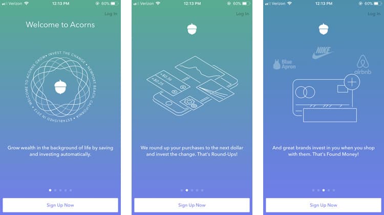
Before I even sign up, I have to learn terminology like Round-Ups and Found Money. Granted, Acorns copy does an excellent job of explaining them. Each concept is introduced by a simple definition, followed by a cheerful “That is X!”.
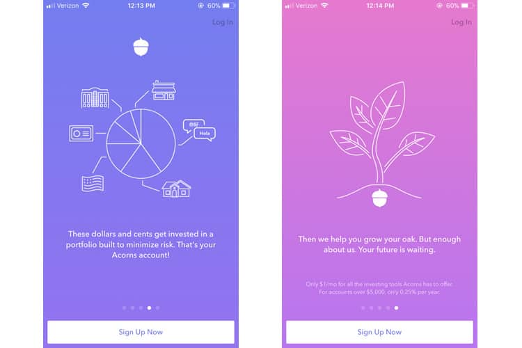
Some of the design is a bit extravagant, even unnecessarily so. The illustration on the first screen not only rotates (making the text incredibly difficult to read) but also reveals that the app was founded in ‘Newport Beach, California’. So now that I have craned my neck to read the spinning copy, I have learned a useless piece of information. It is a small example of Acorns’ broader issue of being a bit self-indulgent in its user experience.
As I am ushered into the nitty-gritty of Acorns onboarding, I run into the obstacles typically seen in fintech sign-up. I need to verify emails, enter bank account information and provide all the necessary info for Acorns to open my investment account. It is a necessary evil, and Acorns does not try to circumvent it with any tricks.
While some apps can (and should) get away with slimming down the onboarding process as much as possible, fintech happens to be one of those rare cases where friction can actually benefit the user experience. It can be off-putting if interfacing with a financial services platform is too easy, and can give the impression that the platform is not secure.
Friction also helps reduce user error, alleviating headaches for both the customer and the provider. Think of how Venmo adds an extra step to the payment process by forcing users to confirm their action. It is less “usable”, but it helps prevents Venmo users from making accidental transactions.
So instead of stripping down onboarding, Acorns simply tries to make the necessarily lengthy process as smooth and as simple as possible, sparing no opportunity to inject small (but effective) touches to their form-filling and data entry.
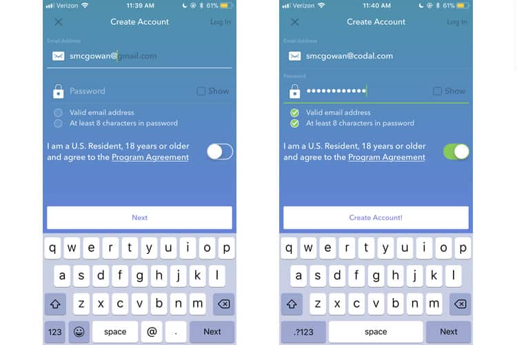
The screens above provide examples and demonstrate the effectiveness of these unassuming UX touches. Note the autocomplete function while entering my email and the ability to view my password. There are dynamic indicators that ensure my email and password meet the requisite criteria, and the call-to-action changes when I have completed the form.
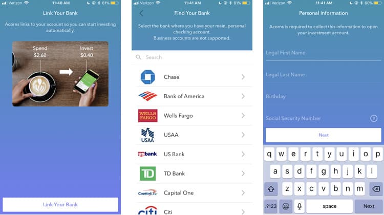
Acorns onboarding process may be long, but thanks to a conscious investment in user experience design, they have managed to make it relatively painless.
Main Interface
Now that I have completed onboarding let us fast-forward: I have been using Acorns for several months now, slowly accumulating and investing money without making any sort of conscious financial decisions. As someone with zero investment know-how, let us see if I can manage my assets in Acorns.
Right off the bat, we see an incredibly exciting architecture choice. Acorns has partitioned its home screen into three tabs: Past, Present, and Potential. There are no icons, save the conventional hamburger menu in the upper lefthand corner of the screen, with Acorns instead opting to leverage unambiguous labels using layman’s terms.
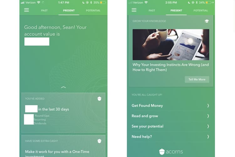
The ‘Present’ tab acts as the default home screen, with almost the entirety of the above-the-fold space dedicated to simply telling me my account balance (albeit in a friendly, conversational manner). It is a savvy UX move, especially for inexperienced investors like myself. Scrolling down the present tab reveals a card-based design strategy, grouping some more detailed stats about my assets into distinct modules.
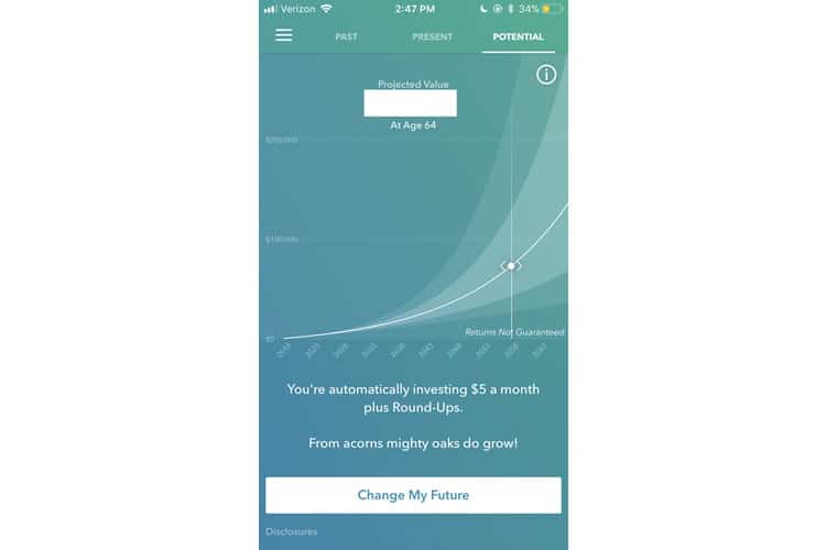
Swiping left, we are brought to the Potential tab, which consists entirely of a single, gorgeous graph delineating how my assets are projected to accrue over time. It is an incredibly easy graph to read and understand, and Acorns savvily allows the user to see how small changes made now have a significant impact in the future. (As a copywriter, ‘Change My Future’ is one of the better call-to-action texts I have seen in awhile).
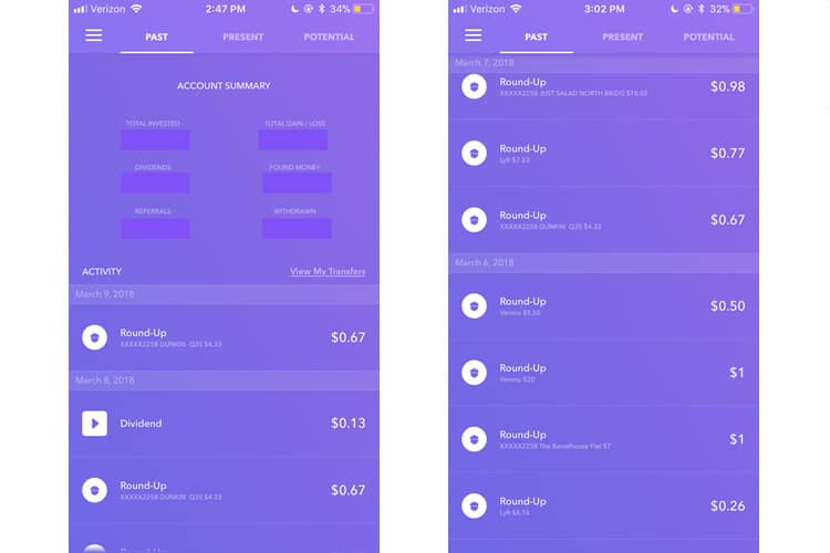
Swiping the opposite direction brings us to the Past tab, which is mostly just an account statement, a ledger of all the times Acorns has rounded up my change and deposited it into my investment account. Like everything else in Acorns, it is easy to read and understand. They have literally mastered how mobile fintech should look and feel.
Final Verdict
You may have noticed I have not yet addressed what is arguably the most crucial question regarding Acorns’ user experience: does it work? I found Acorns to be invaluable for not only introducing me to investing but also providing education on it. While it should not replace your IRA or even a conventional portfolio, it is an excellent starter pack for novices like myself.
I have already gushed about Acorns UI, but it is worth mentioning twice: this is bar none the most visually appealing fintech app I have ever seen. It stands out in a saturated mobile fintech market dominated by a spartan aesthetic. Fintech apps prize barebones utility. Acorns distinguishes itself with stunning use of colour, gradient, and typography.
So while Acorns is visually a different breed of fintech, it does excel in delivering the tried-and-true characteristics of any usable mobile financial service: translating the complex into the understandable or injecting the appropriate amounts of user friction for example. It is tenets of financial mobile app development like these that separate the successful applications from the clunkers.
More from the UX Case Study Series
- UX Case Study: Google Maps vs. Waze Mobile Apps
- UX Case Study: Spotify Vs. Apple Music Mobile Apps
- UX Case Study: Acorns Mobile App ? You are currently reading this
- UX Case Study: Lumosity Mobile App
- UX Case Study: Talkspace Mobile App
- UX Case Study: Zocdoc Mobile App
- UX Case Study: Calm Mobile App
- UX Case Study: Overcast Mobile App
- UX Case Study: SoundCloud’s Mobile App
- UX Case Study: HBO GO App
- UX Case Study: Venmo
- UX Case Study: CNN’s Mobile App
- UX Case Study: ESPN’s Fantasy App
- UX Case Study: Duolingo
- UX Case Study: Bumble
Want to learn more?
If you’d like to become an expert in UX Design, Design Thinking, UI Design, or another related design topic, then consider to take an online UX course from the Interaction Design Foundation. For example, Design Thinking, Become a UX Designer from Scratch, Conducting Usability Testing or User Research – Methods and Best Practices. Good luck on your learning journey!
(Lead image: Depositphotos – affiliate link. All other photos in this article are screenshots taken during usage of the Acorns app.)
