February is here and love is in the air.
A new couple has made things “Facebook Official”, and I just cannot contain my excitement. They are setting the bar so high regarding commitment and compatibility that even the most skeptical would be impressed.
Who is this hot new couple?
Quantitative and qualitative analytics.
Yes – analytics. Am I an absolute nerd to associate analytics with love and romance? Read on, and you might just become an analytics romantic yourself.
When assessing your mobile app’s usability, you probably employ at least one app analytics tool in conjunction with in-person testing, right?
Using analytics and being “data-driven” is important, but how much time and energy are you wasting in an attempt to obtain actionable answers from your data?
If you answered “a lot”, it might be because you are relying solely on quantitative analytics.
However, let me be clear. That is not to say that quantitative analytics does not have its role to play. Think big platforms that track everything and the kitchen sink, from DAU and geo representation to session lengths and conversion rates. These metrics (aka quantitative data) can help you gather insights on overall user actions and usage trends. However, these numbers do not answer the pivotal question of “why?”.
- Why did users drop-off the ‘Refer a Friend’ funnel?
- Why did users abruptly abandon their purchase?
- Why did users navigate back and forth rapidly between two screens?
Quantitative analytics can only answer your number based inquiries. Numbers have a significant story to tell, but how do you figure out and communicate that story?
This is where the “peanut butter” to quantitative analytics’ jelly comes into the picture (please excuse my cheesiness). Qualitative analytics enables you to examine the actual “whys” behind your numerical data.
While quantitative analytics focuses on aspects of your app that can be measured by numbers, qualitative analytics zones in on the user experience.
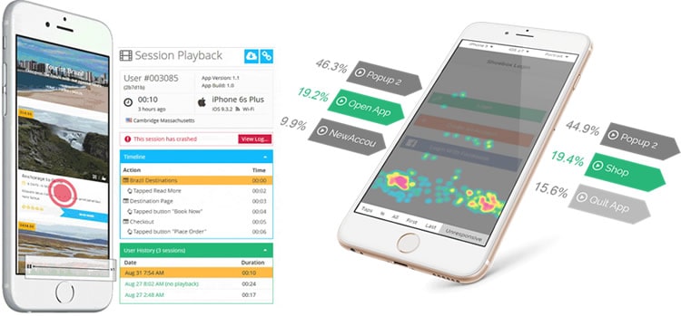
Standard features found within qualitative analytics platforms are typically user session recordings and touch heatmaps. These tools allow you to step into the shoes of your real users (not beta testers) and examine how they indeed interact with your app. This is the best way to analyse a KPI as subjective and nuanced as user experience.

What happens when you combine these two inherently different systems of quantitative and qualitative? A potent, necessary combo that enables you to streamline the process of turning data into information, and information into insights – actionable insights.
Separately they are still useful tools, but when working in tandem, they enable you to make more accurate, data-driven decisions for your mobile product.
In short, your quantitative data serves as an alert to a condition or conditions within your app, and your qualitative data then functions as the investigator.
Let us take a look at some common mobile app scenarios that benefit from this pairing of quantitative and qualitative.
Crashes

Alert:
Your quantitative data on your daily app crash rate shows you that your rate of crashes has increased by 27% from the day before.
Why is this happening?
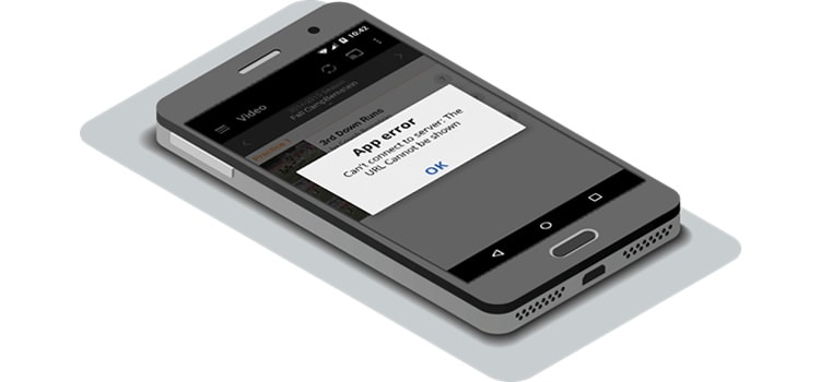
Investigator: You turn to a qualitative analytics tool that offers session recordings, and watch recordings of crashed sessions from that specific day. This enables you to obtain crucial visual context on what a bug looks like within your app and also what your users are doing.
Result: This visualisation allows you to reproduce a crash accurately and pinpoint the exact user action or sequence of user actions that led to a crash. Once the line of code is edited accordingly, you can then reference your quantitative data again to ensure that the crash has fully been resolved.
Conversion Funnel Drop-Offs

Alert:
Your quantitative data on your conversion funnel for “New User Account Creation” tells you that 62.4% of your users are dropping off between the steps of visiting the “Create an Account” screen and triggering the event “New User Account”.
Why is this happening?
Investigator: You access specific session recordings of users that dropped out of this part of the funnel to see precisely what influenced them not to complete new user account creation. You also pull up a touch heatmap of your “Create an Account” screen to see which gestures (on an aggregate level) your users are utilising and where they are executing them.
Result: With the user recordings and touch heatmaps you can directly pinpoint which factor(s) within your app engendered friction in your users’ account creation experience. Once identifying the negative element, you can confidently and accurately optimise that specific funnel (or even A/B test). You can then validate your findings and your adjustments with the improvement in the drop-off percentage.
Screens With High Quit Rates

Alert:
Your quantitative data for screen quit rate shows you that the “Settings” screen has a quit rate of 52.3%.
Why is this happening?
Investigator: You filter user session recordings, by all those user sessions that encountered the “Settings” screen and then watch videos to understand how users are interacting with that particular screen and whether they are experiencing any usability issues. You also review a touch heatmap of this single screen to see whether any unresponsive gestures occurred there.
Result: By examining qualitative data for this screen on both a single user and aggregate user level, you will be able to obtain a clear-cut understanding of all the factors that are contributing directly to the high quit rate. With that knowledge, you can improve the usability of that specific screen and bolster your users’ engagement.
Final Words
Opposites attract? In this case, the answer is a resounding ‘yes’.
This union can empower you to separate the “wheat from the chaff” within your data and make critical decisions regarding your mobile app. It also helps you better understand your users, which means a more user-centred product.
Used together, qualitative and quantitative analytics create a powerful flywheel that can be used for effective, continuous improvement of your mobile app.
Want to learn more?
If you’d like to…
- learn all the details of Usability Testing
- get easy-to-use templates
- learn how to properly quantify the usability of a system/service/product/app/etc
- learn how to communicate the result to your management
… then consider to take the online course Conducting Usability Testing.
If, on the other hand, you want to brush up on the basics of UX and Usability, then consider to take the online course on User Experience. Good luck on your learning journey!
