
Have you heard the big news? Three of the biggest names in the business — Amazon, Berkshire Hathaway, and JP Morgan, have announced a joint effort to form a new kind of healthcare company for their employees. Moreover, while few details have been revealed, the conglomerates have touted the venture as one that will focus on simplifying healthcare processes through tech.
For UX design and development companies, especially ones that often work in the healthcare sector like Codal, something like this perks ours ears up. So in honour of this almost inevitable disruption in the healthcare sector, we have decided to review another product that exists at the intersection of healthcare and tech – Zocdoc.
About Zocdoc
Zocdoc is an online medical care search and booking service that helps connect users to local physicians and specialists. The platform allows users to enter their personal and insurance information, and then serves up nearby caregivers that are verified, well-reviewed, and within the user’s insurance network.
Creating user experiences for healthcare applications is no easy task, especially for mobile devices. I have used the web instance of Zocdoc and been satisfied with the experience, but have not explored their mobile iteration. Does their experience translate? Were they able to cram a complex task — finding a doctor and scheduling an appointment — into the small screen, without sacrificing functionality or usability? I downloaded the app for my iPhone 7 and found out.
Onboarding (Sort Of)
When I open the application, the first thing I receive is a pop-up that is requesting I accept notifications from Zocdoc. Regular readers will know about my pet peeve about untimely interruptions like this, but at least this pop-up provides some value by explaining what these notifications are for.
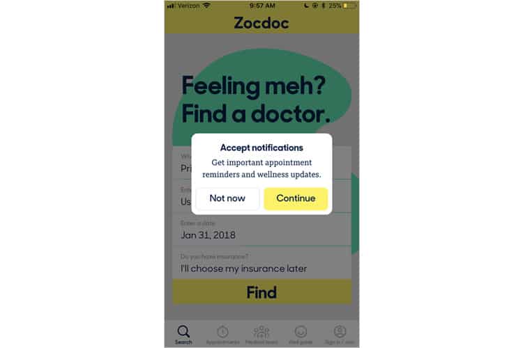
After accepting notifications, I am brought to Zocdoc’s default screen, the search tab. A quirky little page with a vibrant colour scheme, it is the first option in a series of five that make up the navigation bar, lining the bottom of the screen. Bizarrely, the last tab reads “Sign In / Join”.
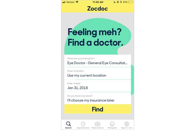
This is a fascinating design choice. It is not the fact they are eschewing the onboarding process— that is a common strategy, especially for platforms where account creation involves an exhausting amount of data input (like, say, health care for instance). Instead, they have dedicated a tab on their navbar to sign-up / login.
My theory here is that because Zocdoc calls for so much information input on the users’ side (personal info, insurance info, availability), the app tries to break up the process as much as possible, rather than hit users with 5+ screens of form-filling and risk user fatigue.
I try exploring the other tabs first, most of which are designed to redirect me to the initial screen (the search feature), or to the account creation workflow. I will oblige, and revisit these tabs later.
Finding & Booking Doctors
I decide to attempt what is perhaps Zocdoc’s primary use case. So, I follow their suggested workflow and start looking for a physician before I create an account. Moreover, it is a good thing I do, because finding a doctor on Zocdoc turns out to be a laughably easy process.
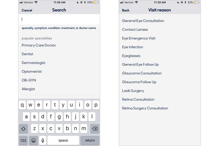
With just four basic forms and all of them with default entries that likely fit a plurality of users, I was able to go from the home screen to a list of doctors in less than 30 seconds. I decided to skip entering my insurance, but I did click on the option anyway to find a photo scan feature—an excellent function to have, especially for users who may not be familiar with the specifics of their insurance plan.
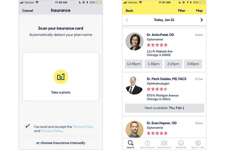
After this effortless data input, the app delivers a feature-packed, robust list of physicians. Not only does this list offer ratings and locations, but also appointment availability, an extremely granular filter function, and a map feature.
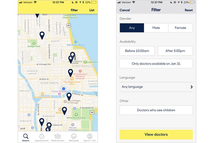
Booking an appointment is incredibly easy. I can swipe for date availability and tap for time, and all that is left for me to do is create my account to sign in.
Appointments & Medical Team
I have now signed in to my personal account (some of the info is blocked for privacy), so we can see what the Appointments & Medical Team screens look like.
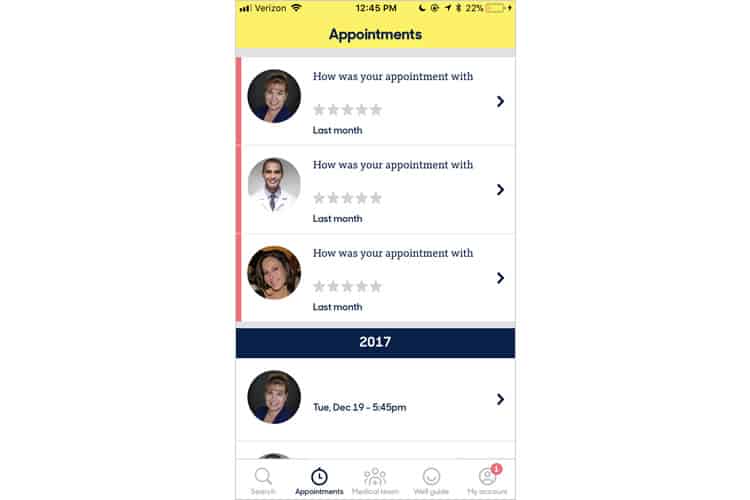
The appointments tab uses a basic card-based design and allows me to review my past appointments and rate them by several different criteria, including professionalism and wait time. The rating function is simple and straightforward and I can write a longer review if I so wish. I can also easily re-book appointments, and even share their contact info via iMessage, email, Facebook and more.

The Medical Team tab is nice but seems a bit unnecessary. It is mainly a roster of all of the doctors and specialists I see but does not really offer any new features that cannot be accessed in the appointments tab. I suppose it is a shorter route to rebooking and sharing, but I am not sure if that necessitates a tab dedicated to it, especially when navbar real estate is such a precious resource.
Final Verdict
Zocdoc’s mobile app’s best move is the segmentation of its onboarding process. Filling out medical forms is a nightmare. By deconstructing it into steps, and allowing the user to access most of the app’s content first, the process becomes much less tedious.
While the design is fundamentally card-based (with some notes of Google’s materialism aesthetic thrown in there), Zocdoc’s bright, quirky colour scheme and cheerful copy ease the hassle of scheduling your next doctor’s appointment.
As far as areas of improvement, the Medical Team tab is a bit superfluous and could be replaced with a more useful feature – possibly a WebMD like integration, or another educational tool so that patients can figure out what ailment they may have and what professional they should see about it.
More from the UX Case Study Series
- UX Case Study: Google Maps vs. Waze Mobile Apps
- UX Case Study: Spotify Vs. Apple Music Mobile Apps
- UX Case Study: Acorns Mobile App
- UX Case Study: Lumosity Mobile App
- UX Case Study: Talkspace Mobile App
- UX Case Study: Zocdoc Mobile App ? You are currently reading this
- UX Case Study: Calm Mobile App
- UX Case Study: Overcast Mobile App
- UX Case Study: SoundCloud’s Mobile App
- UX Case Study: HBO GO App
- UX Case Study: Venmo
- UX Case Study: CNN’s Mobile App
- UX Case Study: ESPN’s Fantasy App
- UX Case Study: Duolingo
- UX Case Study: Bumble
Want to learn more?
If you’d like to become an expert in UX Design, Design Thinking, UI Design, or another related design topic, then consider to take an online UX course from the Interaction Design Foundation. For example, Design Thinking, Become a UX Designer from Scratch, Conducting Usability Testing or User Research – Methods and Best Practices. Good luck on your learning journey!
(Lead image: Depositphotos – affiliate link. All other photos in this article are screenshots taken during usage of the Zocdoc app.)
