While traditional television still commands the majority of the public’s viewership, the small screen is slowly surrendering its audience to an even smaller one: mobile devices.
Major broadcasters have seen this writing on the wall and are already positioning themselves for the seemingly inevitable shift to mobile, with both ancestral networks like CBS and industry newcomers like Amazon providing app offerings for on-the-go viewing of their programs.
We are amidst the emergence of a new breed of mobile applications – mobile television. While this is excellent news for fans and networks alike, the nascent genre currently has some growing pains, making its apps prime candidates for today’s UX case study.
The HBO GO Mobile Application
The HBO GO app is an ideal subject for our dissection today, not just due to my unfamiliarity with it, but because HBO splits the difference between the traditional Big Three networks and the new wave of TV companies. HBO has been around long enough to have mastered the television market, but contemporary enough to ostensibly take innovation seriously.
As we have done so many times before, let us dive into this fledgeling genre of user experience design and see what we can learn from it. We will be using the iOS 10 version of the application, and as always, we will begin our journey from the beginning: the onboarding process.
Onboarding
HBO offers two different mobile platforms: HBO GO (the one we are reviewing) and HBO NOW. I had no idea what the difference was, but after some quick Googling, GO is a free service meant to supplement the standard HBO TV subscription, whereas NOW is standalone – you subscribe to it independently of the cable version.
For us, this means HBO GO does not have a typical ‘onboarding’ process in the traditional sense, that is, account creation, tutorial, etc. To use the app, you need to have HBO credentials already, so ‘onboarding’ in this app is just signing in.
That being said, the sign-in process on the HBO GO app is not as simple as it sounds. When you open up the application, it takes you directly to the home screen, immediately to its content offerings.
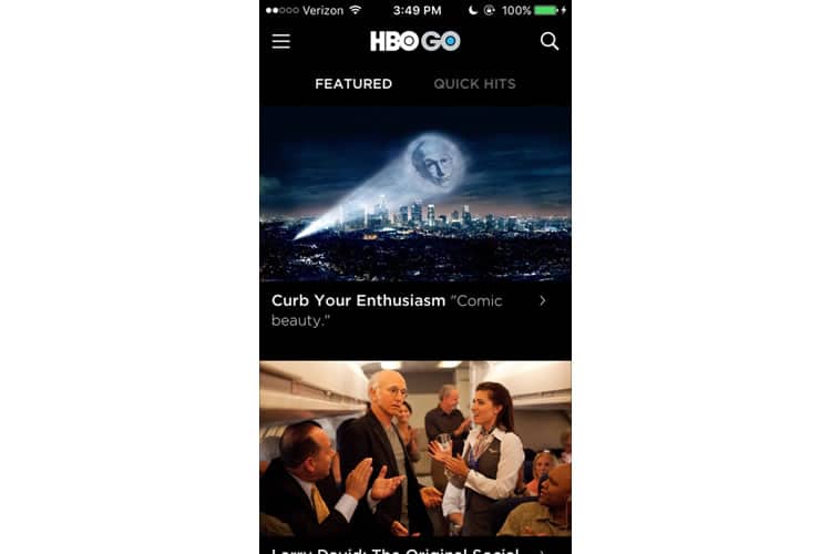
This is a relatively common practice, and I understand the strategy: entice a potential user by displaying the app’s value first (HBO’s content), and when they tap something to watch, hit them with the login.
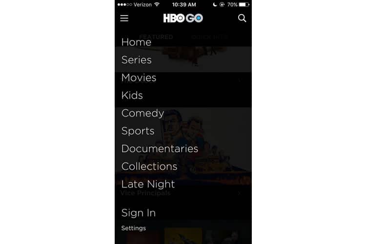
This “sign-in by selection” appears to be HBO’s preferred user flow, as evidenced by the fact their manual sign-in is a bit tucked away. In fact, it is the last option on their hamburger menu list (located in its conventional position at the top left corner of the screen).
I tap sign in and am prompted to select my television provider from a seemingly unending list of options, in alphabetical order, with no search bar in sight. The amount of time it takes to scroll to “Verizon” roughly equates to an episode of Game of Thrones!
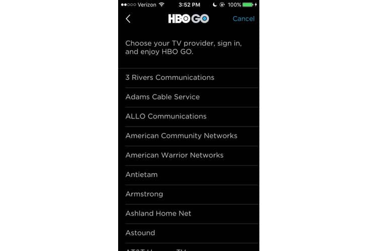
I finally find my provider, enter my account information, and am returned to the original home screen.
Main Screen
HBO GO’s main screen toggles between two feeds: a ‘Featured’ one, which displays HBO’s latest original releases, and ‘Quick Hits’, which acts as a hub for all ancillary content, such as trailers, clips, and sneak peeks.
This division of the home screen into two switchable feeds is not anything groundbreaking, and I think the organisation makes sense. The app predictably emphasises the visual content, but perhaps to an extreme.
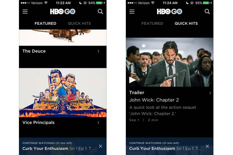
The ‘featured’ tab offers almost no accompanying copy about what each show is about, hoping instead to attract the user by graphics alone. Take a look at the black space under The Deuce and Vice Principals – it is an opportunity to write something, even just a short descriptor. A simple genre tag, like ‘Comedy’ or ‘Thriller/Drama’, is better than nothing.
Other than the two feeds, we have the aforementioned ‘hamburger menu’ at the top left (which has added a ‘Watch List’ feature now that I have logged in) and a search function at the top right.
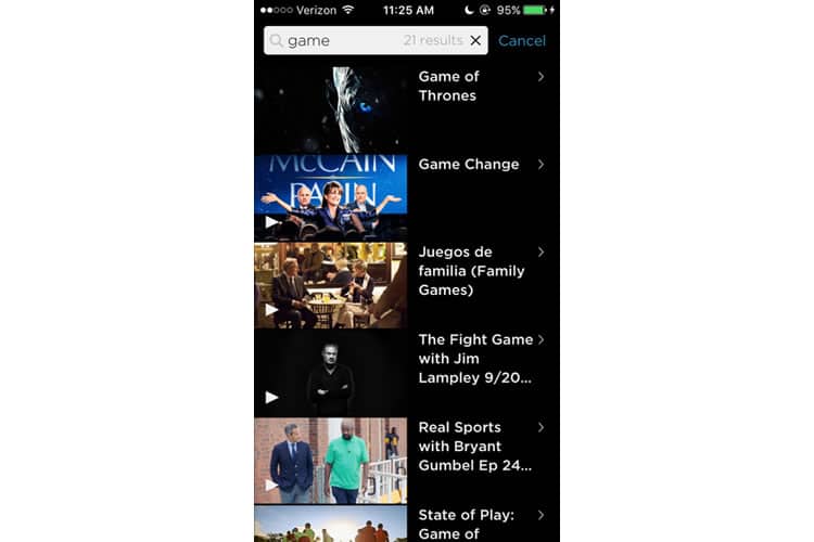
I did not have high hopes for the HBO GO app’s search capabilities, but after a few informal tests, I actually found the UX to be solid. It yields relevant results, each with an accompanying graphic, and the number of results displayed in the search bar is a smart way to conserve space.
But we have dwelled on the home screen enough. It is time to get into the core of this application: the actual watching.
The Video Player
HBO GO’s video player looks a lot its competitors.
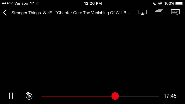

In both, we see standard UX practices for mobile video players—the play/pause button in the bottom left-hand corner, a ‘back’ option tied to the episode’s title in the upper left one – but there are also some disparities as well.
HBO includes a ‘skip ten seconds ahead’ button, which is a bit of a head-scratcher. It makes sense to have a ‘skip back’ button, when you may have missed a crucial line of dialogue or want to rewatch a scene, but I do not think most users would be skipping forward enough to warrant its own button. It would be much easier to just drag the timeline button at the bottom of the player.
Another interesting choice by HBO is its inclusion of a volume bar, seen in the upper right-hand corner. Netflix forgoes this, instead trusting the user will adjust the volume using the external buttons on their smartphone. For Netflix, this frees up space for them to place functions for casting, subtitles, and other episodes.
HBO has opted for an adjustable volume bar in-player, but it is still tied to the smartphone’s volume. So basically I am raising or lowering the sound on both of these players with my iPhone, but HBO’s is just providing extraneous feedback by making its volume bar respond accordingly.
Perhaps the most conspicuous difference between these two players is something these screengrabs cannot capture — video quality. This is the absolute most crucial function of this application, and it is also where HBO fails.
During my tests, the video player was noticeably laggy or even unable to play the video. I changed Wi-Fi networks a few times with varying results, but Netflix’s player did not run into the same issues.
The problem was only exacerbated when trying to cast to my TV at home. I use Chromecast, and while it worked seamlessly with Netflix and Amazon Video, HBO GO’s casting was exceptionally lacklustre.
Final Verdict
Most of the HBO GO app’s UX is quite good. I was quickly able to find the content I was looking for, and its interface is (for the most part) clean and uncluttered. But when it came down to its core use case, the entire reason behind the application, it fell short.
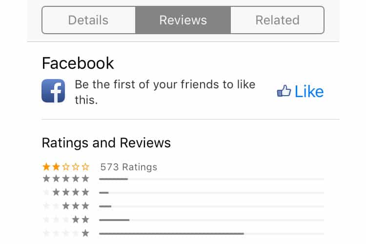
This is probably the best explanation for the application’s poor rating in the App Store. Even just a cursory glance at the reviews shows scores of other users facing the same issues I did. Casting from a mobile app is a prevalent use case, and HBO GO has not been able to deliver it.
If there is one takeaway from this, it is a reminder that user experience is inherently holistic. Is a buggy video player the fault of the UX designer? Probably not. That responsibility likely falls on the developer. But because of the poor engineering, the user experience suffers anyway.
An example like this not only illustrates the importance of user testing but also of the UX designer’s involvement post-design process. They are stewards of an app’s experience, which means following it from the very beginning all the way to deployment.
More from the UX Case Study Series
- UX Case Study: Google Maps vs. Waze Mobile Apps
- UX Case Study: Spotify Vs. Apple Music Mobile Apps
- UX Case Study: Acorns Mobile App
- UX Case Study: Lumosity Mobile App
- UX Case Study: Talkspace Mobile App
- UX Case Study: Zocdoc Mobile App
- UX Case Study: Calm Mobile App
- UX Case Study: Overcast Mobile App
- UX Case Study: SoundCloud’s Mobile App
- UX Case Study: HBO GO App ? You are currently reading this
- UX Case Study: Venmo
- UX Case Study: CNN’s Mobile App
- UX Case Study: ESPN’s Fantasy App
- UX Case Study: Duolingo
- UX Case Study: Bumble
Want to learn more?
Want to get an industry-recognized Course Certificate in UX Design, Design Thinking, UI Design, or another related design topic? Online UX courses from the Interaction Design Foundation can provide you with industry-relevant skills to advance your UX career. For example, Design Thinking, Become a UX Designer from Scratch, Conducting Usability Testing or User Research – Methods and Best Practices are some of the most popular courses. Good luck on your learning journey!
(Lead image: Depositphotos – affiliate link. All other photos in this article are screenshots taken during usage of the HBO GO app.)
