In a blogosphere full of articles honing in on single, often granular components of user experience design, Codal‘s UX Case Study aims to examine UX from a holistic perspective, panning the camera back to explore how an experience functions as a whole.
So far we have conducted UX case studies about the Duolingo, Bumble and ESPN‘s mobile apps.
Today, we are back with another entry in our case study series, this time exploring some uncharted territory for this column: the media. There are a few reasons for our topic of choice, chief of these being that investigating news apps through a UX lens offers a truly enriching experience.
It presents unique challenges to UX designers – how do you design a platform predicated on massive amounts of literally ever-changing content? It also often forces us to ask much larger questions. How do people read the news? How do humans best process information?
These are questions you might not find in the designer job description, but they are nevertheless key for UXers crafting news media platforms.
The vessel we have chosen for exploring this UX genre is CNN, one of the most popular news organisations in the world. The network boasts over ten million downloads across all devices, and with its current standing at the forefront of the American sociopolitical climate, it is about as influential as apps get, making it the perfect candidate for a UX case study.
Onboarding
First, a quick disclaimer: CNN employs a constellation-based app strategy, meaning they offer an entire suite of mobile platforms. For this case study, we are investigating CNN’s primary news app for the iOS.
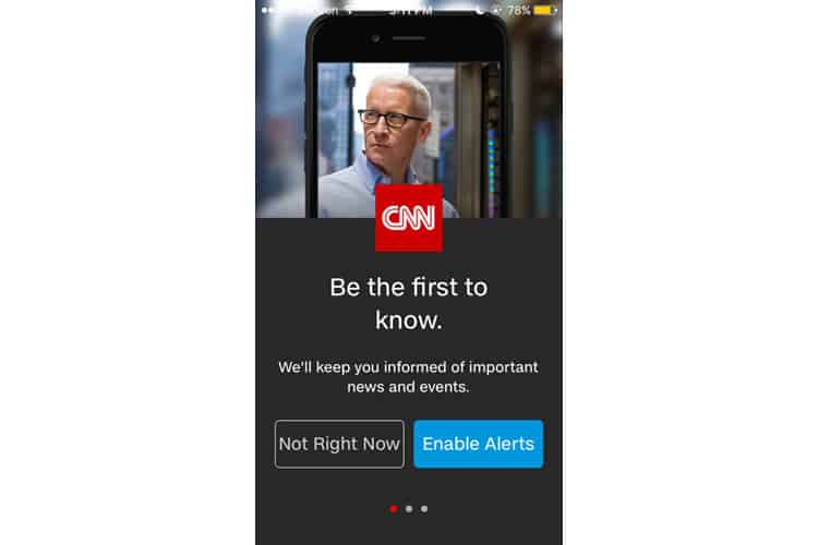
Upon opening the app, we are greeted by a brooding Anderson Cooper and a request to enable alerts. I typically baulk at user experiences that begin with a notification request without first demonstrating value, but we know what CNN is offering, and it makes sense for a breaking news channel to start by ensuring the user is getting their info hot off the newswire.
The row of dots below signifies I will have to interact with two more screens before I get into the app’s screen. This is not terrible as far as onboarding goes, and is a great sign I will not be asked to undergo a tiresome account creation process full of tedious form-filling. I tap “Not Right Now” and continue to the second screen.
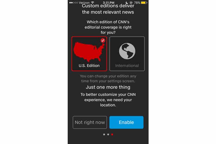
Or the third screen? The final dot is highlighted, meaning I am on the last step of onboarding. I skipped the second screen entirely, perhaps because I opted not to receive alerts. That is a shame because this screen could use some more real estate for all the information it has.
Look how cramped everything is. The top line of text is virtually touching my iPhone’s upper-status bar. The content itself makes sense, as I would like to optimise the app’s content to focus on American news, and I am open to sharing my location, but shoving it all into one cluttered screen is not advisable here.
To be fair, I am viewing this on an iPhone 5 SE, and perhaps the page is optimised for mobile devices with larger screens. Still, there is a reason we call it mobile-responsive design – it should be able to adapt to my (admittedly outdated) phone.
I make my selections and conclude CNN’s mercifully brief onboarding process.
Home Screen
CNN’s home screen is dominated by the accompanying image to the current news cycle’s top headline, in this case, a satellite image of Hurricane Maria. Beneath are two secondary headlines, the icons denoting one as a video, the other a good old fashioned written article.
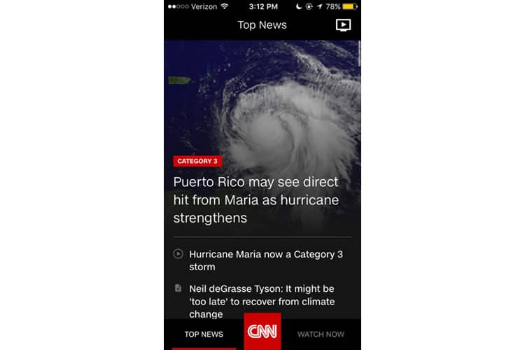
At first, this does not look indicative of a feed-style interface, but I have to imagine CNN is covering more than the hurricane, so I try scrolling and, sure enough, I am rewarded with more stories.
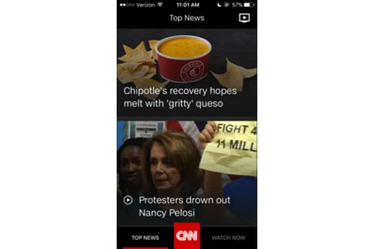
CNN’s app relies heavily on graphics to capture the user’s attention, dedicating an overwhelming majority of the screen’s real estate to high-resolution photographs with an overlaying headline.
This strategy is predicated on the assertion that mobile users have short attention spans. CNN believes they will engage more when offered two stories at a time, rather than skimming a front page packed with headlines. It is a sound plan but still has its drawbacks.
One peculiar observation: when I scroll through CNN’s home feed, it almost feels like I am using a dating app. I see one to two stories at a time, and if I am not interested, I scroll down to see two more. The stories even vaguely resemble a Tinder or Bumble card: pretty photo, concise copy. It is just a relevant graphic and a headline, instead of a selfie and a name.
Elsewhere on the home screen, we have an icon at the top right, which appears to be where I can live-stream CNN. The app has a navbar below with three options: Top News (underlined in red to show where I currently am), the CNN logo (which I am pretty sure I can press), and Watch Now.
Navigation Bar
First, a tip of the hat to CNN for creating a mobile navigation bar that is not jam-packed with options, or littered with icons of indiscernible meaning. We have three simple choices, two of them clearly-labelled so the user cannot possibly mistake their function.
The other option is the CNN logo, which I tap to reveal standard newspaper sections – the same choices you might see on a media website’s navigation bar. Props to the UX designer here for not trying to stuff all of these on a mobile navigation bar – it would be a nightmare.
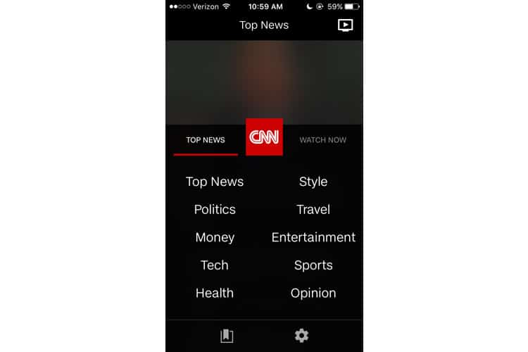
I also find this pop-up overlay to be well-designed. The choices are clearly-labelled, spaced appropriately, and written in a clean and simplistic font. The other options are denoted with standard iconography – a gear for the settings, and a bookmark for stories you wish to save.
Finally, I tap the third option “Watch Now”. Its inclusion in the navbar is a bit redundant as it takes me to the same place as the TV play icon on the top right of the home screen.
Watch Now
As expected, the “Watch Now” screen primarily features a free ten-minute preview of CNN’s Livestream. If I scroll down, the screen shrinks, and I am offered rows of different videos that I can horizontally scroll through.
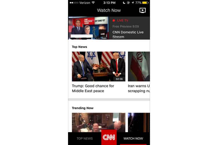
While the horizontal scroll is almost always ill-advised in desktop applications (testing finds users are consistently adverse to it), it can be useful in a mobile interface. CNN’s app has proved itself apt at conserving screen real estate, especially when they are offering such an enormous amount of content.
But while the scrolling mechanism itself is permissible, I am not a fan of its organisation. It is compartmentalised into categories such as “Just For Laughs” and “Trending”, but does not offer much customisation. I tried filtering the video content by category with the CNN logo overlay, but this only returned me to the Top News module.
Finally, as a stray observation, the Watch Now page still has the icon in the top right corner of the screen. As far as I can tell, tapping it does absolutely nothing. I am not sure why it is here.
Final Verdict
I would argue CNN roughly succeeds in translating a massive amount of content to mobile, without overwhelming the user with jam-packed screens. Its news feed design strategy caters to mobile users by only displaying one or two stories at a time but reinforcing their appeal with a high-resolution visual.
CNN’s primary nav bar is a definitive success, a rare achievement in mobile apps. Too often we see bars cluttered with unrecognisable icons. The ‘Watch Now’ module, however, is too busy, difficult to navigate, and impossible to filter.
For me, these flaws are not dealbreakers. All of them are relatively simple fixes for any UX design agency. And while CNN’s content is too video-based for my liking (I prefer to read my news), I feel better knowing Americans are getting their news on a platform that is not rip-your-hair-out frustrating.
More from the UX Case Study Series
- UX Case Study: Google Maps vs. Waze Mobile Apps
- UX Case Study: Spotify Vs. Apple Music Mobile Apps
- UX Case Study: Acorns Mobile App
- UX Case Study: Lumosity Mobile App
- UX Case Study: Talkspace Mobile App
- UX Case Study: Zocdoc Mobile App
- UX Case Study: Calm Mobile App
- UX Case Study: Overcast Mobile App
- UX Case Study: SoundCloud’s Mobile App
- UX Case Study: HBO GO App
- UX Case Study: Venmo
- UX Case Study: CNN’s Mobile App ? You are currently reading this
- UX Case Study: ESPN’s Fantasy App
- UX Case Study: Duolingo
- UX Case Study: Bumble
Want to learn more?
Want to get an industry-recognized Course Certificate in UX Design, Design Thinking, UI Design, or another related design topic? Online UX courses from the Interaction Design Foundation can provide you with industry-relevant skills to advance your UX career. For example, Design Thinking, Become a UX Designer from Scratch, Conducting Usability Testing or User Research – Methods and Best Practices are some of the most popular courses. Good luck on your learning journey!
(Lead image: Depositphotos – affiliate link. All other photos in this article are screenshots taken during usage of CNN’s app.)
