Did you know that it only takes 50 milliseconds for a web visitor to form an opinion about your business based on your website design?
Did you also know that once a web visitor forms an opinion about your site, they take approximately 15 seconds to decide whether to stay or leave?
Then add to that people’s shortening attention span online, it becomes increasingly challenging to keep web visitors engaged.
Even though holding people’s attention to reduce bounce rates seems like a daunting task, some companies are doing it quite well by embracing some website trends that increase conversions and engagement.
So, what exactly are these companies doing, and how can you “steal it” and use it on your website?
Today, we’ll examine some of the most stunning and successful websites to discover how they’ve designed their websites for maximum engagement and conversions and how you can do it too.
Ready? Let’s dive in.
1. Mailchimp
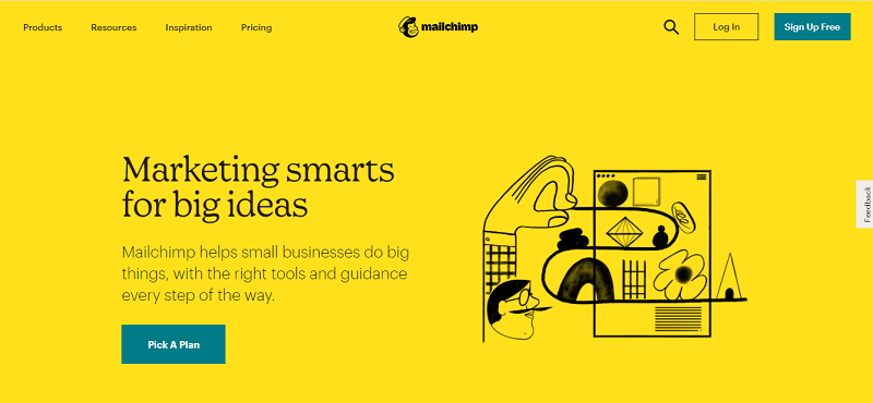
Mailchimp is an all-in-one integrated marketing company best known for its email marketing services. The company has been in the business for close to 20 years now, and here’s what they’re doing right.
Outstanding use of bold colors
As soon as you land on the website, a bright yellow color is what you’ll see. The color contrasts nicely with the black typography making the text stand out and catch your attention.
The background also helps the most important CTAs to stand out –- “Pick a Plan”, which directs you to Mailchimp’s pricing page, and “Sign Up”.
But that’s not all this vivid yellow color does on the website.
When you go past the homepage, Mailchimp uses this yellow color for the rest of their CTAs throughout the website. The now yellow CTA buttons contrast nicely with the white background of the rest of the website, making them stand out even more and grab your attention.
Excellent use of whitespace
Mailchimp places their most important content front and center of their homepage, with a lot of whitespace surrounding it. This way, web visitors will only focus on this content.
What’s more, Mailchimp uses a simple illustration to emphasise the value proposition they offer customers.
Impeccable use of typography
The company uses bold and large letters to draw your attention to what’s essential. The bold letters also help quickly deliver the most important points, for example, the benefits of using their services.
2. Tesla
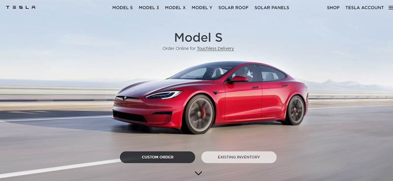
Tesla is an innovative, environmentally-friendly vehicle manufacturing company. The company focuses on reducing the pollution caused by using fossil fuels in cars by manufacturing and selling fully electric cars.
What can you learn from Tesla’s website layout?
Have a short and straightforward buyer’s journey
When you land on Tesla’s website, all you’ll see are the car options you can buy. There are no distractions from what you should do when you get to the website–-buying an electric car.
Moreover, Tesla doesn’t include marketing content like car descriptions or reviews on their site, which web visitors would take too much time on. Instead, they have one sentence copies that ensure web visitors remain super focused on buying the cars.
So, all this helps reduce the buyer’s journey because all you have to do is find the car you want, click on the “custom order” button, make your order and wait for the car to be delivered.
A website layout like Tesla’s is designed to make it as painless as possible for customers to buy what they need, which helps drive up sales.
Be product-focused
As stated before, the first thing you’ll notice the moment you land on the site is all the products they offer.
But that’s not the best part.
The best part is how vivid the product images are, which grab your attention immediately. What’s more, the photo background contrasts well with the product colors making the products stand out more.
Another trick that Tesla uses to keep you focused on their products is not having any other visuals that distract you. So, all you do is focus on the product you want and buy it.
Be user-interactive
Once you click on the “Custom Order” button, you’ll be directed to a page where you get to personalize both the exterior and interior of your car.
From the type of wheels you want to the color of the interior, you’ll interact closely with the site to customize the car to your liking.
3. Amazon
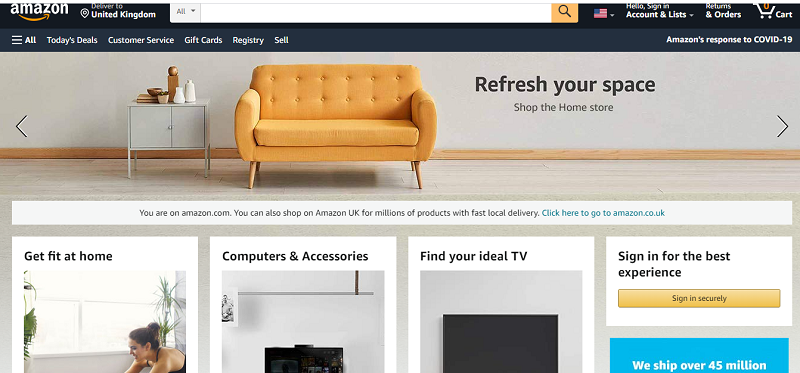
Amazon is an e-commerce giant that has revolutionized the online shopping experience. The company supports over a million small businesses with over 100 million monthly users worldwide.
Here’s why so many people shop on Amazon from around the world.
You can easily navigate the website
Having so many items to sell, you may think that Amazon’s website may be cluttered, but that’s not the case.
The website has an open layout with a grid structure that helps keep everything organized. Amazon also uses a card layout to categorize products with a CTA directing you to a page with more products.
Amazon’s website design is so streamlined that you can’t get lost trying to find what you want, making it easier for a web visitor to convert to a buying customer.
Excellent use of sharp imagery
Since the website’s goal is to have you buy the products they’re marketing on the site, Amazon provides vivid photos of each product. This way, you can quickly assess if the product is exactly what you need.
Amazon also uses color contrasts–-with images having bright colors–-to make images pop more against their background to grab the web visitors attention.
The more time a web visitor spends on the site looking at the photos, the higher the chances of converting him or her into a paying customer hence reducing bounce rates.
Furthermore, the CTAs are strategically placed within the cards holding each product, making it easier for customers to make a purchase.
Offers a straightforward buyer journey
It takes just a few clicks to move from product viewing to making an order.
The site makes it easy to find a product, examine it, and decide whether to buy it or not because products are organized in an easy-to-access way and are clearly visible to the website visitor.
Having a short and straightforward journey makes it easier for customers to buy from the site, which boosts sales and increases profits.
Makes the buying experience personalized
When you sign in, Amazon will request you to share some information, which forms the basis of personalizing your user experience.
Now, Amazon uses AI to learn your shopping and browsing patterns and then recommends products based on these patterns, making your shopping experience simpler.
So, it comes as no surprise when a customer ends up buying more than one item from the site because of the personalized recommendations the platform makes.
Ultimately, the faster it is for visitors to find what they need and even get personal recommendations, the easier it is to convert them into paying customers.
4. Netflix
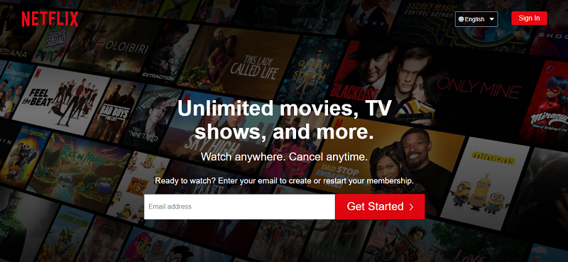
Netflix is a company that revolutionized movie watching by converting any household into a movie theatre. The company has won over almost everyone with over 200 million paying subscribers worldwide.
It’s a pretty big deal and here’s why so many people love using Netflix aside from the movies.
Great use of the dark mode
Netflix’s website offers a dark background that is easy on the eyes and makes it easier for you to watch continuously without irritating your eyes.
What’s more, the dark mode helps you save battery life if you’re watching on your phone or other OLED screens.
Excellent use of whitespace
The value proposition and CTA are front and center to draw your attention to what you need to do on the website–-find a movie to watch.
Other than the company name that’s tucked neatly on the left corner of the site, the value proposition and CTA is the only content on the homepage. So, it keeps the website visitor laser-focused.
Another neat trick the company uses is having the homepage background as a photo collage of the movies you’ll find on the site.
Interestingly, rather than being distracting, it acts as a teaser for the web visitors to feel compelled to sign up to see more of what the company offers.
Easy to navigate
Netflix uses a minimalist design approach with only two menu buttons on the homepage navigation menu “Language” and “Sign In”. This makes a website visitor stay focused on the attention-grabbing value proposition directing them to create an account and start watching.
Moreover, scrolling past the homepage, you’ll find the rest of the content organized in a grid structure to help the customer quickly skim through to find all the information they need to pay the subscription fee.
Uses little to no copy
Netflix takes minimalism to a whole new level using just one sentence content to explain what you’ll get for paying for the membership.
Now, this helps a website visitor avoid distraction and only concentrate on the facts the platform provides, which points to ultimately signing up for membership.
Excellent use of typography
The platform uses bold and large letters to highlight the most important content and help the user quickly scan through the content to make a buying decision.
The text contrasts nicely with the dark background drawing your attention to it.
Impeccable use of vivid imagery
Netflix uses short, crystal clear videos and animations to help the user understand clearly what they’ll get once they sign up.
Now, these videos and animations have a sharp contrast to the background, which helps to keep you focused on them.
5. Fitbit
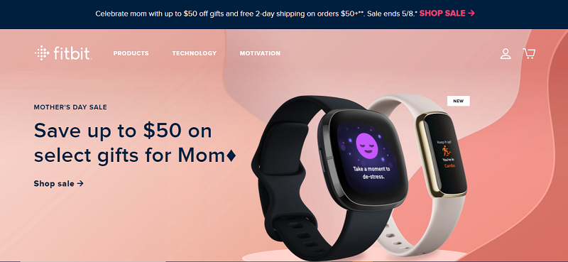
Fitbit is a fitness company that has been selling trackers and watches for years to help their customers take control of their health. The company boasts of close to 30 million active users.
Here’s how Fitbit’s website keeps customers focused on buying the products.
Has a minimalist design
Fitbit has only three menu buttons on the homepage. Each menu button is a product category representing what Fitbit offers.
Hovering over each menu button gives you a list of other pages of interest you can explore.
You should also place your products into categories to make your website look neat and organized.
But most importantly, help web visitors find your products faster and navigate easily throughout the website.
Uses sharp images
Fitbit uses sharp and vivid images of its products throughout the website to draw attention to them.
The images have a sharp contrast against the background, making them stand out more.
Fitbit includes a photo of a celebrity to get web visitors more interested in their products and increase their credibility.
Excellent CTA positioning
With every photo comes a CTA button that’s clearly highlighted and which you can’t miss.
The CTA buttons are obvious because they include an arrow and have a substantial amount of whitespace surrounding them.
Outstanding use of bold colors
Fitbit uses various bold colors throughout the website to highlight the most important elements.
The company achieves this by combining different colors to create a contrast that makes products and content sharper and eye-catching.
Great use of typography
Fitbit uses different sizes of text to draw your attention to what’s important: their products, services and offers.
They use large and bold text to help web visitors quickly take note of the information they provide to make a buying decision.
6. Rocka
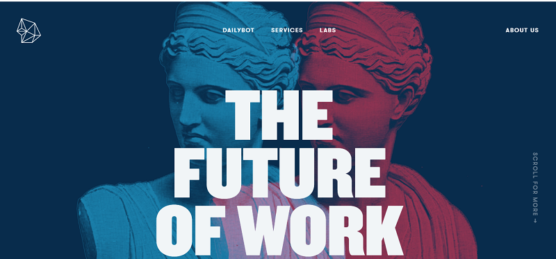
Rocka is a venture builder focusing on tech startups. The company has, for years, been creating tech companies from the ground up by turning ideas into successful products.
Here’s what you can learn from Rocka.
Excellent use of attention-grabbing visuals
When you land on Rocka’s website, your attention will be drawn to two 3D statues on the homepage. The statues stand out but don’t distract you from the site.
In fact, they’re placed right at the center of the website, along with the content. So, the statues don’t just draw attention to themselves but the content too.
Aside from the two statues on the homepage, Rocka uses more Greek mythology 3D statues throughout their website.
What’s more, the site uses animated geometrical shapes in the background to add a special touch to the overall website.
Such eye-catching visuals are memorable and captivating and keep web visitors fully engaged.
Easy navigation
The menu bar has only four menu buttons which makes navigation super simple and fast. Web visitors on this website won’t get lost as they try to navigate through the site to get what they’re looking for.
The few menu buttons help portray a minimalist design that keeps customers focused on what’s important.
Outstanding use of bold typography
When you land on the homepage, you’ll see their value proposition “The future of work” in big, block letters.
Rocka also uses larger text throughout the website to draw attention to what’s more important: their products and services.
Excellent color combinations
Rocka uses five solid colors for the background, which blend well together.
The colors help make each page’s content stand out without being distracting like on the homepage, the white text contrasts nicely with the colored background making it stand out more.
7. Asana
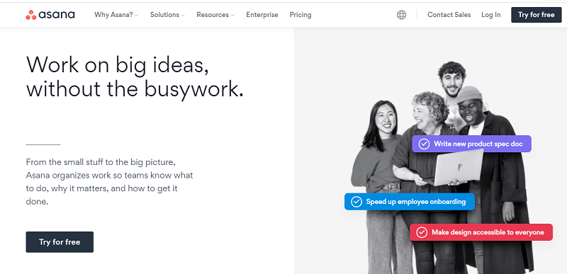
Asana is a project management tool that helps you manage one or several teams at once. The best part of using Asana is how easy it is to collaborate with team members using the built-in messaging tool.
Here’s what makes Asana’s website exceptional.
Excellent use of whitespace
Asana uses whitespace to draw attention to what’s essential.
When you land on the homepage, you’ll see all the whitespace that surrounds the value proposition and CTA to make them stand out more.
Outstanding positioning of the value proposition
The moment you land on Asana’s homepage, your attention will be drawn to the value proposition at the top, left corner written in big, bold letters.
But the best part about the value proposition is that Asana makes a bold promise to the visitor “work on big ideas, without the busy work” that’s intriguing and makes the visitors want to know more.
There’s also a CTA button right after the bold promise, which helps visitors focus on what they came to do on the site–-sign up to get project management services.
Excellent combination of visuals and short copy
Asana uses just a few words to explain their services and the benefits you get from using the platform, meaning you get the most important information right off the bat.
What’s more, the site uses short copy and sharp visuals to lead prospects through the sales funnel.
Emphasis on Trustworthiness
Asana cleverly includes positive reviews from happy customers on their homepage. You should note that the site focuses on the reviews from customers of known brands to help boost their credibility with their leads.
People will always buy from people they can trust. So, having people in authority from renowned brands endorse a platform goes a long way in attracting more prospects and keeping them engaged long enough to convert to paying customers.
Make your website stand out with a modern design
Your potential customers can tell a lot about your company just by looking at your website. Therefore, creating a website that stands out while giving your prospects exactly what they want is the best way to see more conversions and a higher engagement rate.
So, what can make your website stand out now?
- Using whitespace to make your prospects focus on what’s important.
- Having a minimalist design to keep visitors engaged without the distraction of too many options.
- Having bold colors for the visual elements and background to draw attention to the information you want your visitors to see.
- Finally, if you sell products, you can make your site more product-centric to keep your prospects engaged and reduce their buyer’s journey.
So, pick the elements you like and create or improve your website’s design to attract more prospects and keep them engaged enough to convert to paying customers.
Where To Learn More
To learn more on how to design better websites and interfaces, consider the Interaction Design Foundation’s online courses on Web Design for Usability and UI Design Patterns for Successful Software.
Apart from courses, webinars and bootcamps, the IxDF is also home to the biggest and most authoritative library of open-source UX Design Resources. Check out the free UX Literature here.
Good luck on your learning journey!
