Imagine walking into the most beautiful building in the world—mosaic on every square inch of the place, stained-glass—the whole shebang.
You walk into the first door, it’s a push one. Still marvelling at the beauty around you, you reach out to the next door—and smack face-first into it. Ah, so this one was a pull.
No matter how gorgeous that place might be—that door is has a design flaw. In UI design, to be more precise. While the architect was focused on the looks, he overlooked usability.
Why You Should Double Down on UI Design
We deal with a lot more user interfaces on a daily basis than we are probably aware of. No matter how handy an app is, or how necessary a website is—we’re nowhere without UI. Unless it’s the website where you have to file your taxes, you’ll just leave whenever it’s not working out.
UI is important for all kinds of businesses. 88% of online shoppers won’t return to a website after a bad user experience. That’s a lot of sales you’ll miss out on. On the flip side, investing in frictionless UX design could raise customer conversion rates to 400%.

How can you recognize good UI design?
Good UI design is practically invisible. Users shouldn’t even be noticing it, they should be completely focussed on whatever task they’re performing. That doesn’t mean it is purely practical. Good UI design is enjoyable in its own way and when done right, also contributes to your brand values, because it reinforces trust.
UI design is all about the interface and everything you see in it (and also what you don’t see yet). There are seven dialogue principles that you should follow, on which we’ve based the practical tips coming up below:
- Suitability for the task: does it help the user complete the task efficiently?
- Self-descriptiveness: does the user understand what a certain action will do?
- Controllability: can the user initiate and control the pace of her actions?
- Conformity with user expectations: does the action work like the user would’ve expected?
- Error tolerance: can the user make mistakes in the process without any real consequences?
- Suitability for individualization: can the interface be altered to match the needs or skill level of a user?
- Suitability for learning: does the interface guide the user so that she learns to understand it better?
Follow These Rules to Create a User Interface That People Will Love
You might be able to use the golden ratio in regular design, but when it comes to user interfaces, there’s no template to follow. Nevertheless, there are some ‘rules’ to stick to, to make sure your UI design is at the very least pleasant—and with enough testing, even perfect.
1. Make Everything People Need Instantly Accessible
Whether you’re on a website or in an app, sometimes you simply need help. If your copy speaks about something, like a FAQ page, downloadable document, a description—anything—make sure it’s readily available.

You can do this using links in your copy, with buttons on the page, tabs—however you see fit. But do make sure that whatever is mentioned or useful in a certain screen, can be opened with just one click. If people have to have multiple tabs open or go back and forth one too many times, they’ll just leave.
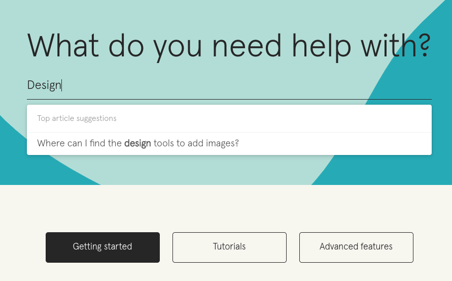
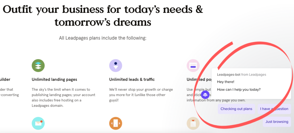
This also goes for the help button. Some websites have turned hiding their chat function into a real art form, in the hope to save time. But what it really does is drive people away. Make sure everyone can find customer service or support wherever they are in your design.

2. Be Consistent
We began this article with the push and pull door issue. That’s, simply put, an issue of inconsistency. Details like that can be easily overlooked, especially because it still ‘’works’’—it could just work better.
In UI design, consistency is really key. People have to be able to get used to how something works, and not have to go through a learning princess every time a new page opens.
That means that things like your menu buttons should be in the same spot at all times. But it also means using the same fonts and designs across your website or app. A sudden change can confuse people and throw them off.

What you should use is the Principle of Least Astonishment. That’s right: take out the element of surprise and leave it for Christmas and birthdays.
The principle of least astonishment applies to user interface and software design. If something in your design has people going ‘oh, I didn’t think that would work’, or surprises them in any other way—we’re sorry, but it will have to be redesigned.
In design, systems, and buttons should behave in a way that people expect them to. That means you shouldn’t just be consistent within your own design, but also look at other UIs people use frequently and follow those rules. For instance, the search button is usually on the right, so that’s where people will look for it.
Double-tapping should have the same effect everywhere. Apple might be the last one who completely broke with consistency and reversed the way we scroll.
3. Give Away Spoilers

Think about this: what if Spotify didn’t show you how long was left on your song? If you couldn’t move your mouse to see how much longer that Tarantino movie is on Netflix? If you simply push buttons to change the volume but never see a number or bar?
Design is the only place where it’s okay to give spoilers and tell your users what’s going to happen next. CTA’s are key. They should be creative and persuasive, but also informative.
Acknowledge every little action. If someone hovers their mouse over an arrow, it’s okay to show ‘Go to next page’. If someone presses a button, change its color, so they know they did something. Work with loading icons. Even better, get creative with them.
When someone clicks a button or downloads a document, let them know how long it will take for the action to be completed—especially if it takes more than two seconds.
4. Give Your Users Control and Freedom in Equal Measure
Your users should have complete control of their actions in a design. That’s why most UI designers will tell you they’re not a fan of automatic sliders. Who are you to decide how fast your users should be able to read?
Another way to give users more control is by allowing them to make mistakes.
This means you should give them the opportunity to reverse clicks, go back and not get stuck in a long process immediately. It also means that when they do choose to go back, you don’t drop them off at the homepage or top of the page. You’ll drop them off exactly where they left.
This will give users more confidence while using your design and allows them to play around and discover. Moreover, it avoids irritation.
5. Don’t Get Too Creative
Sure, go crazy when it comes to design. But not when it comes to UI design (and they are connected, yes).
Have you heard of Jakob’s Law of Internet User Experience? In short, this law describes how people spend most of their time on other websites than yours. They will use your website with the same set of eyes, hands, brain, and device than they did for the others.
That means they hold your website to similar standards and have certain expectations. They’ll be familiar with how certain things work and will try that on your website or app, too. Make sure that it works.
You don’t have to reinvent the wheel when it comes to design. Starting with a blank page can be liberating, but we’d rather recommend you to take existing, popular designs and see how you can make those even better. This will speed up the adoption process drastically.
6. Aim for Recognition Instead of Recall
Here’s a simple rule: always assume your users have terrible memories.
Expecting people to recall information or interactions they had on a previous page is a costly mistake in UI design. You should lead the way, even if that means reminding them what left and right is again.
Don’t make your users’ memory work overtime by having them memorize what a button did again or what symbols mean. Go for recognition. A play button is a triangle—don’t turn it into a P all of a sudden, or a guitar.
7. Find What Works for You
The most important rule of creating a great UI design is to build it for your users. That means testing it on them, instead of guessing what they want. Nowadays, it is easier than ever to test with real users, even remotely, using tools such as Maze.
Apps like Facebook and Instagram are designed differently than Etsy or a web shop that needs to convert. Simply copying an interface and hoping for the best won’t work.
For instance, Instagram’s infinite scrolling is meant to make users consume content. But if you want to sell something, you will want to use pagination to guide actions on each page.
Design Is Not Just about Looks
Great designs are not just easy on the eyes, but easy to use. Every colour you pick, every font you take, and every button you place somehow affect the interface and therefore experience of your users. Be mindful about this, and don’t be afraid to let others test your designs to find the flaws you can’t see anymore.
Where to Learn More
To level-up you UI design skills, check out these courses:
If you’re just getting started in UX design, take this foundation course: User Experience: The Beginner’s Guide, or explore the free, open-source library of UX literature here.
To kick-start your UX journey, another great option is to explore bootcamps that offer access to instructors and 1:1 mentors. Our recommendations are the ones offered by the Interaction Design Foundation, which are fully online, part-time and offer specializations. If you’d like to compare the top bootcamps, here’s a handy overview at UX Planet.
Happy exploring!
