Apple’s trademarked saying famously states that, “There’s an app for that”. For the sake of making users’ lives more comfortable, I could not agree more.
Picture this: You are hungry, your refrigerator is out of groceries, and you want food delivered to your door. In this day and age, what would you do? You would probably follow Apple’s mantra and turn to a food delivery application.
You are not the only one. Food delivery has been on the rise over the past few years, with apps flooding the App Store – Uber Eats, GrubHub, DoorDash, Postmates, and more. In 2015, Statista reported that consumer spending on food delivery reached 30 billion. Also, as more customers rely on these delivery apps, this number continues to increase steadily.
As a UX writer, I hit the App Store and downloaded some food delivery apps to discern the good UX from the bad. From my downloading and tinkering, here are four UX necessities that all food delivery apps need to succeed in this crowded market space.
1. A Simple Onboarding Process
From the onset of downloading these delivery apps, I expected that the onboarding process would be quick. I figured it would be standard protocol: I would create a profile and enter my payment information at the end. After all, these apps should not have a complicated onboarding process – it is food delivery, not the Fintech industry.
That is the balance that you need to find with your app. How are you going to separate your onboarding steps, so it is not overwhelming for your user? Most food delivery apps divide the steps into the creation of a profile, the selection of a food item, and then the entering of payment information at the end before the delivery is on its merry way.
If delivery apps are advertising quick and easy service, it should not take me more than a minute or two to create an account and activate it.
2. Restaurant And Menu Searching Ease
When logging into the many food delivery apps that I downloaded, most did a solid job of presenting restaurants and their corresponding menus.
Almost all of the apps provided me with an easy search bar, to look for restaurants that were in my vicinity. Then, after selecting my desired restaurant, I could search through their menu. While some apps categorised the menu items, others just had them listed. I thought the categorisation provided better UX for the customers but to each their own. This categorisation slims down a large menu into easy-to-find classifications that the user can navigate seamlessly.
This should be the most crucial aspect of a food delivery app. Since a food delivery app is taking the restaurant experience and mobilising it, it needs to provide a browsing experience that is streamlined and clear. Just like how one would browse a menu in a restaurant, all the menu items should be showcased in front of a user.

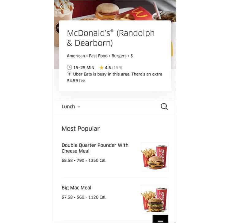
However, while most food apps did a solid job of this aspect of UX, I do wish that there were more description and photos of the menu items. For example, DoorDash and GrubHub did not provide me with a picture of the menu item, while Uber Eats did.
If a food delivery wants the item to look good enough to eat, the UX of the food delivery app should also be incorporating more visuals.
3. Clear Listing Of Delivery Times And Costs
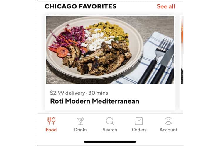
Aside from menu browsing, as a ‘delivery’ app, their delivery times and costs need to be clear. For these app’s UX, these delivery times should be listed next to the restaurants and should fluctuate based on how long it would take for the user to receive their order. That way, users can choose a restaurant accordingly, based on their time restrictions and schedules.
For example, DoorDash did a great job of showing delivery times on their app. As seen below, I can clearly tell how long this item would take to get to me. Easy, peasy.

DoorDash also presents their delivery costs well. Close to specific menu items, they advertise their cheap delivery. For items that have this reduced delivery charge, there’s a “free over $15” for users to see.
For food delivery apps, that is another crucial UX aspect that must be included. Users should be able to see how much delivery would cost clearly. Any app that hides its delivery charges until the end has poor UX. Transparent pricing is pivotal for good UX and makes the selection process more comfortable for the app’s users.
4. Rating Systems Incorporated
If a user were not using a food delivery app and were going to an in-person restaurant, most would check reviews before going to the establishment. A food delivery app should be no different.
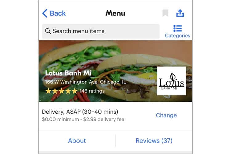
While providing a seamless food delivery experience, these apps should have a transparent and easily viewable rating system. Delivery apps, like DoorDash, GrubHub, and Uber Eats, use stars to translate user opinions of a restaurant.
Varying in where they place these stars, some have them next to a restaurant when scrolling, while others have the stars only visible when a user clicks on a particular restaurant. Either way, the rating system is easily found.
For the best UX experience, the rating system should be scaled in a universally comprehensive manner. Stars, like the example above, are easy to understand when translating a restaurant’s ranking.
However, one area in UX that I noticed these apps lacking would be the lack of restaurant reviews. Aside from the star rating system, some did not have an area for user commentary. To make the food delivery process more painless for the user, they should have the opportunity to see other user comments on menu items.

The incorporation of these two app review systems would make the user more informed on the menu items and make their selection process a breeze.
Bon Appétit
With all of these food delivery apps, there can be one major takeaway: making the process the easiest for any user. No matter the experience level of the user or the tech knowledge, the app’s purpose should be accomplished with ease.
These UX necessities can be applied to any app, website, or any other medium that focuses on providing the user with a service. So, basically, everything and anything. Your medium should be transparent, informative, and streamlined.
That is UX advice ‘delivered’ right to you. Cheesy delivery app puns aside, these UX tips will allow you to enhance the experience you provide to your user, whether your app is food-oriented or not.
Want to learn more?
Want to get an industry-recognized Course Certificate in UX Writing, UX Design, Design Thinking, UI Design, or another related design topic? Online UX courses from the Interaction Design Foundation can provide you with industry-relevant skills to advance your UX career. For example, Design Thinking, Become a UX Designer from Scratch, Conducting Usability Testing or User Research – Methods and Best Practices are some of the most popular courses. Good luck on your learning journey!
(Lead image: Depositphotos)
