When we talk about user experience and your website, it is easy to get caught up in the site’s design and navigation options. While that is important, the words you place on the page are equally essential to create a great user experience.
Although design and copywriting seem like two different fields, they have many things in common. Not only do they have to work together, but they both aim to make a customer respond in a particular way, usually to take some sort of action.
Copywriting is the type of writing that is primarily used for advertising and marketing. You can use copywriting techniques on your site’s home page and landing pages, and you might even use these methods when writing blog posts (although keep in mind that blogging in general falls in a whole different category than copywriting).
Once your site’s layout and design is where you want it to be, it is time to tweak your copy for the best user experience. Start by following the tips below.
1. Identify Your Ideal User
This first tip does not start with putting words on the page. It starts before you have written a single word and it is important because it will guide you to know what to write.
Martin Stellar discusses this step in his article on UXMatters.com. He says:
The most successful copywriters spend days on research, trying to figure out who the ideal customer is. Then they create a profile of that ideal customer that is as detailed as possible — age, income, type of breakfast, number of unmatched socks, average time behind a PC, number of kids, flavor of toothpaste. They want to know everything
And guess what? It results in copy that is completely relevant to your website visitors.
This is a tough step to understand at first because it is likely that there are many different types of users visiting your website. You might wonder how your copy can resonate with all of them when you are only focusing on one user.
While this is a good point, Stellar points out that there is only one ideal user, “the one who completes the task that you want him (her) to complete.” If you speak to just one person, you end up telling a concise story that will speak to others as well.
So decide who you really want to talk to. Give this person a fictional name, job, family and picture him/her when writing your copy. In other words, create a persona that represents your user. Don’t try to please everyone, because when you do, you end up pleasing no one.
2. Know at which Stage they are in the Process
One big part of knowing your ideal user is understanding where they are in the process when it comes to purchasing your product or service. For example, if you are selling a premium WordPress plugin, your users are very likely to have a WordPress site. You don’t need to waste their time by convincing them they need to sign up for WordPress in order to use your product.
You should never assume they are so far along in the buying process that they do not need an explanation of your products’ features.
Understanding your customer like this will allow you to focus on what they need to know while making it easier for you to answer questions before they have even asked them, boosting the user experience.
3. Focus on the Benefit, Not the Action
Too often when we are on the side of writing copy, we are thinking about what action we want readers to take. While we should certainly be thinking about it, that is not what your site visitors will be focusing on. It is certainly not in their primary interest to subscribe to your newsletter. They care about what benefit they will get from doing so.
For example, you might offer an eBook as an incentive to join your mailing list. You are thinking about how you want people enter their email address because that is beneficial to you. But your site visitors are thinking about the eBook they are going to get for free because it will benefit them.
The real key here is to focus on their wants and needs. So, instead of saying, “Sign Up Now,” you might say, “Get Your Free eBook Now.” See the difference?
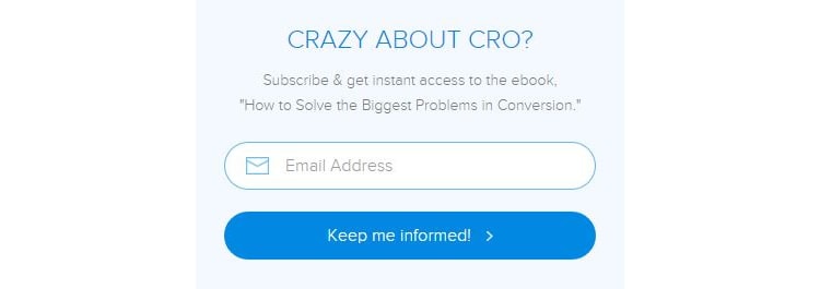
Here is an example from The Daily Egg (Crazy Egg’s blog).

Notice how they do not use the phrase “Sign Up.” Instead, they focus on what the user will get out of their newsletter: they will keep them informed on industry news. Furthermore, they highlight that subscribers receive instant access to their eBook.
This advice does not only apply to your newsletter! If you are selling a product, don’t try to sell the features. Sell the benefits of those features. Don’t sell an air purifier. Sell an allergen-free home. Don’t sell a cordless vacuum. Sell convenience.
Make the experience easy for the user by highlighting what they will get out of your site and your services and there is a good chance they will be more willing to buy from you.
4. Use Simple and Familiar Language
Remember how we talked about researching your audience and defining your ideal user? Now it is time to speak to that user. Trying to sound smart or making it seem like your services are top-of-the-line because you are using complicated words can actually hinder your efforts.
You want the user to understand what you are saying … and quickly! Users only spend 10-20 seconds on a web page, but communicating a clear message that they do not have to fight to understand will keep them there longer.
To make sure you are using the appropriate language, visualize your ideal customer again. Consider what words and phrases will resonate with them. What is important is to think about how they specifically respond to a word because of their past experiences and personality (everyone will respond differently to the same words). The trick is knowing which words will get your ideal customer to react in the way you want them to.
The language you use is different than keywords. Keywords are what tell people and search engines what your page is about. After that, you have to make them care.
For example, a university that uses phrases like “advance your career” can entice students to attend their campus, yet people are not searching for that phrase when the are seeking colleges.
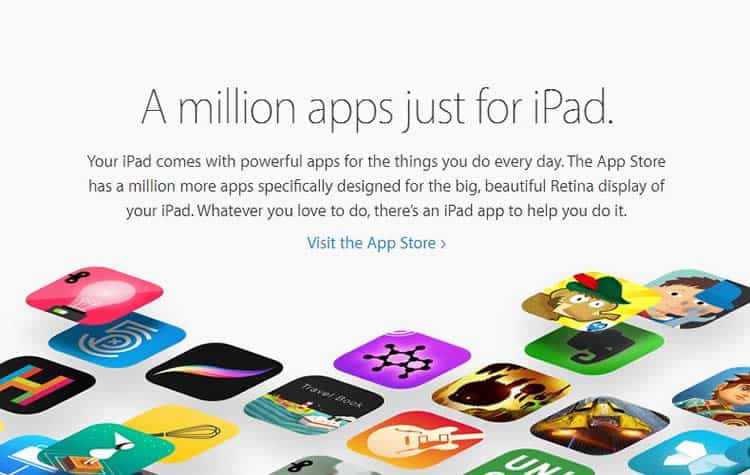
Apple is a great example of a company that uses simple language with its customers.

5. Say Only What You Need to Say
When writing website copy, it becomes all too easy to try to over explain your product or service because you are not sure if customers understand your vision. The truth is, you do not need a lot of words to communicate your message. In many cases, less is more.
This is important for the user experience because it makes it quick and easy for users to grab the most important information. Going on for paragraph upon paragraph about every detail of your product, business or service makes it tough for users to pick out what you want them to focus on. Short copy is also easy on the eyes!
But don’t let me limit you, either. I am not going to say that you can only have 300 words on your home page. It is not about how long your copy is. It is about what it says. Cut the fluff, and focus only on what your audience needs to know.
Here’s a great example from Netflix:

Their introduction is a mere seven words with a five-word call-to-action. (Notice how they focus on the benefit as mentioned in tip #3?)
If you scroll down the page, Netflix features more content, but you will notice that they do not say more than they need to in order to convince users to try their product.
If you need to include more in-depth articles on your site, create a separate blog page for them. This is another way to contribute to user experience because users expect to find your articles in blog format, leaving your site navigation uncluttered and easier to use.
6. Pay Attention to the Flow of Information
Think about how the structure of information on your site appears to the user. Does it make sense as they are navigating through your site? If they have to jump around for information, then your copy is not contributing to a positive user experience.
For example, if users click a button that says “Learn More about our Product”, they will expect to see a page detailing your product’s features, prices, customer testimonials and information on how to buy. They should not end up on a page with an image of the product but no explanation on the features.
It is not just the navigation you have to pay attention to, either. Consider what information needs to come first and how you can transition into the rest of your copy. For example, it doesn not make a whole lot of sense to mention your product pricing before customers know what the product is.
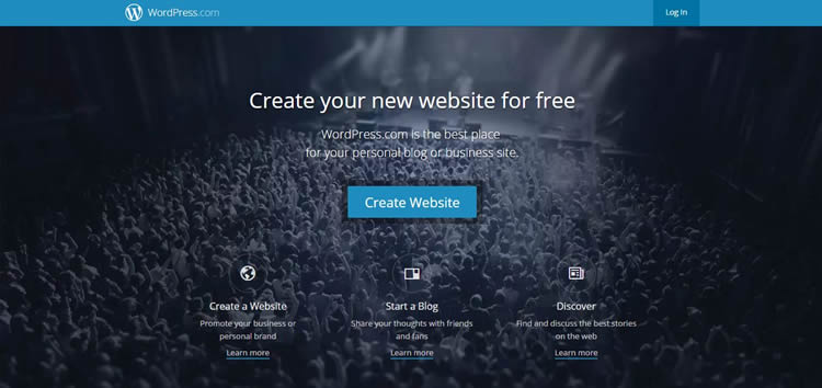
WordPress.com is a good example that shows a logical flow of information.

They start by mentioning what their product does (allows you to create a website for free), and then they go on to talk about the benefits of their product and why they are the right choice (“WordPress powers over 25% of the internet”).
Once you click on the “Create Website” button, you are guided through a logical flow by choosing what type of business you run, what theme you want for your website and what domain name you want.
Think about how users will read your content and navigate your site. At times, this may mean repeating yourself or leaving out certain information. For example, not everyone will visit your “About” page, so you might mention some of your company’s background elsewhere when it is relevant.
Not everyone will land on your home page when they first visit your site, either. They might come through a blog post or other link, so it helps to think of each page as its own free-standing page.
7. Use Subheadings for Easy Scanning
People read web pages differently than they do print. They start by scanning the page for areas of interest and then go onto scanning subheads, skimming copy, reading to get detail and then clicking to take action.
Because users scan web pages, you can make it much easier for them to get the information they need by highlighting important points with subheads.
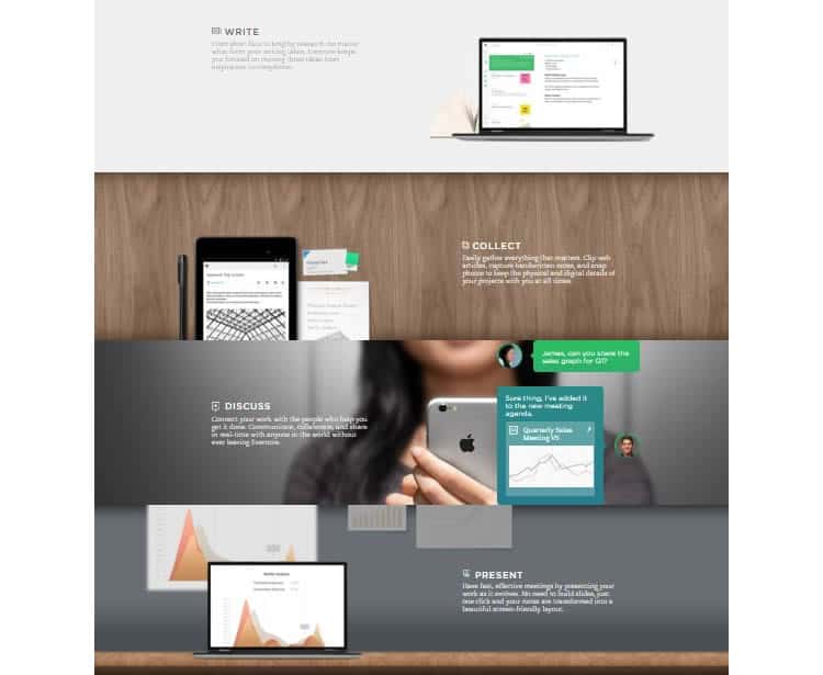
Here is an example from Evernote:

They use the subheads “write”, “collect”, “discuss” and “present” to show users what they can do with the app. This helps streamline the scanning and reading process so readers can grab the gist of the information quickly.
8. Focus on Informing and Persuading Your Audience
We can use online content to educate and entertain people, such as through blog posts. Copywriting is different. Your home page, services page and similar landing pages are there to sell your product or service. While they can teach users something and make them laugh, their main goal should be to inform and persuade users.
By focusing on informing and persuading your readers to take action, you are not wasting their time. This in turn boosts the user experience.
Let us take an example. A company selling a diet plan should not be wasting site visitors’ time by telling them that they need to lose weight and that the way to do that is through dieting. Users want to know about the results they can expect from the diet plan and what makes it different from other plans.
9. Use the Word “You”
You have probably noticed that bloggers talk directly to you by using “you” language. It pulls you into the story and makes you feel connected to the advice they are giving. You can use the same principle in copywriting to make the user feel more invested in your copy.
Need an example? Let us take the paragraph you just read and remove the “you” language:
“Bloggers tend to talk directly to the reader by using “you” language. It pulls readers into the story and makes them feel connected to the advice the blogger is giving. The same principle can be applied to copywriting to make the user more invested in the copy.”
Not as engaging, right? That’s because I am no longer talking to you.
Here is a great example from Mint.com:

In their two-sentence intro, they use the word “you” or “your” three times!
Whenever you can, don’t talk about yourself. Talk about how you can help the user and you will improve their experience on your site.
10. Write for the User
It goes without saying, but this tactic needs repeating: write for the user, not search engines.
Too often we get caught up in keyword usage and word count, thinking there is a specific formula we need to stick to in order to rank higher on search engines. When we think too hard about this, we only hurt our chances of converting site visitors.
You don’t want your keywords to sound unnatural – which is often the case when you are focusing on search engine algorithms. Writing for search engines only takes away from the user experience.
Put your users first. Search engine optimization can come secondary, but ideally, it should come naturally as you focus on the user. After all, search engines like Google are interested in delivering quality search results to real people and if your copy doesn not deliver good user experience that converts, it does not matter how many people end up on your site since they will not take action.
11. Test Your Copy
In the drive to create a great user experience, user testing is a natural process that needs to be undertaken. The same applies to copywriting. A writer cannot assume how well his or her copy will aid in the user experience and whether or not it will convert. It takes real data to show us which version of our copy is actually better.
Simply switching out a word or two can make a huge difference, so do not be afraid to run an A/B test to see whether “Download Now” or “Get Your Free eBook” converts better.
Don’t just limit yourself to watching your conversion rates, either. Ask people to read your copy and observe them react to it. For example, ask them to search for your product features, and watch them follow the instructions on your website. How do they interact with the page and your content to get the answers to their questions? What are their personal thoughts and feelings while they are reading and navigating your website?
Then, ask them to summarize what they have read. If they can do it without looking back at the page, then your copy is doing its job.
By really getting into your site visitor’s heads like this, you can get a better idea of how your copy truly correlates with user experience.
Wrapping it Up
With these 11 tips in mind, you can create compelling website copy that leads to a better experience for your website visitors. While this list can seem overwhelming at first, you can always tweak parts of your website copy and test out new ideas as your site evolves.
So, will you stick with your current web copy, or will you put these tips to use and write copy to boost the user experience on your site? The choice is yours.
Want to learn more?
Want to get an industry-recognized Course Certificate in UX Design, Design Thinking, UI Design, or another related design topic? Online UX courses from the Interaction Design Foundation can provide you with industry-relevant skills to advance your UX career. For example, Design Thinking, Become a UX Designer from Scratch, Conducting Usability Testing or User Research – Methods and Best Practices are some of the most popular courses. Good luck on your learning journey!
(Lead image: Depositphotos)
