
User Interface testing has become an individual core testing process for both the Internal (employee accessing) and External (public) web applications. Here we are going to discuss the ‘External’ aspect, that is, the testing of applications accessed by users who do not work with the company that owns them. Typically used for commercial purposes, these applications include those for shopping, banking, tax submission, etc.
In this article I will be listing a few of the basic techniques that I learnt from my career as a user tester of commercial web applications.
Document subject: This document serves to identify the basic, first-level checkpoints used to ensure a usable user interface of a web application. It should precede any testing that involves users.
Audience: Business users, Developers, Testers
The stage at which this checklist should be used: It is advisable to go through these checkpoints at the design stage of the application itself. This would minimize costs associated with maintenance and re-coding of changes and well as effort in the later stages of SDLC / STLC
Benefits: By taking these checkpoints in consideration, you would be ensuring that the application is set on the right track towards good usability. Since I drafted these points based on my experience of conducting the application evaluation analysis with the real users, I can attest that they will help you avoid several headaches at later stages of development.
1. Know where you are:
Page title – Tells you clearly the purpose of accessing the specific web/application page. Here is a full set of 15 guidelines on how to ensure that your page title is optimized for usability.
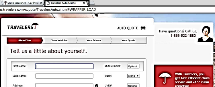
2. What to fill in:
Field names – The field name should be short and precise to tell you what to fill in the related input fields. But this does not stop there. As you can see in this article, there is a whole science behind field naming.

Ironically, when researching for this article, I came across an example where the field name is pretty confusing:
In ‘Google New Blogs Creation’ window in Blogger, there is a field name called ‘Address’. As an example the site provides a valid entry as being ‘mynewblogaddress.blogspot.com’. Naturally, I tried inputting ‘UItesting.blogspot.com’, only to receive the error message saying ‘the address is not available’. This was confusing for me since I was creating a new blog. I headed over to ‘blogger help’ to look up the error message, and finally I got some long alternative URL. After I inputted it, the application said ‘The address is available’ and it allowed me to create a blog, I was still confused how the already available URL address was taken for my new blog which was not even created yet. Of course I know that this is because someone else has already created a blog with the same name but this is just to illustrate how a non-tech-savvy user would reason this out.

3. Telling the process steps at the starting point itself:
Number of steps to complete the process – When a user starts an online process, inform him/her about how many steps are there to complete the process. An easy way to do this is by using breadcrumbs. Here is a handy list on how to ensure that you are doing it right.

4. Name the steps
Appropriately naming the different sequential steps helps the user to really understand the purpose of providing the inputs
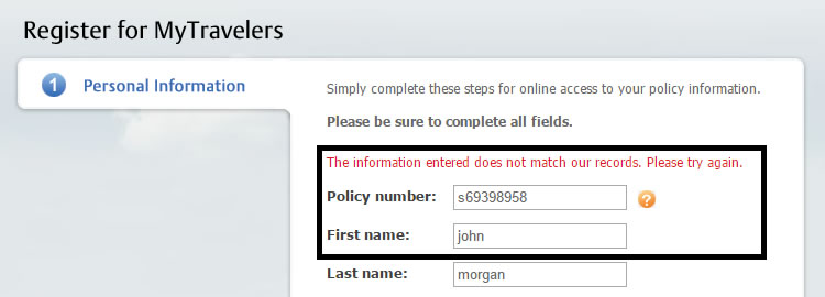
5. Confirmation on successful action on each step completion:
Confirm the successful actions to the user – Giving a confirmation message to the user right there in that step screen helps them to realize that they are on the right track to complete the action/process
Once again, when working on this article I tried out a couple of applications that contained forms that needed to be filled in over a number of steps. As a user I was frustrated when I faced this inconvenience: In one application, after filling 5 pages of details online and clicking on ‘submit’ button, I got a message saying ‘There is something wrong in the (First page)’ …and it took me back to the first page, losing all the data I had inputted in the subsequent pages.
6. Help/Suggestions:
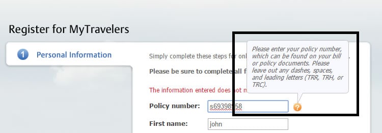
Providing users suggestions or help exactly where and when needed – There are some instances where an application has to use technical jargon that is naturally not understandable to all users.
In such cases, providing help text, imagery, suggestions and examples for the type of content that is required would facilitate data inputting. UserFocus have compiled a handy list of usability guidelines for help, feedback and error tolerance.

7. Meaningful Link Names:
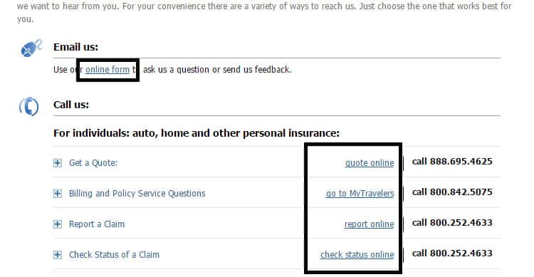
Links should be meaningful to users – Give your links names that are short and understandable to your users. This will give them a relatively clear idea, as to which page of the application he/she is navigating to and be able to get a hint of the data contained in the data it leads to. This is also applicable when showing clickable search results.
Provide meaningful link names such as ‘Register Here’, ‘Sign In’ and ‘Create New Post’ instead of the generic ‘Click Here’, ‘Read more’ or ‘Go’. Here is a good article that we have written a couple of years ago but which is still very valid today that details how to ensure that your links are usable.
8. Important Information at each page of the application:
Give important information at each and every page of the application – Provide information to your users in each and every page of the application and make sure to identify the sequence of importance by appropriately marking headers, footers, navigation menus and normal content.
This will really help your users in getting the information that your want to convey irrespective of whether they have accessed your application from its homepage or landed in it after clicking an external link (e.g. a Google search result).

9. Quick access navigation links:
Quick access navigation links in a web application in the form of menus – Provide any navigation links to users in the form of menus (or navigation bars) in the areas where they expect to find them. This will help them quickly access the main purpose of the application pages to navigate where they want to go.
For example, in an eCommerce application, these would be providing quick access links for shopping items and cart. In a banking application, providing quick access links for statements, funds transfers, etc.
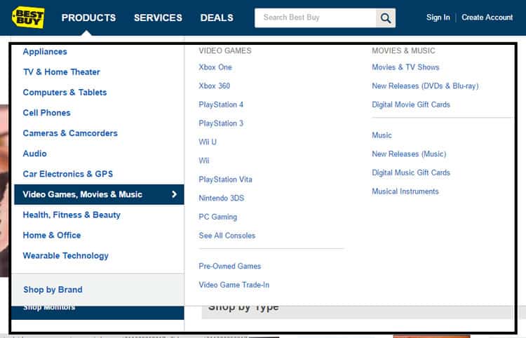
10. Itemize the menus:
Try to itemize/categorize the menu items – Logically categorizing the menu items helps users to easily locate that item that they are looking for. Just like in real life, this is particularly useful in big eCommerce applications.
The above picture itself is a good example for itemizing the menus in the website.
In Conclusion
As I have stated in the beginning, these are just a couple of basic mental notes, or checkpoints as I like to call them, that one has to keep in mind when emulating the user in user interface testing. This is not a full list of the tests but instead they are the most basic checks that one should make. Nevertheless I have found them particularly useful especially when I first commenced my career in user interface testing so hopefully you will find them too. If you have any other checks that you consider as being key for this list, please suggest them in the comments section below.
Want to learn more?
If you’re interested in the intersection between UX and UI Design, then consider to take the online course UI Design Patterns for Successful Software and alternatively Design Thinking: The Beginner’s Guide. If, on the other hand, you want to brush up on the basics of UX and Usability, you might take the online course on User Experience (or another design topic). Good luck on your learning journey!
(Lead image: Depositphotos)
