With mobile visitors creating an ever-growing traffic source to websites these days, mobile-centric problems arise for those seeking to engage their users with this new medium. With it this new traffic, engagement metrics are not on par with desktop. Pages per session, time spent, and various other popular metrics, seem to fall short of the desktop benchmark.
So why not find other ways to design interaction for content sites, based on a mobile first approach of Gestures, which fit perfectly with the concept? If apps can do it, so should web. And in some way, web pages on mobile already react to taps and scrolls, swipes and pinches.
But First, the Definition of Gesture
ges·ture (Source – Oxford Dictionaries)
?jesCH?r
noun
plural: gestures
- a movement of part of the body, especially a hand or the head, to express an idea or meaning.
“Alex made a gesture of apology”
synonyms: signal, sign, motion, indication, gesticulation; show
“a gesture of surrender”
verb
3rd person present: gestures
- make a gesture.
“she gestured meaningfully with the pistol”
on mobile phones: screen gesture
- An action with a finger on a mobile device screen to indicate intent.
Tap, Zoom, Scroll, Swipe
“Swipe left, I like her!”
“ooohhh, scroll down i need to see more”
From Clicking To Tapping
Touchscreens have changed the input method for interacting with our mobile devices. Once we evolved beyond the Nokia bricks and the Palm Pilots, multi touch paved the way to use screens for direct interaction. It’s a new experience that has given us the ability to interact more intimately with our (relatively) tiny devices. We’re doing much more, with fairly less, in a natural and familiar way. So it’s no surprise that young children adopt touchscreens so fast.
Here’s a few examples of what gestures do on mobile screens and browsers:
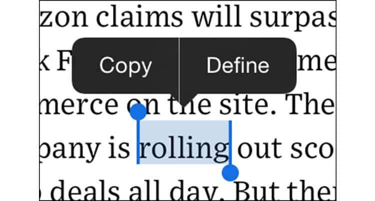
- Selecting a text: brings up tools that relate to a piece of text we select with a tap action.
- Pinching: Zooming in or out on pages and their different elements.
- Scrolling: view/scan/read information/content, moving the page up and down and increasing the view space on the browser.
- Swiping: moves us from section to section or from item to item, and can be used to move between back and forward.
Findings From Our Study
Surveying about 5000+ sites, a recent analysis I made on our data set at errnio, which is basically an add-on which let’s web publishers control gesture interactions, shows a lot of gestures. Mobile users browse 5-10 mobile websites a day, our network data shows that an average user performs 10-15 gestures with every visit to a mobile page.
Obviously, Scroll is the gesture performed the most, but other gestures are not far behind, and we were initially very surprised by how many zooms or text selections are performed. Here’s an average displacement for 100 sessions:
- 200 scrolls
- 60 swipes
- 100 zooms
- 50 long taps
I’ll note that it’s a matter of determining how to measure each gesture, and we hardly measure all of them to the pixel, but i’ve yet to find a proper study about this. Would be great to get some feedback on this in the future from a reliable source.
We also confirm industry wide figures about mobile traffic and interaction:
- Approximately 40% of traffic to sites is mobile
- Time spent on mobile sites is 50% less than desktop
- 30% less pages are seen per visit session on mobile
What’s interesting is the connection between this low mobile site performance, and the potential for interaction through gestures. A lot of use can be made to circulate content, enhance discovery, and engage users with actions.
iOS and Android Behavior
Here are some examples of what two of the major browsers do with our physical actions, and how they react in turn.
iOS Using Safari Browser
The iOS default browser began it all. We may now see these gestures as perfectly banal and mundane yet some of them might be less recognized.
- Swipe: Back/next page
- Zoom: Zoom entire page.
- Select: Engages a simple button toolbar with items such as copy and define, which is being enhanced with a share feature on iOS9.
- Scroll down: Minimize the top and bottom bar to an almost fullscreen experience.
- Scroll up: Returns the popular search and tools items at the top and bottom of the browser.

Android Using Google Chrome Browser
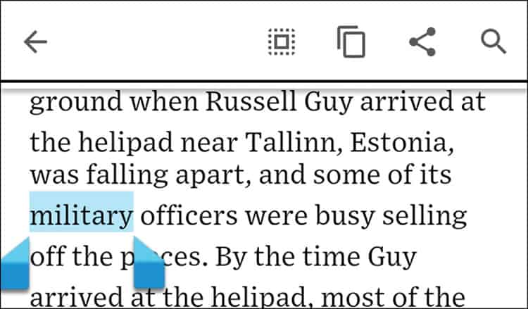
- Select: The main difference here lies in the visual. As opposed to the buttons on iOS, selection on chrome reveals a toolbar with clipping options at the top.
- Scroll down: Minimizes the top bar to an almost fullscreen experience.
- Scroll up: Returns the popular search and tools items at the top and bottom of the browser.

Do More
We can extend the gestures’ use and set of actions to let the publisher and website control these. Android and iOS attach an action to those gestures to improve the user experience … so why not piggy back?
Here is an example: An obvious gesture is that of long tapping and text, and selecting it for the purpose of copying. On Google Chrome running on Android, upon text selection, not only will you get the copy action but also a toolbar offering more (one might say too much) actions like search, share, etc. Publishers / designers / product managers can do a lot better, and customize these gestures to fit the required action or intent on the website. We assume the users want to either search or copy the selected text, and mostly for the purpose of searching and using the information. They usually do this outside of the site once they copy it. Here’s a way of bringing the information and the actions to them.

We can use the selected text to bring information from Wikipedia in this case, and also provide useful follow on searches. As we’re assuming the user is focused on the text, we can make use of the peripheral space of the screen for this information. In the case above, a definition is brought in from Wikipedia, which can be made to fit the semantic comprehension of the text. It’s not always a perfect fit, but there are ways to deal with it. The added value is that you don’t have users leaving the site when reading this. In addition, offering related items below that selection presents a way of circulating recommended content or possible offers, which make use of this space for the better.
Imagine engaging users with an enhanced experience on each gesture, with a relevant action for each intended direction. Mobile phones have evolved from a brick to a supercomputer powered by our fingers. Mobile apps have evolved from a flat operational UX to a multi-gesture platform where each app can customize gestures for their use.
Mobile web can and will evolve to harness the power of gestures so users are be able to better interact with sites in context of what their fingers are saying. Gestures can open up a whole new engagement platform that is less intrusive and more tailor made for mobile web publishers.
There are serviceable frameworks which can help in achieving these design goals, and a fair bit of coding. There are also challenges that go into designing the right design language per device, OS, platform or browser. These are all dimensions to think about when applying a design like this, and different verticals may require more nuanced approaches. Overall, the main game we’re hinting at here is that you can create more interactions, which leverage native mobile behavior to achieve better results and friendlier UX.
Want to learn more?
If you’re interested in mobile UX, you could take the online course on Mobile User Experience. It includes templates you can use in your own projects and you’ll get an industry-recognized certificate to improve your career. If, on the other hand, you’d like to…
- learn all the details of Usability Testing
- get easy-to-use templates
- learn how to properly quantify the usability of a system/service/product/app/etc
- learn how to communicate the result to your management
… then you might take the online course Conducting Usability Testing.
Lastly, if you want to brush up on the basics of UX and Usability, the online course on User Experience could provide you with the necessary knowledge. Good luck on your learning journey!
(Lead image: Depositphotos)
