It is no secret that color theory plays a vital role in user experience. From highlighting CTAs to making sure that your text is readable, both the colors you choose and the context in which you show them are crucial to consider. Used correctly, color can evoke a specific reaction in your users and ensure that their experience with your product is as positive as possible.
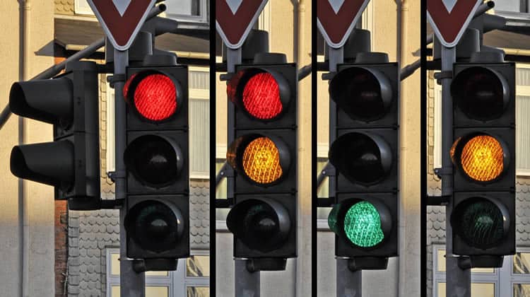
Perhaps the most important colors are red, orange and green – the traffic lights of UX. This is not because they are the best colors to use in your general scheme (they are not), but because they are actionable.
Think about it; when was the last time you saw a blue button and thought “I must absolutely press this”?, or a brown sign which instantly made you think “I should not do that”? Chances are that you have not, because red, orange and green are the most widespread in being ingrained into our minds with existing connotations.
We have already seen Hubspot announce https://www.interaction-design.org/literature/topics/ux-design?ep=ug0
how changing a single CTA’s color increased clicks by 21%. Their audience reacted to the colour change strongly enough that a huge benefit was apparent after only a few days of traffic.
Now, you can certainly use these colors just to make certain elements stand out from their surroundings, but UX is about more than making a few buttons eye-catching. You need to craft the experience for your users from start to finish, including everything from the logical progression to the frequency and amount of value they receive, or potentially even their emotions during the whole process.
Color is a fickle mistress, and as I have already stated, you cannot just use any old button and get the same impact. If you want to highlight the best route for you and your users, you need to know what you are saying by using a green button instead of a red one.
What We Already Know: Color Context
To know how to use your colors, you are going to need to know what the majority of your users are going to automatically associate them with. Now, I could be here for days discussing the ins-and-outs of all colors, but let us stick with the theme for now; the traffic lights.
Red: Warnings and Importance
Typically, red will automatically be associated with either a warning or something which is crucial to see. Although the reason why will vary depending on who you ask, there are several examples you can find if you look a little closer at your day-to-day apps and even games.
For example, take a look at the “Close” button in the top right of your browser right now. Go ahead, hover your mouse over it. Red. This is because you are being warned of your decision, and almost encouraged to think twice before exiting your session.
Another example where users are accustomed to see red as a warning (or at the very least a red action as undesirable) are error messages. While some utilize a yellow warning sign (again, there is a little leeway), the vast majority of error notifications are accompanied by a big fat red symbol to drive home the point that you do not want this option or color to show up.

The existing connotation of colors does not stop at apps, websites or even operating systems though. The culture surrounding your user’s experience with colors spans into every sector of their lives.
Take color in video games, for example. They strive to achieve a similar goal to apps and websites with their UX. They need to keep the player (audience) coming back for more, through a (largely) visual and interactive stage. To this end, they need to communicate with users while taking existing assumptions into account. Color is used to create a particular mood, highlight important mechanics and much, much more.
As a result, red is the most common choice for items which are dangerous, or are especially important. Take for instance the Legend of Zelda games. The most important element to the player (their health bar) is displayed as a series of bright red hearts at the top of the screen.

Similarly, the free-running experience Mirror’s Edge uses red to highlight items the player can climb and therefore progress with.
Orange: Transient Warnings
Orange typically consists of items which require the user’s immediate attention, or indicate a waiting period. Although this overlaps a little with the use of red, orange is more transient in nature. Yes, I know that sounded pretentious.
Essentially, orange has two existing associations which you need to be aware of when crafting your UX; that of immediate instructions to carry out, and that of waiting. This can be seen in items such as unsaved changes warnings in our own app back at Process Street…

… or the “pending” state of Inbox (which has fantastic UX).

Need some more proof? Look no further than the title of this very article – traffic lights. They are easy to take for granted, but every day these three-coloured lights are reinforcing the idea that orange signifies an audience to wait, or at least be prepared for a change.
Similarly, vehicle indicators use a flashing orange light to tell everyone seeing that vehicle what direction the driver intends to turn; an immediate, but transient, warning. This is how orange is perceived by a user during their first few experiences with your product; too much and they will be overwhelmed with what should be an instruction they immediately need to follow.
Green: Success and Encouragement
Green is ever-positive, spurring you on through the learning process and encouraging you every step of the way (at least, in terms of UX). Typically, green is seen to signify an action which is complete, a task which has been saved or an item which is correct; a positive final action, if you will.
As such, you will tend to see many CTAs utilize green to try and encourage users through a particular process. For example, Slack’s homepage prompts users to sign up and “Create [a] New Team” with a green button; although this is admittedly speculation. I would be willing to bet that green was chosen over red because of the tone which Slack re-iterates throughout every corner of its marketing. They are a company with a casual, informal, positive tone, and so a red CTA would clash due to the automatic context of the colour with danger or warnings.

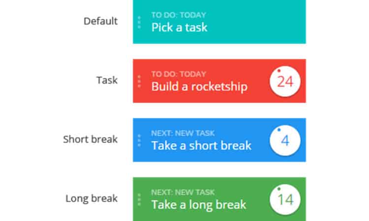
Much in the same way, Pomello (a Pomodoro-style time logging app) turns its window green when it is time for a long break between work loads. The color is used as a reward or measure of success, similar to how (most) progress bars in apps and games fill with green.

Let us go for a slightly more complex example of green as demonstrating success to your audience in their UX; Pokémon Go. At the beginning of the game you choose a creature to start with and proceed to battle with it for the first time. This not only introduces you quickly to one of the largest parts to the game’s experience (the battle system), but also uses a complete “traffic light” spectrum to show the player’s success.
Both you and your opponent’s health starts at full, shown by a green bar. As damage is dealt to either party, their health colour changes to orange, saying to the player “look out, one of you’s getting hurt”. Finally, just before victory or defeat, the last sliver of health is bright red and accompanied by a persistent alarm sound; the final warning that someone is going to lose and something needs to be done about it.
As it turns out, video games are a gold mine when it comes to UX inspiration.
Final Thoughts on Complicated Context
The actionable “traffic light” colors are certainly not applicable to every situation when crafting your user experience. Sometimes your site or product’s color scheme will result in a specific change being made to better contrast with the usual theme. Perhaps your interactable icons will be largely colorless with a border; minimalism is not always a bad thing.
Still, no matter what you decide to go for, always be aware of the wider context and think a little broader. For example, what about colorblind users? If you are basing your choice of palette according to emotions which you want to inspire during those crucial first few moments with your product, you need to consider the pros and cons of taking this sort of thing into account.
Let us say that you want to follow Hubspot’s example and boost your signup rate by changing the color of a single CTA. You know which one you are going to change, but cannot decide on the specific color to use. Do you pander to the masses and consider only those with perfect color vision? Or do you take the time to accommodate the 4.5% who are unable to distinguish between green and red?
How about cultural differences? Although this really only applies to those with an international audience, you need to think about the potential that your colors’ context changes based on the viewer. For example, do you avoid white because in Japan (a potential market) it is associated with death? Cultural influences like this have caused color changes to products in the past, such as Rayman 2, so it is once again a case of how far you want to go with your analysis.

Whatever you do, the best of luck with your product. Remember, as long as you do not do something like this, you will still probably get a few things right the first time round.
Want to learn more?
Are you interested in the intersection between UX and UI Design? The online courses on UI Design Patterns for Successful Software and Design Thinking: The Beginner’s Guide can teach you skills you need. If you take a course, you will earn an industry-recognized course certificate to advance your career. On the other hand, if you want to brush up on the basics of UX and Usability, try the online course on User Experience (or another design topic). Good luck on your learning journey!
(Lead image source: WikimediaImages – Creative Commons)
