If you are over the age of twenty-five, it is likely you do not use Snapchat. So you will have to take my word for it when I tell you that their UX is a close to a complete trainwreck. And if you do not believe me, you can read the countless articles complaining about it like this one, this one, this one, this one and … this one.
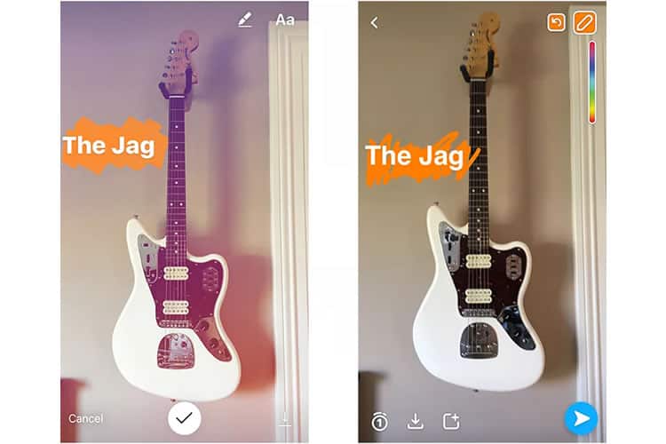
These denouncements are not without merit. Snapchat’s iconography is cryptic, their labels non-existent, the app’s functionalities hidden or obscured.
As an app that is part messaging, part content-delivery, and part photo-sharing, it is as if they decided to take the worse parts of all three and create some grotesque, unholy amalgamation to anger the UX design gods.
But this atrocious design is not why Snapchat’s UX needs an overhaul.
Snapchat’s decision to completely eschew traditional, market-tested UX design rules is one that would condemn 99.9% of other companies to failure. But before we chastise, we have to remember that UX design is an intersection of myriad fields and disciplines, one of which is art.
And in art, rules are made to be broken.
Designing Without Purpose … On Purpose?
So how did Snapchat get away with it?
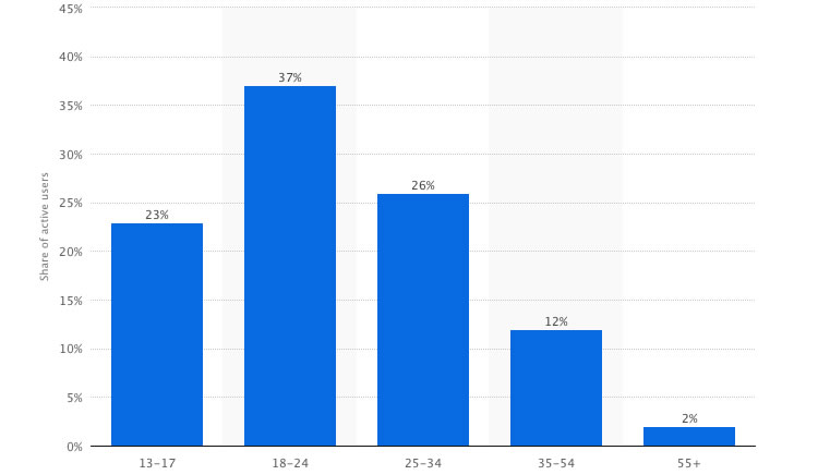
It is their baffling UX that maintains Snapchat’s relevance to their key demographic: teens and millennials. This target audience is as powerful as it is fickle, and capturing it means keeping Snapchat cool. And nothing kills cool faster than adults.

Snapchat rewrote the design book, but not in a different language – they made a code. Their obscure UX acts as a cipher that teens were willing to spend time cracking to fit in with their peers, and keep up with what is cool.
Simultaneously, its poor design deters adults from wrestling with its confusing interfaces, almost encouraging them to abandon the app entirely.
If you are bored one Sunday afternoon, have anyone over the age of thirty-five try to use Snapchat. It is an exercise that epitomises the importance of well-designed UX. Most adults trying to use the app last about five minutes before throwing the smartphone away in frustration.
Snapchat’s CEO, Evan Spiegel, claims his app’s questionable UX design was on purpose, insisting at a conference that, “This is by design. We have made it very hard for parents to embarrass their children.”
Whether or not this was intentional, the results are undeniable: as of February 2017, Snapchat boasted over 158 million daily active users.
So again, Snapchat does not need to facelift their UX because it is bad — the bad has worked!
The question instead becomes “How long can these poor design practices can last?“. It seems Snapchat’s days of relying on their unconventional UX may be numbered.
Poor UX Catches Up
Recent data suggests Snapchat’s user base is flatlining, which, while never an encouraging omen for any business, is especially dangerous for social media companies. Look no further than Twitter, whose stock price is rapidly declining due to limited user growth.

Snapchat’s different UX has worked beautifully to capture their target audience and cement the photo-sharing service as the defining app of teens and young adults. But to contend with their competition, Snapchat needs to grow out of their millennial niche.
Mark Zuckerberg understood this when grooming Facebook into the behemoth it is today. In its infancy, Facebook maintained an air of youthful exclusivity: it was designed for Harvard students only, then later expanded to other colleges and universities.
Today, everyone uses Facebook. And because of this, it should not surprise you which demographic uses Facebook, the least: teenagers. By designing Facebook for a wider market with more intuitive UX (more so than Snapchat at least), Zuckerberg sacrificed cool points—and it clearly paid off.
So now Snapchat has to make that decision: keep their teeny bopper design that adults find arcane, or redesign for the masses and make their user experience, well, usable. And if Snapchat does not adapt, they may be risking much more than stalled user growth.
Feeding The Competition
If Snapchat chooses to keep innovating within the demographic they have confined themselves to; they are at risk of competitors adopting their ideas and tailoring them for the masses. In fact, it has already happened with one of Snapchat’s most intuitive inventions: the story.
Perhaps the most quintessential feature of the app, the Snapchat story is a personalised media slideshow, a collection of pictures and videos user uploads that disappear after 24 hours. It is a simple concept that transformed Snapchat from recreational time-waster to every-day necessity.
But despite the novelty of the feature, Snapchat still chose to dress it in confusing UX. On Snapchat you can fast-forward through stories, skip whole ones, or reply to specific posts within a story, all with varying taps and swipes that the user has to discover on their own. Snapchat provides no guidance for navigation.
Snapchat’s competitors, however, are more than happy to adopt the story concept and redesign it with a quality user experience in mind. Instagram, one of Snapchat’s chief opponents, was the first to do this with their own Instagram stories, and it was not long before Facebook followed suit.

Snapchat’s social media rivals have poached their idea, re-designed it with market-tested UX principles, and rolled out the new feature to the wider user base they are targeting. If Snapchat keeps innovating in their limited niche, they are funnelling their ideas directly to their competitors, who will implement on a wider scale with a better design.
The Bottom Line
I have penned a considerable amount of writing about UX design, its intricacies, and above all, its necessity for a successful website or application. Snapchat is not an exception to this rule, but rather just a wildly different implementation of UX: embracing a user experience that alienates users you don’t want on your app.
Despite this, if Snapchat wants to grow, they need to embrace a makeover, whether it is done in-house or by a trusted UX design company. If not, they risk declining into obsoleteness and becoming an app that resembles its own mascot.
If nothing else, Snapchat’s design principles are a lesson—if you are having trouble targeting your desired demographic, it can sometimes pay to think outside the box, at least for a little while.
Want to learn more?
If you’re interested in mobile UX, then taking the course on Mobile User Experience, which includes templates you can use in your own projects. If, on the other hand, you’d like to…
- learn all the details of Usability Testing
- get easy-to-use templates
- learn how to properly quantify the usability of a system/service/product/app/etc
- learn how to communicate the result to your management
… then consider to take the online course Conducting Usability Testing.
Lastly, if you want to brush up on the basics of UX and Usability, the online course on User Experience could provide you with the necessary knowledge. Good luck on your learning journey!
(Lead image: Depositphotos – affiliate link)
