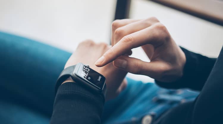
One of the most noticeable implementations of the Internet of Things is the smartwatch. We are actually past the dawn of the smartwatch and have entered a period of refinement. The next few generations of smartwatches will undoubtedly possess even more rigorously designed screens and, most importantly, drastic improvements to battery life.
Smartwatch Hardware Incorporations
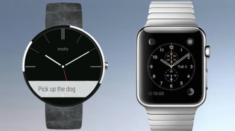
The hardware used in smartwatches is diverse. Apple seems to be a major player. However, the market has seen LG, Samsung, Motorola, and Huawei come out with Android Wear products. Designing and developing for each is totally different. Becoming familiar with their respective styles means investing in the necessary research. Apple’s WatchKit provides extensive recommendations for interactions between users, devices, and wearables. This arrangement is a factorial of three, so accounting for each interaction is crucial. With Apple, there is less to be concerned about because the screen ratio is equal across all devices. For Android, there are many more challenges, but the advantage is that the market has a better price point on the devices, so the user pool is potentially much greater.
That Software Though
Apple doesn’t have a search engine yet, but many industry insiders believe it will be slowly rolled out over the next year or two. This is important when considering design and development for smartwatches. Siri is not a search engine itself. It is simply a mediator between a user’s thought and the web. The drawback is that Siri has to take that extra step to input a query into an engine, and then filter through results to provide the user with the best possible answer.
On the other hand, Google Now has the advantage of using a direct query, because it is integrated with Google Search much more densely. Then again, Google Search does not make the extra effort to integrate with an Apple device assistant. The difference is thus obvious – Siri is more human like, and Google Now doesn’t attempt to be human or your friend, it just outputs.
A good user experience should ideally blend with human familiarity, but its more important to reduce the steps a user takes to complete a task. Search is just one component in the usability of smartwatches that is adapting to it’s own principles.
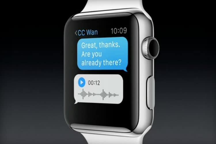
Following design guides is crucial for both Apple’s and Google’s smartwatch operating systems. Android Wear does not support the same mechanical features like Apple Watch’s crown. For the most part, other than the power button, its all onscreen. So if a user’s finger is roughly a third to a half of the screen size, an app needs to follow suit to accommodate that. When it comes to notifications, except for phone calls, Android Wear heavily utilizes the Google Card overlay. The card overlay attempts to be recognizable and similar across platforms: desktops, mobile, and ultra mobile (the smartwatch). Apple provides a little less room, but the UX is very similar to iMessage:
On Android Wear, Google’s material design chooses function over form, displaying the most pertinent information possible:

It is all in the Wrist
There is no generally intuitive nature for gesture controls on smartwatches, except for one: bringing the watch into eyesight. Everything else is new. With such a small screen size, gestures like pinchtozoom, or doubletap will probably not work on most apps. Designing around this means sacrificing lots of features. Distilling these features is a feat all unto itself.
In order to take full advantage of one of the few intuitive gestures for ultra-mobile implementations, smartwatch interface designers have sought to offer a means of expanding on the platform’s inherently limited functionality. Remember, the primary function of a smartwatch is to serve as a “satellite accessory” to a user’s smartphone. As such, an effective smartwatch implementation ought to display only the most relevant information, then direct the user to their smartphone for more information.
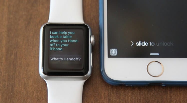
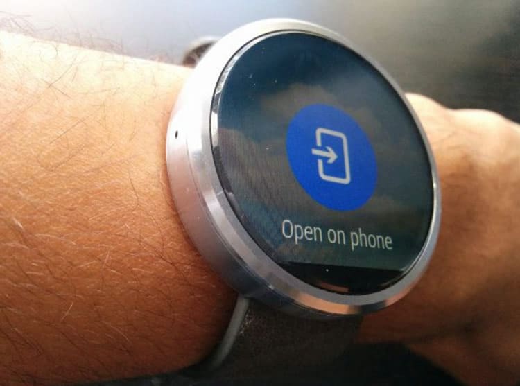
Apple Watch users have come to know the seamless transfer of information between portable and ultra portable devices as the “Handoff,” while Android Wear users know this simply as the button that suggests, “Open on Phone.” Both major ecosystems have numerous apps that take advantage of the unique interactivity paradigm created by the introduction of the smartwatch. There are a number of messaging, navigation, and fitness apps that particularly excel in this area. To name a few apps on Google’s platform that take exceptional advantage of the “Open on Phone” function: Hangouts, Uber, Google Fit, Skype, Evernote, and IFTTT. On Apple’s platform: Target, American Airlines, Nike+ Running, Instagram, and MLB.com At Bat.
When designing for one of the two major smartwatch platforms, it is important to take full advantage of the interactivity between the smartphone and the smartwatch. Consider the intuitiveness of looking at one’s wrist to acquire relevant information, and weigh that against the perceived hassle of taking one’s phone out to do the same. A productive UX design ought to find a balance between the two.
All By Myself
As with any platform there are standalone apps for both Apple Watch and Android Wear, such as calculators, compasses, timers, stopwatches, alarms, and of course, a clock. As each ecosystem continues to grow, the number of standalone apps is sure to rise. Standalone apps ought to address the core functionality of the smartwatch, which is to keep time, while taking full advantage of the technological developments that have allowed the watch to become “smart.”
Think about this all the Time
When designing for either platform, UX designers ought to keep in mind the various usability requirements, and new functionalities, brought about with the introduction of the smartwatch. The decrease in screen real estate has made the size of a “touch target” a very important consideration. Likewise, the role of the smartwatch as a “satellite device” is an important factor when designing apps. Keeping all of these factors in mind when designing the user experience of an app is crucial to the design of a successful smartwatch UX.
Want to learn more?
Want to get an industry-recognized Course Certificate in UX Design, Design Thinking, UI Design, or another related design topic? Online UX courses from the Interaction Design Foundation can provide you with industry-relevant skills to advance your UX career. For example, Design Thinking, Become a UX Designer from Scratch, Conducting Usability Testing or User Research – Methods and Best Practices are some of the most popular courses. Good luck on your learning journey!
(Lead image: Depositphotos)
