Mobile internet is on the rise. According to research by Ofcom, the average time spent browsing on mobile devices rose by 2.5% between March 2013-2014. Indeed, smart phones are now the second most popular device for internet access, with some 23% of users choosing their phone over another device (according to this same report).
A poor user experience can reduce traffic and kill conversions on any device, and desktop usability testing has long been an important part of the development process for many businesses.
However, with the popularity of hand-held devices growing exponentially, creating an excellent mobile user experience is becoming ever more important.
New Tools of the Trade From Google
A poor mobile user experience could have unexpectedly wide-reaching implications. In the past, Google has openly admitted to ‘…experimenting with using the mobile-friendly criteria as a ranking signal’. As a result, it was long suspected that sites with a bad mobile user experience could eventually be penalised in the SERPs, regardless of the number of mobile visitors a site actually receives.
These assumptions were recently confirmed, as Google announced that mobile usability will become a ranking signal from April 21st 2015. In preparation for these changes, Google have released a couple of mobile usability tools. Although primarily developed for SEO purposes, they can also prove useful to webmasters looking to improve the user experience of their site.
PageSpeed Insights
PageSpeed Insights is a useful tool which analyses a site’s loading time. It then suggests a range of improvements based on each site’s particular setup – from formatting and compressing images, to compacting JavaScript, CSS, and HTML code.

Mobile-Friendly Test
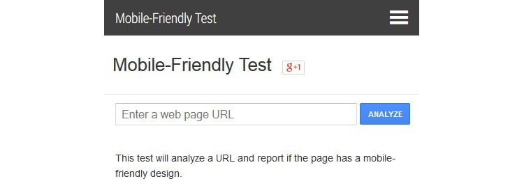
Google has also created the Mobile-Friendly Test, which is designed specifically to test the usability of mobile sites. It reports on a number of mobile-friendly features, including text size, link spacing, and content width.

Which Devices Should I Test With?
These new tools are undeniably useful, but it’s also important to undertake traditional usability testing too. One of the first hurdles is deciding which devices to test – the iPhone and iPad no longer dominate the mobile market, and visitors will be accessing your site on an ever-increasing range of different devices and operating systems.
Thoroughly testing every single permutation of device and OS would take weeks, so begin by assessing your site’s visitor data in Google Analytics. Many people only view the broad breakdown between desktop, mobile, and tablet visits.
However, Google also provides highly detailed information about different devices, networks, and operating systems – all of which can be found under the ‘Audience’ tab. Use this to identify the most common combinations, and create a testing shortlist.
Usability Testing
There is often a stark contrast between lab testing and real-world mobile interactions, which makes usability testing slightly trickier. Desktop users are generally seated at a desk and focusing on the task at hand – an easy setting to recreate in the lab. However, mobile users are far more flexible, and use their devices in any number of situations. This makes developing a rigorous usability test difficult, and requires some creativity on the part of the UX team.
Fortunately, traditional screen recorders and camera mounts can both be adapted for use on mobile devices. There are several different ways to test mobile usability, each with their own benefits and drawbacks.
Screen Recording Apps
A number of apps have been developed for mobile usability testing, and at first glance these might seem like the obvious choice. They can be downloaded onto a control device, and then typically capture both the screen’s live feed, and facial expressions through the device’s forward-facing camera. As this is a fairly unobtrusive way to monitor the participant, they are more likely to interact naturally with the device.
However, there are a number of difficulties involved with the process. Apple in particular is reluctant to approve UX apps, and as a result most tests must take place on jailbroken devices – which prevents participants from using their own.
There are a number of Android-approved apps, but these pose their own share of problems. They generally can’t capture gestures or facial expressions, and can only record for a limited amount of time. Perhaps most frustratingly, testing is often restricted to in-app browsers, meaning they can’t be used to test other apps.

External Cameras
The alternative – physically filming the participant’s actions with an external camera – may seem obtrusive and impractical in comparison. However, this method of testing remains invaluable to usability professionals. The footage can be projected onto a screen in real-time, allowing analysts to monitor the test without physically standing over the participant’s shoulder. It can also be recorded for future analysis, and even uploaded to specialist usability testing software. The participant is also able to use their own phone or tablet, rather than an unfamiliar test device.
There are two main ways to record the necessary footage:
- 1. Fixed camera: A stationary camera is fixed to a table and trained onto the device, capturing the participant’s gestures. The image quality is usually superior – however, movement is severely restricted, as the device must be laid flat on a table.
- 2. Camera mount: The device is placed into an adaptable cradle, and the participant holds the whole structure in their hands. Although the rig can be heavy and the footage quality poorer, it feels more natural to use than a fixed camera. Many usability professionals build their own filming rigs. However, some pre-made mounts – such as Mr Tappy – also work well. Whether fixed or portable, testers must be able to remotely alter the camera’s focus and zoom. The footage must be projected onto an external screen, and then captured by screen-recording software. Morae is a popular choice with usability professionals, as it can record screens, keystrokes, and user reactions.

Be Prepared
There are a number of things to look for when running a usability test. Is your site logical and straightforward to use? Are there any features missing that could be valuable to users? Does everything work correctly, across a number of platforms and devices?
A bad user experience can affect mobile sites far more radically than their desktop counterparts. Even simple design elements like poor font choice – merely irritating to desktop users – can render mobile sites completely unusable. It’s therefore absolutely essential to test your mobile site, no matter how well the desktop site converts.
Want to learn more?
If you’re interested in mobile UX, then taking the course on Mobile User Experience, which includes templates you can use in your own projects. If, on the other hand, you’d like to…
- learn all the details of Usability Testing
- get easy-to-use templates
- learn how to properly quantify the usability of a system/service/product/app/etc
- learn how to communicate the result to your management
… then consider to take the online course Conducting Usability Testing.
Lastly, if you want to brush up on the basics of UX and Usability, the online course on User Experience could provide you with the necessary knowledge. Good luck on your learning journey!
(Lead image: Depositphotos)
