Have you ever had to port an existing website or application to a new locale / language?
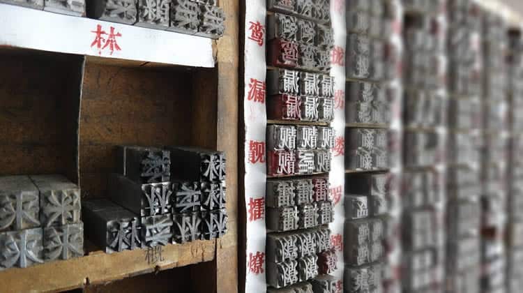
Internationalization, which describes that very same process, can be quite tricky, especially if you are moving into a market that looks nothing like what you are used to working with. The international typography design landscape is by no means monotonous. It is a very diverse and varied set of ecosystems, some of which are relaxed and expressive, while others are grandiose and riveting in their typographic elements.
So it makes sense that such an undertaking would require a little more consideration than simply a change of language. Regardless of your desired effect on a website or application, different languages will present obstacles of varying complexity to the realization of that effect.


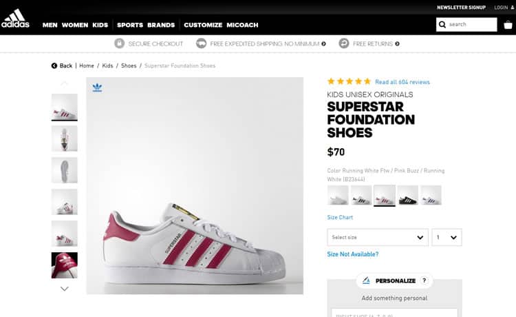
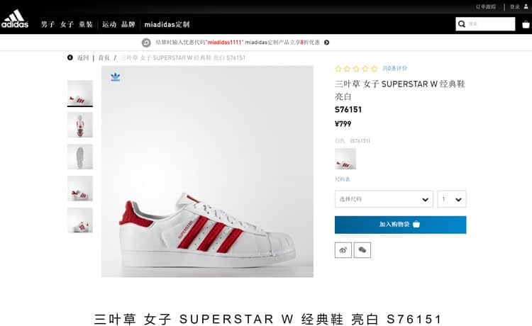
As you can see, something as simple as changing the language on a site can dramatically affect your ability to capture the original typography. Where are the bold characters on the Chinese product page? The bold fonts do not look the same for such complex characters, and give a different feel to this product page.
The adidas logo uses sans-serif font, and so does the body text of the English version of the site in order to exploit an important concept in web design: brand identity. Notice how the change in language completely removes the possibility of this type of brand identity.
Internationalization and Typeface
Consider Chinese, Japanese, and Korean (CJK) characters, which tend to group entire words into one character (sometimes more). This can have a very significant effect on the visual length of a phrase, for example. How would that affect your beautiful hero design?
CJK characters are also much more visually complex, meaning that they may need to appear larger than an English font in order to be easily read. This alone, can alter the look of a page.
And what about Cyrillic characters? Chances are, you will not find an exact match for the typeface that you want with different types of characters. That is not to say that there are not many to choose from, but keep in mind that if you want to keep the same theme alive, you will have to do significantly more searching around to find a comparable typeface.
Different words in different languages obviously have different lengths. For example, “Add to Cart” is 11 characters in English, but in Dutch, it is 25 characters, taking up over twice as much space. When space is scarce, you may have to change the size of the font, or change the entire layout of that page.
Simply put, if your website is multi-lingual, your web font needs to be compatible with every language you support, and it may mean redesigning some of the pages, based on that language or culture.
UX Concepts may be Manipulated for Different Languages
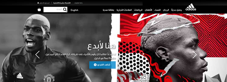
As seen in the image below, localizing your website can completely change the UX. In Arabic, text is read right to left, instead of left to right, which completely overrides all concepts in American or European user experience standards.

The logo (which is typically on the left top corner) gets moved over to the right top corner, changing the entire layout of the website. Yes, the layout, not just the text. The images, sidebars, navigation, call-to-actions, dropdowns, scrollbars, and buttons all may need to be adjusted if you offer your website in (for example), the Arabic language.
Other Internationalization Considerations
When creating a multilingual website, the typeface and UX standards are always important to keep in mind. However, there are other aspects of a website that often get left behind.
Dates, Captchas, Phone Numbers and Ethics.
A handful of countries use different formats for dates and phone numbers, which is important when a user is trying to get into contact with you, or ordering a product off of the website. You may have to convert dates, country codes and phone number formatting.
If you are using captcha on your site for security purposes, do not forget to also translate that to the same language that is on the website. I do not think that a visitor from the UK is going to want to solve a captcha in the Korean language!
Last (but not least), ethical values. Every culture has different ethical views and values. When it comes to humor, sexuality or symbolism, you must be careful with what type of content you are translating, or images you are placing on a web page. A ‘funny’ joke in the United States may not be understood elsewhere, and a commonly used symbol may not make sense on an international website.
Conclusion: There is More to do than Just Translate
Internationalization is not the easiest change to make to a website. It takes a lot more effort than just translating the website’s language.
With every language, comes a new challenge. Is the content itself okay? Are the character counts way off? Will any of the images be offensive in other cultures?
When you offer your website in multiple languages, you cannot rely on translation software. A designer and a human translator will most likely need to be involved. A designer will need to assure that every page is still visually appealing, and that the usability is still up to par.
A human translator will need to make sure that the content has been translated seamlessly, and that the message being expressed is uniform, no matter the language.
Want to learn more?
Want to get an industry-recognized Course Certificate in UX Design, Design Thinking, UI Design, or another related design topic? Online UX courses from the Interaction Design Foundation can provide you with industry-relevant skills to advance your UX career. For example, Design Thinking, Become a UX Designer from Scratch, Conducting Usability Testing or User Research – Methods and Best Practices are some of the most popular courses. Good luck on your learning journey!
(Lead image source: chaton – Creative Commons)
