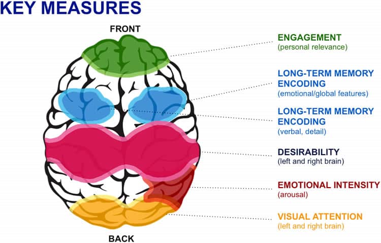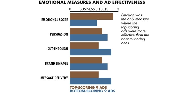
We humans try to convince ourselves that we are rational beings, who make choices based on logic. In truth, we are highly emotional ones. The harder we try to convince ourselves of our rationality, the greater impact our emotions have on our decisions.
Website designers need to take into account what emotions their site elicits. It’s not enough to make sure a site is giving the impression you mean to send. Sites that elicit no emotional response are quickly forgotten. When you begin designing your site, you need to take human emotions into account.
Emotion and Web Design
In his book “Emotional Design“, Donald Norman states that users perceive objects that are aesthetically pleasing as being more effective. This concept applies to (almost) everything, hence the reason why it has been applied to websites.
Emotion can be both positive or negative and is triggered in the user as a response to specific design elements. The reaction to these elements is different between men and women and is also affected by culture. For instance, Dianne Cyr states that if women do not like the online tone and format of a website, they are less likely to be emotionally engaged with it. This can have very serious implications especially if that site is an ecommerce website (and emotion is a very relevant topic for online shopping sites).
Begin with a Concept
Before you start looking for potential customers, you need a concept for your website design. You need to figure out what appeals to your target audience and what message you intend to send. You wouldn’t want to try to cross a continent without a map; while you might get to your destination, getting there is going to be a lot harder than if you had a plan in the first place.
In designing a website concept, you must consider a number of factors, such as:
- The message you want to communicate.
- Your corporate image.
- The design features that will help the message reach your potential customers.
- What design features would hurt the message.
What is Your Message?
Starting with a clear message will make the process infinitely simpler. Content that emphasizes the emotions of a message will help your website succeed. Consider very carefully any content that conflicts with the message. While there is a place for adding depth to an argument, it needs to be carefully considered.

In addition to this, special consideration needs to be paid to the tone in which this content is being delivered. It is no secret that humans love humour. So carefully adding a light dose of humour to content could be a great strategy to break the ice and make users feel comfortable. Notice the emphasis on the word ‘carefully’. What is humorous to you may not necessarily be humorous to your readers. Also, overusing humour may backfire because users may perceive your website (and your company) as being unprofessional.
Thus, a message is more than simple words and design elements. It involves making sure that these elements evoke the right emotions. All elements of the design, from textual content to design elements to emotions, add up to a meaningful page. Check that the elements are harmonious, or you’ll have a lot of very confused landing users.
The message and associated emotions should match your company’s image as well as each other. Users like consistency, and established companies should tailor their webpage’s message to match their corporate image. Otherwise, people will become confused.
You should never confuse your users because that increases the chances that their view results in a bounce. This is particularly true on home and landing pages, which serve as the introduction to your website. Keep your message simple, the emotional responses clear, and only break design rules when you want to make a point.
Getting the Message Across
Everything on a website should have a purpose. Meaningless design choices are frustrating for visitors. If some feature doesn’t have an obvious meaning, then users will become frustrated because they can’t figure out what it means, or they will assign a personal meaning to it. Although reading additional depth into a choice may not seem bad, it might contradict your message.

Users are going to attach emotional significance to any design choices you make. Simplify their lives and yours by attaching a clear meaning from the beginning.
Consistency is a large part of sending a clear message. With web design, consistency means more than making certain that text doesn’t contradict itself. It means that all elements of a page work together harmoniously and match your corporate image. Try to keep the meaning and emotion in your design clear to avoid confusion.
Consistency should follow across all media. Always use your logo on websites, in e-mail messages, and on social media accounts; then it will always be associated with your company. That association can be invaluable, especially if you have worked at establishing a consistent social image. Eventually, a consistently used logo can elicit meaning all by itself.
Choose Design Elements Carefully
When you are designing a website to elicit emotions, you must consider every aspect of the page. From color and image choices to typography, each part of the page should add up to a harmonious whole.
Reams have been written on the subject, but you should always remember that color is particularly important when designing a page. From yellow for happiness, blue for serenity, and red for excitement, color can create an appropriate emotional cue. Individual preferences may influence a particular viewer more, but each color has a certain established emotional weight that the average viewer recognizes.
The perceived proximity of images to the viewer can be a significant emotional cue. The closer an image appears and the larger it is in the visual field, the more it communicates urgency and intimacy. Perceived distance often leads to emotional distance. If images aren’t across a large part of the visual field, they don’t seem as important, and the image may be perceived as silly.
Images also can elicit emotions by what they display. For example, the picture of a smiling girl can express positive emotions.

Whatever meaning your image has, it should be obvious from the context. Do not force your viewer to guess why an image is present.
You should use standard user interface elements unless part of your message is that you are unique and cutting-edge. When deciding against using these interface elements, ensure you understand the purpose of each. Breaking design rules without knowing why they’re standard is never a good idea. Only deviate if the change is an improvement – and you understand why.
If you do stray from standard user interface elements, make sure the change is clear and that their location is well marked. No viewer likes to play hide and seek with a menu bar. Forcing a viewer to do that is a good way to create a bounce. Novel features may create a sense of uniqueness for a webpage, but check that these features don’t interfere with the page’s function. From menus that appear only when the viewer scrolls down to large illustrations, there are a number of special elements that can detract from your interface’s usability. Be cautious when applying any unique design feature.
Even a simple font choice can completely derail a webpage. Certain fonts are considered standard and more professional, such as Arial and Times New Roman. Using a different font can make your page stand out. However, it can also make your page look unprofessional.
Intentional Emotion
Understand the emotional purpose and utility of every design choice you make, or a bad choice may come back to haunt you. Choose fonts that feel like your corporate image, not ones that conflict with it.
When pulling the website together, verify that all the individual pieces fit with each other as well as your message. An ill-considered blend makes any website feel slap-dash. While you might want simplicity, there is a fine line between simplicity and boredom. An equally fine line is found between excitement and confusion.
Make sure your page is on the correct side of the divide. If you need help designing an evocative webpage, consider hiring a design team. Designers can help you convey the message you want to send quickly and efficiently, as they know all the important elements of a successful webpage. Don’t trust your business to an unskilled team. If need be, call the professionals.
Want to learn more?
If you’re interested in the intersection between UX and UI Design, then consider to take the online course UI Design Patterns for Successful Software and alternatively Design Thinking: The Beginner’s Guide. If, on the other hand, you want to brush up on the basics of UX and Usability, you might take the online course on User Experience (or another design topic). Good luck on your learning journey!
(Lead image: Depositphotos)
