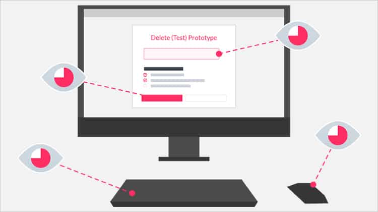
A Heuristic Evaluation is a usability inspection technique where one or a number of usability experts evaluate the user interface of a product (for example a website) against a set of Heuristic Principles (also known as Heuristics). As the definition of Heuristic Evaluation by the Interaction Design Foundation explains:
Heuristic evaluation is a usability engineering method for finding usability problems in a user interface design, thereby making them addressable and solvable as part of an iterative design process. It involves a small set of expert evaluators who examine the interface and assess its compliance with “heuristics,” or recognized usability principles. Such processes help prevent product failure post-release. (Source)
It is usually conducted by a group of experts because it is very likely that one person will not be able to find all usability problems. On the other hand, a group of different people tend to analyze an interface from different angles and as a result are more likely to identify a wider set of areas for improvement.
Consequently, the results obtained from an evaluation are greatly improved if multiple evaluators are involved, although adding more evaluators does not necessarily translate into more usability issues found. We will talk about this in more detail later on in this article, including the optimal number of experts and the reasoning behind it.
Heuristics (which you might also find named “rules of thumb”) are a well-established, proven set of guidelines that tend to result in good interface design when adhered to. They are not necessarily rigid and allow a certain degree of interpretation. In fact, usability evaluators might also adjust heuristics to create domain-specific ones for the product that being evaluated. We will also go more in-depth about this later on.
The Case for Heuristic Evaluations
There are costs involved in conducting usability tests. In order to get high-quality feedback from your users, you must recruit participants that fit your target demographic, set up proper testing conditions and train the person that is conducting the tests in order to conduct them without bias. You also need skilled professionals who know how to interpret user feedback. Its cost is still fairly high, even though modern tools have made it easier to recruit, set up and conduct tests.
A heuristic evaluation can be seen as a quick and lower-cost way to measure and improve your product’s usability before conducting usability tests. The idea is that before you spend a lot of time and resources conducting tests, you perform the evaluation to deal away with any identifiable usability issues. It should be a part of the process and should be used in conjuction with usability testing. That being said, heuristic evaluation is not cheap since it requires the engagement of knowledgeable and experienced usability experts who are rare to find and quite expensive to recruit.
So how effective is a heuristic evaluation? Tests conducted by Jeff Sauro from MeasuringU concluded that although heuristic evaluations will miss issues, they do uncover between 30 and 50% of all usability issues (including all of the most severe ones) when compared against user testing. This is in line with findings by Law and Hvannverg which he cites in his article.
It is worth noticing that you should not approach heuristic evaluations with the implicit notion that somehow there is a perfect user interface to be achieved and that by hiring experts (or more experts), the product under evaluation is going to achieve it. This is simply not true and striving for a perfect interface will not take you anywhere. Experts are still human and will not be able to identify all usability issues. They will most certainly iron out the most serious ones but a heuristic evaluation is by no means a way to achieve perfection.
Moreover, heuristic evaluation is an inspection method that does not involve the end user of the system – an essential component of usability testing.
How to Conduct a Heuristic Evaluation
Now that we have stated what a heuristic evaluation is and when you should (and should not) use it, we will dive more in-depth about how the process works and talk more about the heuristics and the experts involved.
The process of conducting a heuristic evaluation is divided in three key phases: Planning, Executing and Reviewing:
1. Planning
Since heuristic evaluation is a usability evaluation technique, you should have a clear objective of what you are hoping to achieve with your evaluation. In other words, you need to set your goals prior to any inspections. Understand what exactly needs to be evaluated and make sure that the experts who are involved are briefed accordingly.
It is also essential that you know who your users are. Even though you are not performing usability testing, the demographics, needs, motivations and behaviors of the people that will be using your product should be in mind. Personas, stories and information gathered through interviews are very helpful here. The experts evaluating the interface must consider the users and their perspective and ideally should be familiar with the domain in which the product will operate in.
It is also in this phase where you should define the set of heuristics you will employ and the number of evaluators that will be involved. We will dive into both later on.
2. Executing
Once you have your goals clear, your target demographic and a set of heuristics defined and a team of evaluators ready, you can move on to the execution phase. The evaluators will go through your product’s flows and respective interfaces independently. They will analyze them against the defined principles and whenever they come across an issue or an area for improvement, they will record it. Typical data that is recorded should include the issue found together with relevant details such as what the task attempted was, where they encountered the problem, why that is a problem and possibly also suggest ways of fixing it.
3. Reviewing
After the evaluations have been completed, the experts should summarize their findings to eliminate duplicates and create a list of usability issues that should be addressed. These issues should also be prioritized in terms of severity. Jeff Sauro has compiled a great article explaining the different severity ratings that can be used to prioritize usability problems.
The results are usually presented in the form of a report, describing the evaluation process and closing thoughts with recommendations to fix the issues found. Your team should spend time digesting the report, understanding it (trying to identify the ‘why’ behind issues the evaluators found) and planning an action plan to address the findings.
Heuristics
Let us now talk about Heuristics. Unfortunately, there is not a single correct answer to “What set of Heuristics should I use?”. What you should do is consider the project’s specificities and either use a set of heuristics that are a good fit or adapt them to create your own custom set.
That being said, here are some of the most commonly used heuristics:
- Jakob Nielsen’s “10 Usability Heuristics for User Interface Design“
- Arnie Lund’s “Expert Ratings of Usability Maxims“
- Bruce Tognazzini’s “First Principles of Interaction Design“
- Ben Shneiderman’s “Eight Golden Rules of Interface Design“
As an example, I will now apply four heuristics from Jakob Nielsen’s “10 Usability Heuristics For User Interface Design”.
1. Consistency and Standards (Nielsen)
Consistency is one of the most important aspects of any given product. The way the interface is organized and how elements are presented should be consistent across the product, irrespective of which device is being used to access it. Users should not have to wonder whether different words, situations or actions in different places mean the same thing. When designing interfaces, you should pay attention and make use of guidelines for the platform that you are designing for, as well as employing patterns to solve issues and stick to the same patterns during your design.
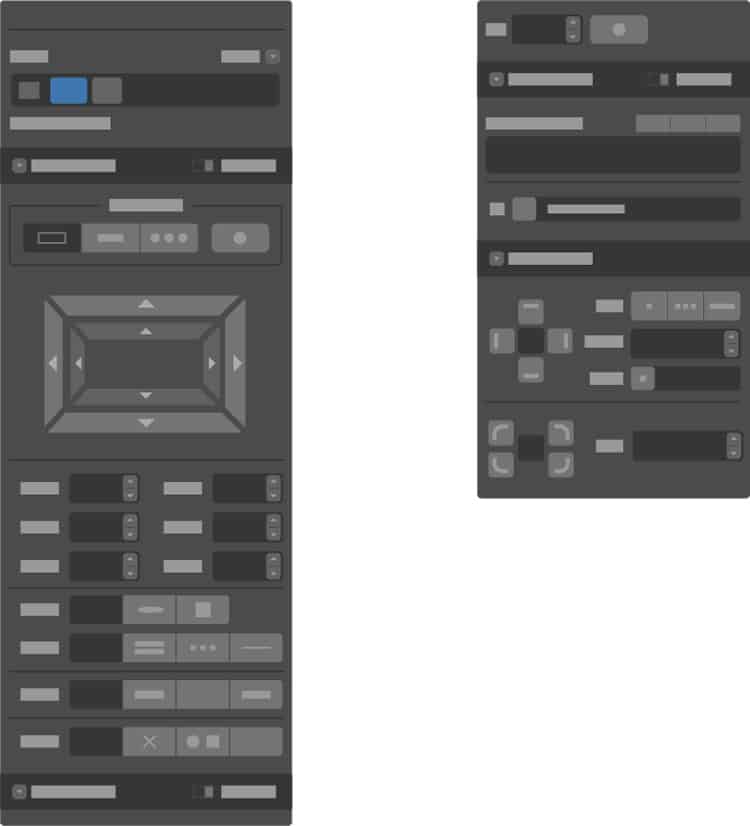
One great example of this is Webflow. Its interface is solid and consistent and users do not have to wonder what elements are clickable or not, that is, they can easily distinguish between menus, links, labels and text.
2. Error Prevention (Nielsen)
You should strive for creating interfaces that will prevent a problem from happening. For example the system should let a user know its password policy before they type it. Very often we come across systms that let us type an entire password and then informing us that the password does not meet the required security format after we press a ‘submit’ button. Similarly, the system should make it clear if an action is not reversible before the user performs it.
A good example of what not to do? Let us take a look at this system’s signup process. I will not mention the name of the system as this is irrelevant for this explanation. If I type in “23” as my name, “49” as my email address and “123” as my password, there is no indication that this will lead to an error.

To make things even worse, after I click on “Sign up Free”, the error message is simply an “Oops! Ensure all fields are valid”. This gives me no indication of what I typed wrongly. Although in this case it is quite obvious what the system is expecting as data entry, this is not always the case, especially when filling in more complex forms.

3. Help Users Recognize, Diagnose, and Recover from Errors (Nielsen)
Whenever your system returns an error message to the user, it should be expressed in plain language (this means no error codes or development-related jargon). It should precisely indicate the problem and explain how it can be resolved. It is important not to make the user feel like he/she is the problem as this causes anxiety and creates a bad user experience. This reasoning is closely tied to avoiding errors from happening in the first place. The idea is that even if an error happens, the user should feel that it is not a big deal to solve it and resume product use.
A very good example of this practice is found in the same product referenced in point 2 and occurs when a user requests to delete a prototype.
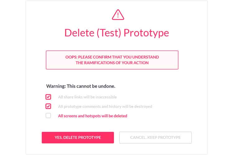
If the user fails to select all boxes, the system clearly indicates why the error has happened and what they need to do to resolve it. The system provides visual cues to make it more clear (e.g. last box’s text highlighted in red).
4. Visibility of System Status (Nielsen)
The user should be informed about system status in any particular moment. He/she should know what is going on so they do not feel lost or wonder whether something worked or not, thus avoiding unnecessary anxiery. Once again, the prototyping product provides a great example of good practice:
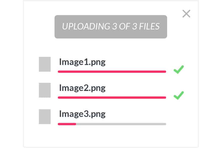
When uploading screens to a prototype, the system uses visual and text cues to inform the user, thus making both the current state and how it will progress very clear. Adding an estimate of how long it will take would be good, but it is still a good example of how the user should be informed of the system status in a particular moment.
Experts for a Heuristic Evaluation
As mentioned earlier on, one single expert would not be able to find a high number of usability issues. This is why it is recommended to have a team of usability experts conducting your heuristic evaluations. But what is the right number?
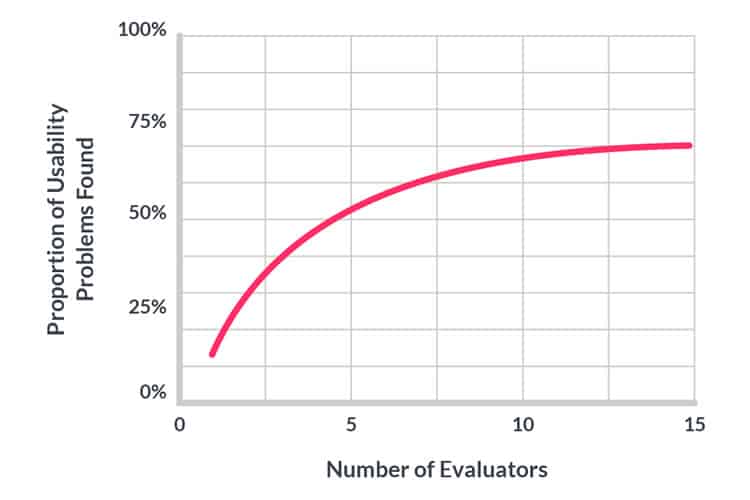
In his article “How to conduct a heuristic evaluation” (1995), Jakob Nielsen mentions that averaged over six projects, single evaluators only found 35% of the usability problems in interfaces and that adding more evaluators increased the number of issues found. The graph below shows the proportion of usability problems found as more evaluators are added, using data from the referenced article.
It is also necessary to think about the benefits-to-cost ratio. For example, for a SaaS business, the value of the heuristic evaluation can be estimated based on the expected decrease in churn as a result of higher user satisfaction or increase in signups based on better reviews or word of mouth spread. Since it is impossible to fix all issues found, we are considering the ones that were fixed. Again, using data from Nielsen’s article, the following graph shows how many times the benefits are greater than the costs for heuristic evaluation of a sample project:
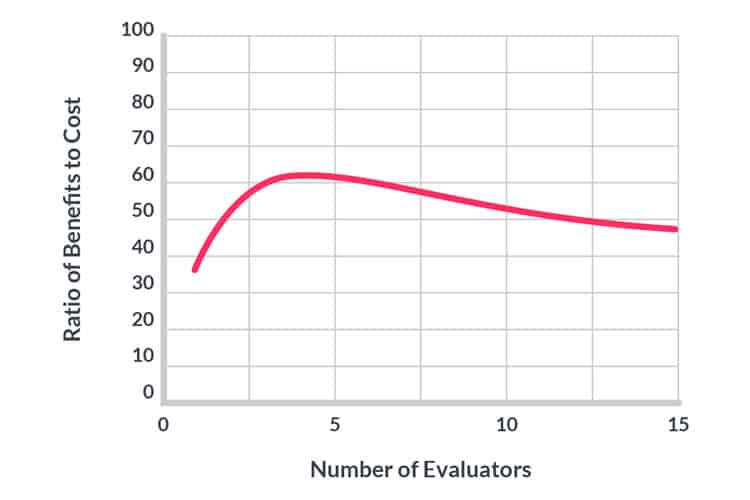
The optimal number of evaluators in the example is four – with benefits 62 times greater than the costs. Overall, you should aim to have from 3 to 5 testers – this is the sweet spot. If you want to read more about this, be sure to visit the referenced article “How to Conduct a Heuristic Evaluation” by Jakob Nielsen from the Nielsen Norman Group.
Wrapping Up
Heuristic evaluations are a great way of identifying usability problems in your product while spending less time and money than you would by conducting usability testings. This does not mean that heuristic evaluations are cheap to conduct, since usability experts are rare and hence costly to recruit. That being said, when conducted with clear goals, a good understanding of users and led by experts with domain knowledge using heuristics that apply to your project, the results are worth the invested time and effort.
If you’re interested in learning how to do a full-blown usability test, including the use of heuristic evaluation, then we recommend you take the online course “Conducting Usability Testing“
Want to learn more?
If you’d like to…
- get an industry-recognized Course Certificate in Usability Testing
- advance your career
- learn all the details of Usability Testing
- get easy-to-use templates
- learn how to properly quantify the usability of a system/service/product/app/etc
- learn how to communicate the result to your management
… then consider taking the online course Conducting Usability Testing.
If, on the other hand, you want to brush up on the basics of UX and Usability, then consider to take the online course on User Experience. Good luck on your learning journey!
