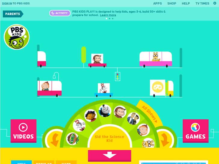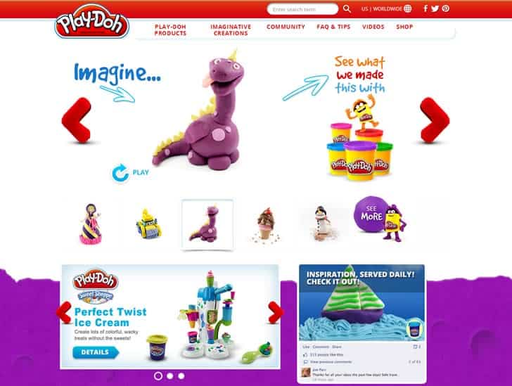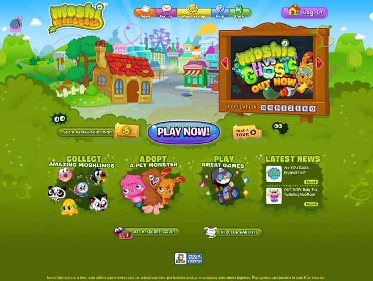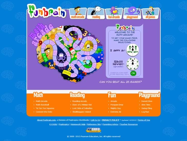
Website designers do not often think about designing a website which is suitable for children; that is, until such time that a specific age group amongst children needs to be targeted. A decade ago it was unthinkable for a three-year old to be able to use a computer. Nowadays several websites are designed especially for them.
In the past decade the proliferation of affordable electronic hardware and the explosion of games, social networking sites, cable and satellite TV, and smartphones and their apps have had a Pied-Piper-of-Hamlin effect on the generation of children now growing up. The incomparably empowering benefits of the Internet now risk being overtaken by the lure of the non-information side of this technology.

How do we as adults in a parenting or educational role deal with this problem? The awareness is out there, check out the excellent site Quib.ly and its informative and instructive content. This issue will be batted about in that forum where individuals can share common experiences and elicit advice from experts in the field of e-technology, e-safety, and child development.
Internet Habits of Children
In 2012 the Nielsen Norman Group conducted a study concerning the internet habits of children aged between 3 and 12. This report was based on actual user studies in order to offer important insight in terms of the true usability problems experienced by children.
One aspect that emerged from the study, is the fact that most people believe all children have access to the most advanced forms of technology such as cutting-edge mobile phones, personal computers, laptops and PC tablets. However, the truth is that children under the age of 12 years only have access to old-fashioned desktops and laptops.

Children between the ages of 3 and 12 are not as dependent on computers to complete their schoolwork or tasks; therefore they often only have computers which have previously been used by their parents and are by any means, not as advanced as the latest computers. In effect, children therefore have computers hosting much slower processors and as a result, could be limited in their attempts to connect to the internet.
The same goes for computers at school. These computers are often donated by large companies when new technology is incorporated. School budgets are also largely limited and therefore new technology does not feature high on the priority list. It is not unheard of for schools to utilize the same technology for a period of five years; sometimes even longer.
Do children really understand modern-day technology?
Most adults will tell you that children are more understanding of the technology they use than the adults themselves. However, this is not true. There is a huge difference between knowing HOW technology operates and actually knowing WHAT a piece of technology is supposed to DO. And the reasoning of children seems relatively simple: They do not feel particularly inclined to clearly comprehend the working of the Internet before they use it.

This “simple” reasoning is what makes it all the more important for web designers to not overestimate the internet knowledge of children.
Children do not understand the concept of online patience
Even as adults, we stop visiting a particular website when such site is not user friendly. This is even more so when it comes to children. While adults may try to spend some time on a site to figure out its workings, children who experience a problem in using a particular website will leave the site immediately.

Another thing is that children do not want to wait for files and videos to upload. This is an important factor which needs to be taken into consideration when designing a child-friendly website. Designers should try to steer clear of extended loading times or as an alternative, make the waiting time relatively clear, e.g. making use of a progress bar instead of animation or text stating “loading”.
Children need to be entertained online
While adults mainly use the internet to obtain information, children use the internet to find entertainment (in extreme cases, maybe even to do some homework!). Children want to play online games or just have some general fun. When the site you are designing for children is not an exclusive site for kid’s entertainment, it may be helpful to incorporate some engaging elements such as games or other forms of interactive material that could keep the attention of children.

Summary
When you design a website for children between the ages of 3 and 12 years, it is essential to bear the differences between the internet usage of children, teenagers and adults in mind. Young children are not as understanding as adults, or even teenagers for that matter. They are more likely to leave a website when it does not meet their youthful expectations.
Want to learn more?
If you’d like to improve your skills in User Research, then consider taking the online course User Research – Methods and Best Practices. The course certificate is recognized by industry and it will help you advance your career. Alternatively, there is an entire course on Usability Testing which includes templates you can use in your own projects. Lastly, if you want to brush up on the basics of UX and Usability, you might take the online course on User Experience. Good luck on your learning journey!
(Lead image: Depositphotos)
