
For a long time now, it’s been accepted that colour has the power to affect our moods, emotions and behavior. It’s a potent and persuasive visual cue that has a real influence on consumer decisions, so its selection for a website should not be taken lightly. So what’s in a colour? From strong, powerful red to cool, confident blue, the colour of your website can do as much to evoke emotion in your users as the best written copy in the world. The basics of colour theory should be second nature to us, but just in case, let’s take a moment to refresh our memories.
Colour Theory – The Colour Wheel
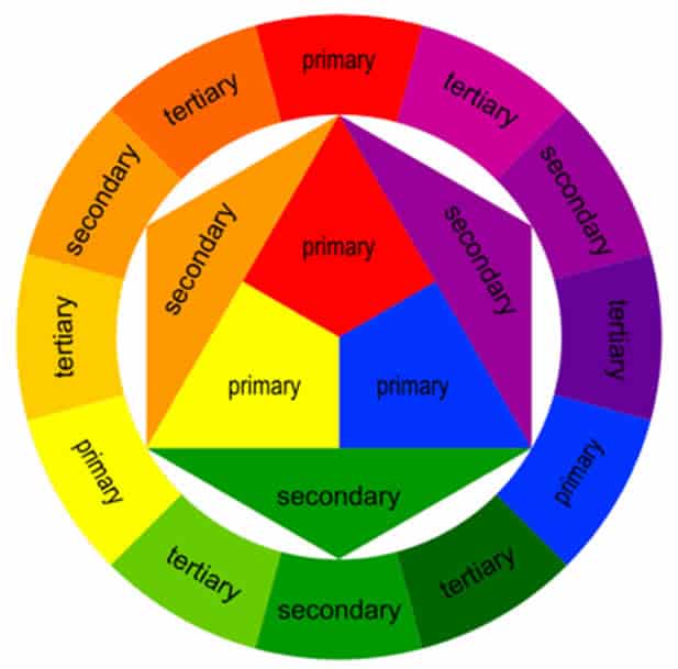
The basic colour wheel is made up of three primary colours (red, yellow and blue), three secondary colours (orange, green and violet) and six tertiary colours (red-orange, yellow-orange, yellow-green, blue-green, blue-violet and red-violet).
It’s from these basic colours that we can make the innumerable variety of tints, shades and tones available to us. But how should we use them?
Colour schemes, can be broken down into commonly used categories, and each have differing effects:
- Monochromatic: Monochromatic schemes use variations of the same hue. They’re simple, safe and minimal and can be used to achieve a polished, elegant look.
- Analogous: Analogous schemes use colours that sit next to each other on the colour wheel. They’re calming and comfortable, are often found in nature, and create a pleasing, unified feel.
- Complimentary: Complimentary schemes use a powerful contrast, colours that are opposites on the colour wheel. They’re highly visible and somewhat obnoxious – very much an ‘in your face’ combination.
- Triadic: The use of triadic colour scheme benefits from the unity of an analogous colour scheme as well as the vibrancy of a complimentary. They’re created by using three colours evenly spaced throughout the colour wheel.
So those are colour schemes, but what about the colours themselves? What effects do they have?
Red

Red is a warm colour, the colour of passion, love and anger. In marketing, it creates urgency, increases the heart rate, and appeals to impulse shoppers.
The Women’s Refugee Commission‘s use of red is powerful, and emphasizes the importance of their cause. Its association with violence and warfare also subtly informs the issue at hand.
Orange
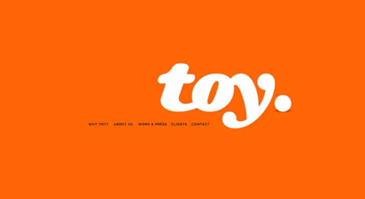
Orange is an energetic colour that speaks of happiness and vitality. It creates excitement and is perfect for calls to action.
Toy uses orange to command attention. It’s less aggressive than red, and due to its association with the changing seasons represents movement – perfect for innovative advertising.
Yellow

Yellow is a complex colour that can be contradictory. Although this bright and energizing colour evokes happiness and hope, in nature it often signifies danger and deceit.
Yellow certainly grabs the attention, but be wary of using it for backgrounds unless you are looking to make a point, like SimpliSafe’s digital security guide. Their choice signifies the caution they are advocating.
Green

Green represents new beginnings, abundance and nature. It has a calming effect, and a down-to-earth significance.
Here, Plant with Purpose‘s use of muted, olive-toned green makes the user think of renewal and sustainability.
Blue
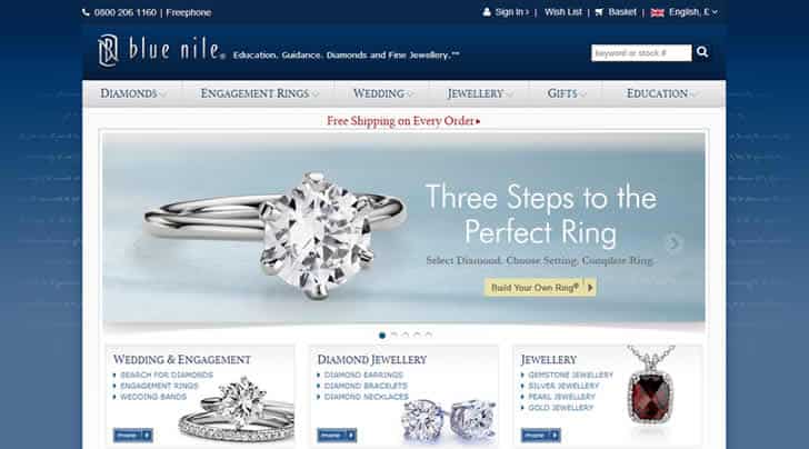
Blue is often used in business as it represents strength and reliability. Another calming colour, it has associations with cleanliness and purity.
For purchasing diamonds, cold, precise blue works on two levels for Blue Nile. The company appears trustworthy and authoritative, while the monochromatic blue colour scheme compliments their pure, brilliant diamonds.
Purple
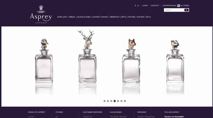
Purple has long been associated with royalty and wealth, but also has supernatural connotations.
Purple is rare in nature, making it seem expensive and luxurious, it’s the perfect choice for luxury brand Asprey and conveys decadence and a hint of conceit to appeal to their affluent customers.
Brainstorming with Colour
Now that you’ve seen it in action, break out of old habits and experiment with colour using some of these fantastic tools.
- Shutterstock Spectrum is an image discovery tool that allows users to search images by colour rather than keyword – a great way to boost your brainstorming efforts.
- Check My Colours allows you to check foreground and background colours provide sufficient contrast – great for analogous colour schemes.
- Colour Lovers is a creative community that is a great place to get feedback on your palettes, as well as gain inspiration from the work of others.
Remember, colour has the power to persuade and influence consumers – make sure you’re taking advantage of its benefits.
Want to learn more?
If you’re interested in the intersection between UX and UI Design, then consider to take the online course UI Design Patterns for Successful Software and alternatively Design Thinking: The Beginner’s Guide. If, on the other hand, you want to brush up on the basics of UX and Usability, you might take the online course on User Experience (or another design topic). Good luck on your learning journey!
(Lead image: Depositphotos)
