
The modern customer’s brain works on a single track: “Click, click… I arrived at this site… what does it give me?”
That’s generally followed by
“How on earth do I find what I am looking for in this mess?”
“This looks like too much reading. Maybe I’ll get it done by someone else.”
“Do I have to sign up for this?”
With respect to web design, however, businesses sometimes focus on how “good looking” their websites are.
From a marketing perspective, good-looking websites are worth nothing if they don’t help get leads, convert, or sell. Some companies have websites that are both beautiful and effective. Others might not exactly be stunning or make you go “Wow!” but they give you what you’re looking for in less than a minute! If you find yourself going back to these sites again and again for information or services, there’s a reason: they work.
Let’s take a look at a few that fall in this category.
1. Stitchlabs – Inventory Management & Order Processing Software
It’s scary to launch as a startup. If the arena or the industry into which a startup is looking at making inroads is a competitive one, the scare factor turns into paranoia. So, be it.

Stitchlabs is a web-based service that provides comprehensive inventory management, order processing, and e-commerce management software for small businesses and retailers. It helps entrepreneurs who want to go the multi-channel e-tailing way. You’re obviously stopped in your tracks at the home page itself. The new redesigned home page features a direct call-to-action (CTA). Of course, it’s peppered with customer testimonials, social proof, and “make me happy” copy.
2. Unbounce – Landing Page Optimization
You obviously expect experts on landing pages to have a website that not only looks good but also works. The folks at Unbounce practice what they preach (and practically live on it), and they do it well indeed! The company that makes landing page creation easy and effective also puts its heart where it matters: right on the home page. Clear CTA and tons of social proof obviously work for the company.
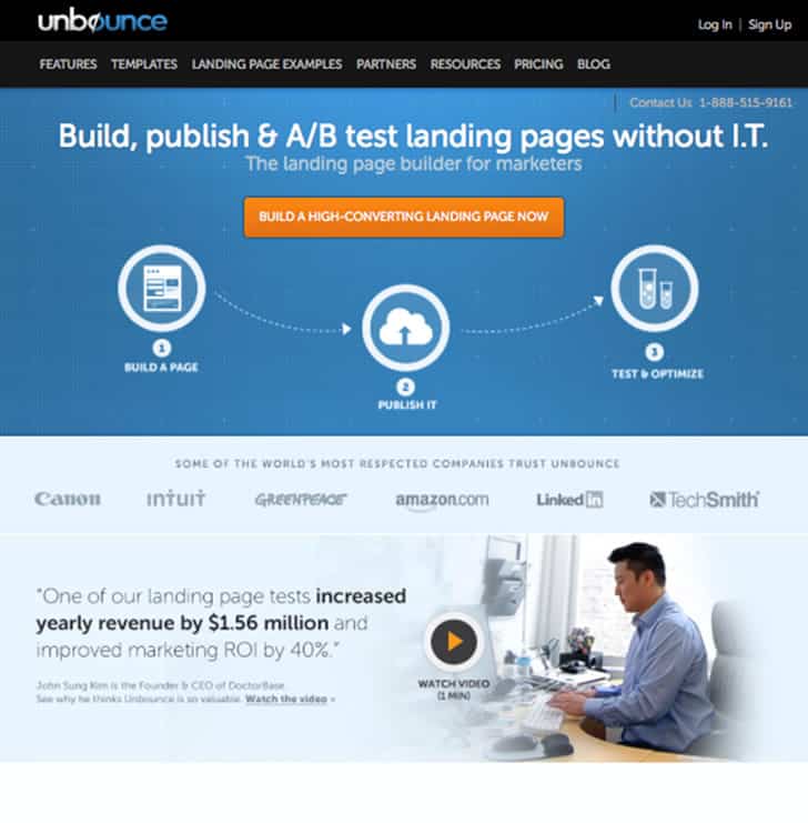
Smart marketing, focused copy, an authoritative blog, and a personable face to the company combined with the effective, branded, and consistent layout of the website is a clear winner.
3. Dropbox – File Storage
What can a single website with a video slapped on the home page can do? You should ask Dropbox. Kipp Bodnar of HubSpot reveals the secrets to DropBox’s popularity.
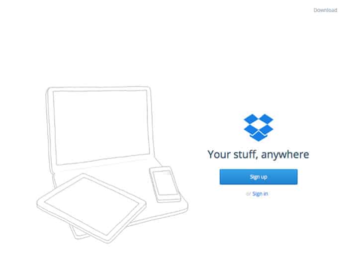
I will not repeat what experts have already dissected, but suffice it to say that marketing muscle comes from a great product, building your community even before you launch, and sometimes going against the norm. Dropbox clearly knew what it was doing with the website and the video.
4. Moz – SEO Software
It started as just a blog. Today, it’s the “go to” resource on all things inbound marketing. Moz, hitherto SEOMoz, is a great example of how a good looking website can also be an invincible moneymaker.
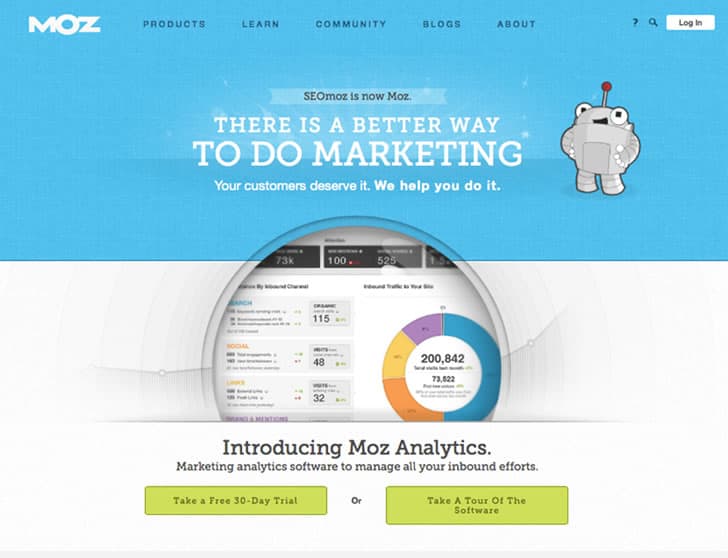
Moz’s product line consists of SEO software (including the popular Moz Bar and the new Moz Analytics). While its blog (actually two of them) works as a great traffic generator, trust enabler, and credibility builder, the actual website is almost built like a landing page with focus on what they want visitors to do: read, try, explore, and buy (when you are ready).
Powerful, consistent, and remarkable content strategy plugged to a pleasant website can make money. Point taken.
5. Who Is Hosting This – Web Hosting
Whoishostingthis.com is perhaps “not-so-stunning” when it comes to website user interface, but it makes it into our list because of a reason: This is not a product or a service – it is a tool that provides decision-support information on a particular subject. Most informational websites take a magazine-like approach, but here’s a company that takes the landing-page approach, i.e. it does what it says.
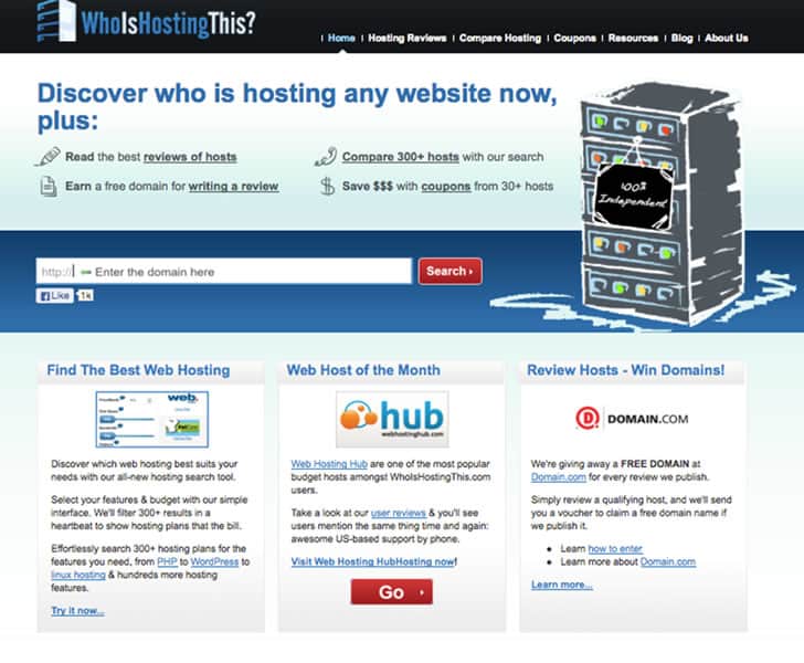
Who Is Hosting This is a web hosting discovery, review and comparison site. It gives value before it asks for anything. On the home page, you find a utility tool that does one thing: find what web host a site of your choice is using.
It has three different utilities: comparisons, reviews, coupons and tutorials (resources) neatly demarcated in separate sections. It is rare to see a website that has an “information dispensing business model” to have a landing-page styled home page.
6. MailChimp – Email Marketing
Backed by a very strong product, an irresistible offer, “value” for “free” and an immaculately designed website, MailChimp has everything it needs to stay competitive in the email services industry.
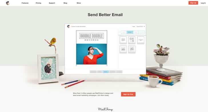
In addition to this, it also has an extremely lovable copy with an extreme focus on brevity and personality. The chimp mascot only adds to the charm. For a long time now, MailChimp has been the favorite of many businesses – from the miniscule (individuals) small to the medium, large and extra-large (Facebook). It’s not hard to see why and it is not surprising that even our newsletter is powered by MailChimp! The site also has a section dedicated to resources, guides, and an entire gallery for email marketing inspiration.
7. Litmus – Email Testing & Analytics
While we are on the subject of emails, we cannot ignore the smart kid on the block – Litmus. They define themselves as the “perfect complement” to MailChimp and other email providers.
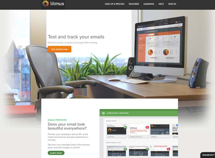
Litmus’ homepage design is beautiful and effective. Armed with a single button and an enticing graphic as background, the pre-scroll part of the home page should sell by itself. Yet, there’s more.
A couple of scrolls on the home page will educate you in a jiffy about what services Litmus provides, that is, email testing and analytics for the uninitiated.
Of course, they have a strong content marketing strategy too, including their learning page, blog, and a dedicated statistics page. If nothing, their newsletter is full of valuable information on the art of email marketing.
8. Evernote – Note Taking
One page tells it all! It’s amazing how Evernote manages to bring up copy that’s just two words long. One graphic and the charmingly short benefit list later, a little more information below the call to action (which doubles up as email opt-in) also helps. Evernote has tons of inbound links, references, citations, and reviews. Sheer usage-driven popularity that’s hard to replicate only add to the effectiveness of the home page.
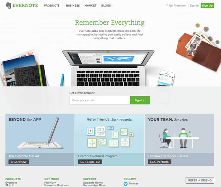
What would a company do when it finally understands the principles of marketing and then applies that to its entire suite of products? It reproduces success over and over.
Evernote for Business, Skitch, and many other products from the Evernote stable follow these same principles of effective design and success.
9. Basecamp – Project Management Software
This list would not be complete without Basecamp from 37 Signals – arguably the most popular (and admittedly old now) project collaboration software. Basecamp’s landing page has been a subject of discussion since the dawn of Conversion Rate Optimization theory, and is still one of the best examples, in layman’s terms, of how to make good-looking websites that also make money.
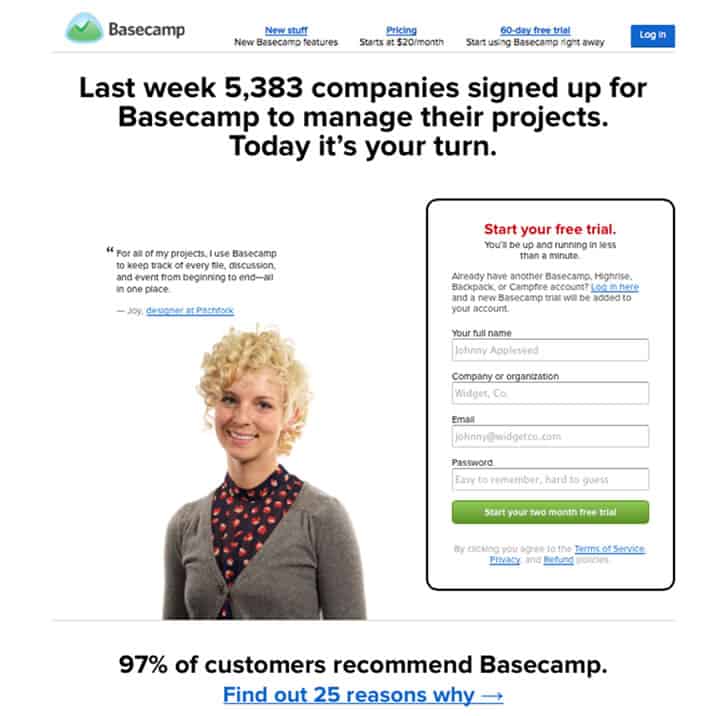
Michael Fern of Content Gems wrote in the evolution of Basecamp’s landing page about how they have managed to keep coming up with effective landing page optimization tactics consistently over the years. The home page succinctly but expertly summarizes why you should invest in Basecamp: what it does, who uses it, and a running list of benefits.
You can’t get clearer than that.
Want to learn more?
If you’d like to become an expert in UX Design, Design Thinking, UI Design, or another related design topic, then consider to take an online UX course from the Interaction Design Foundation. For example, Design Thinking, Become a UX Designer from Scratch, Conducting Usability Testing or User Research – Methods and Best Practices. Good luck on your learning journey!
(Lead image: Depositphotos)
