![]()
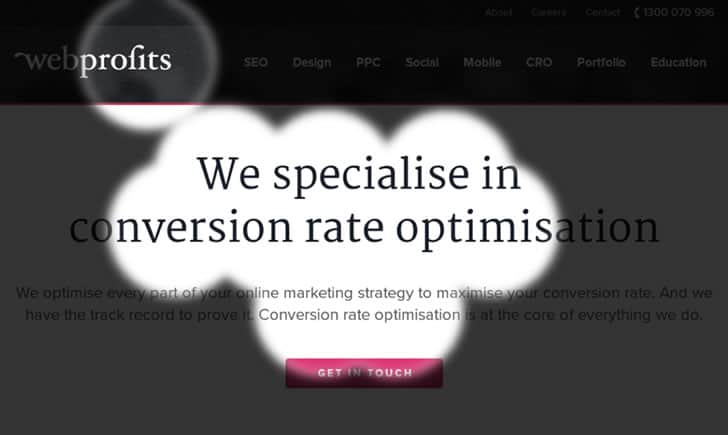
Eye tracking provides business owners and marketing professionals with valuable insight into how customers interact with websites and landing pages. The most advanced eye tracking services can show exactly where a user’s eyes land when they first view a page, how much of the page they actually take in, the order in which they process information, and how much time they spend focussing on any specific area. All of this information can then be used to make a host of improvements to increase conversions.
These sophisticated tools generally cost thousands of dollars, making them appropriate only for websites with extremely high revenue and volume. For everyone else, there are some great tools available that provide much of the same information with two of the most popular being Crazy Egg and EyeQuant.
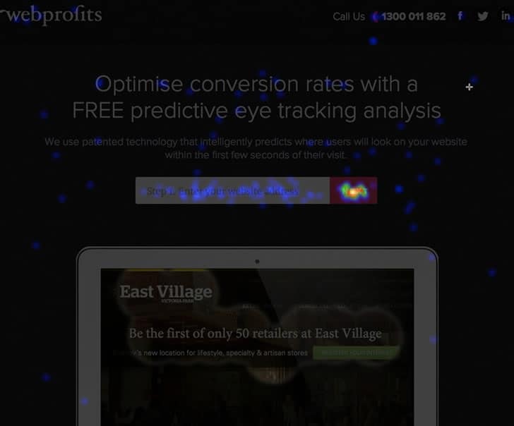
Crazy Egg follows where users click on your webpage to see how it is used, while EyeQuant uses predictive technology to determine where people will focus when they view your site. Whether you’re using these tools or the most sophisticated eye tracking technology, here are seven ways how to use eye tracking to improve conversion.

#1 Challenge Your Assumptions
When you developed your website, it was based on a series of assumptions about how it would be used. No matter how many websites you’ve designed or how expert you are in your industry, invariably many of the assumptions you made will simply be wrong. If you’re going to have any success in conversion rate optimization you must be comfortable with this reality.
With this in mind, your eye tracking report is likely to show that people are focussing on areas you never intended, or that what you thought would be an important feature of the page is actually rarely noticed. Look at how the information that received the most attention is presented, then use that to reorganize the page to feature what you want users to see most.
#2 Components of Confusion
It’s often the case that you’ll be so familiar with your website and the information it contains that you’ll miss those areas where users may get confused. You already know the details of your products, the related services you offer, or the terms and conditions associated with any interaction with your site. Users, on the other hand, don’t – and may end up following unpredictable paths of inquiry that lead them off your landing page.
If people are regularly leaving your page to find more information, you should bring what they want onto the page for them. If they are distracted by products, services or general information that is not related to your conversion, get it off the page. If there is a point on your site where people usually stop reading, figure out what they’re confused by and fix it. Then split test your idea!

#3 Hidden in Plain Sight
Remember that sub-header you spent hours editing to get just the right wording? It’s probably the first thing you see when your page loads. For other users it may be completely lost. With eye tracking analysis, you’ll find a number of areas that you thought were highly visible but that people simply are not registering (this is a real issue if it’s your call-to-action). Once you know these areas, look at redesigning your page to make it all visible.
#4 Open to Redesign
If you’re using eye tracking analysis, you’re obviously willing to make changes to improve your site. But don’t be too narrow in your thinking. If users are drawn to information that’s not the focus of your landing page, maybe it should be? As long as it brings them closer to a conversion, what’s the harm in making a dramatic change? And harm to your ego doesn’t count. The goal of your site is to give users the best experience possible that leads them to a conversion. If they’re telling you they want something different, you need to give it to them.
#5 Limits of Scrolling
Many more people are going to see the banner at the top of your page than the form at the bottom. And in between there will be a number of points where people will stop reading or leave the page. Use your eye tracking reports to determine the exact points where the number of readers drops off significantly. To maximize your number of conversions, put a call-to-action before each of these points. This way you give users an opportunity to convert before they leave the page.
It’s also possible that your page is structured in a way that’s stopping users from continuing to read. Maybe there’s a way to reorganise it to flow better. Or maybe the copy simply needs to be more engaging. Another possibility is that you’ve set your call-to-action too high. If you know all the information on your page is essential for a quality conversion, split-test moving the call to action further down. The number of conversions may decrease, but their quality should improve.
#6 Clicks Should be Links
If users are clicking on parts of your page, they expect it to link to something. And if there’s no link there, they’re likely to get frustrated. Any area that you see people clicking should include a link to the information they want. There are many ways of doing this that will still keep them on the page, but you must make sure there is some response to their attempt at interaction. An optimized website works the way people expect it to.
#7 Optimize Placement of Call to Action

Your call-to-action is where you either gain or lose a conversion. It’s the most important part of your page and needs to be featured. But this won’t always be simple. If people haven’t already been educated on your product, they’re probably not ready to buy it yet, regardless of how well the form is designed and placed.
Optimizing your call-to-action requires finding a balance between its visibility and its place within the conversion funnel (the series of steps a user will take from landing on your page to converting). Once you have a placement in mind, split-test it. And then split-test it again.
Eye tracking is a powerful tool to optimize the way people interact with your website. But remember that the goal is not to get them to see any one specific part of your page or to follow any particular path – the goal is to convert them. Make sure that’s always your focus when using these powerful tools.
Want to learn more?
If you’d like to…
- get an industry-recognized Course Certificate in Usability Testing
- advance your career
- learn all the details of Usability Testing
- get easy-to-use templates
- learn how to properly quantify the usability of a system/service/product/app/etc
- learn how to communicate the result to your management
… then consider taking the online course Conducting Usability Testing.
If, on the other hand, you want to brush up on the basics of UX and Usability, then consider to take the online course on User Experience. Good luck on your learning journey!
(Lead image: Depositphotos)
