The concept of “good web design” is as controversial a topic as the notions and theories of the “perfect machine” or the “best economic model.” Opinions are dime a dozen. And more often than not, they are passionately held. Even more frequently, they are diametrically opposite to every other view in the room.
While I cannot give you any answers on engineering or the economy, good web design is definitely rooted in certain fundamental drivers or core motivations that help in convincing and converting users.
1. Product and Brand Image
The biggest determinant of a website’s design and layout is the product (or service) itself and the brand image that it evokes in the consumer’s mind. The basic differentiation of whether the website is transactional or purely informational sets the tone for the entire design blueprint. Using an ecommerce layout for a dentist’s website not only confuses the visitor, it also completely fails in conveying the unique selling points of his/her professional services.
This is where all your conventional themes and templates hit the wall. A better option is a DIY “landing page” builder tool such as Unbounce, Wishpond, Landingi, and many more. These tools allow brand owners to create their own interpretation of their brand on the internet by modifying images, blocks of text and headlines. They often have existing design inspirations that are modifiable through simple drag and drop design customisation, offering just the right amounts of freedom and guidance to navigate through the ins and outs of effective page design.
Let’s look at two completely different brands – Burberry and Ernst & Young – to understand how correctly showcasing your product and brand online can be translated into offline capital.

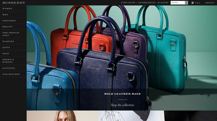
Burberry, though a luxury brand, makes it clear to visitors that they cannot do anything here but shop, and offers them a familiar ecommerce layout to browse around. The distinct aura of luxury comes through in their choice of dark colors and minimal design that reflects Burberry’s offline design palette. Note that the site uses Burberry’s signature typography across banners, navigation links as well as section labels to maintain a consistent look and feel.

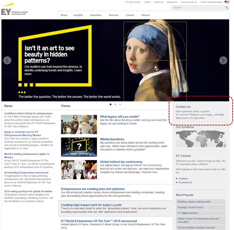
On the other hand, Ernst & Young has no tangible product to sell. Their website is more of a PR exercise for E&Y’s research capabilities, their latest reports and the lasting impact of their organizational knowledge on the quality of their services. It showcases news and views on the various industry sectors that E&Y operates in and subtly offers contact details to visitors interested in E&Y’s consulting services. The conservative website design with a focus on content as opposed to gimmicks is a deliberate attempt at appealing to a CXO in search of sage business advice.
2. Findability
A website is your brand’s address on the internet. Once a user is at your home, you would not want them to turn into Alice in Wonderland, wandering around in every which direction seeking what they came to find. Making your visitors’ job easier by taking them to exactly what they had in mind is a top priority for any web designer.
Findability translates into web design in numerous ways:
- Transparent site architecture with sections and sub-sections clearly visible
- Correct nomenclature for various website sections
- URLs and page titles named as per self-explanatory conventions e.g. shoesstore[dot]com[slash]runningshoes as the URL and “Running Shoes” as the page title
- Easy navigation between different sections of the site and an intuitive sitemap
- A clearly visible and highly usable search function to help users find what they want in an instant
Making sure that you get each piece correct goes a long way in ensuring quick findability and easy navigation for every site visitor, helping them along the conversion funnel.
3. Customer Preferences
A business that does not listen to its target market does not remain in business for too long. Listening to consumer preferences begins with designing the website that is going to sell your products and services. Invest time and effort in digging out as many details as you can lay your hands on about your target audience. Discover what motivates your target customer’s purchase – low price, time sensitive deals, one of a kind pieces, ability to create DIY products, whatever. And design with this central stimulus as the fulcrum around which the entire site moves.

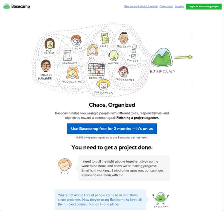
Basecamp’s website is simple to the point of being too empty. However, this design works perfectly for its audience. Basecamp’s typical customer is a millennial who’s familiar with technology and does not need too many impressive slideshows and images to convince them. They belong to the casual cool camp of users who only need quick, easily digestible nuggets of information from the brand. They do their research themselves. Basecamp recognizes this need for simplicity and offers a design that is minimal, yet smart enough to engage their target audience.
4. Device Based
In this rapidly mobile-first economy, website design cannot afford to become mobile friendly retroactively. Websites need to be designed with mobile, tablets as well as desktops in mind. Many brands choose to work on their desktop sites as their primary online destination, building watered down versions of their desktop site design as their mobile sites. Trouble is, an approach that treats the mobile as a step-child of the desktop site runs the risk of alienating younger users who prefer mobile over desktop as a first port of call.
If the mobile version of your site looks nothing like your desktop version (in terms of brand consistency), your visitors will not forgive you. When you’re as big as say, Walmart, people will find a way to get around the inconsistencies. As a startup or a relatively new business, creating completely different looks for your desktop and mobile presence is a risk for sure.
A device-based approach ensures that the design created for your business’ online presence remains the same across all devices. The consistency in look and feel helps strengthen your brand and aids in recall among users. Users can navigate quicker and find things they want faster on whichever platform they choose to use when a consistent design makes life simple for them.

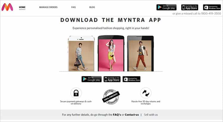
Sometimes mobile specific design is such a success that it overshadows the desktop site. Indian online fashion store Myntra that attributes 80% of its traffic and 60% of all sales to its mobile app, took the bold step of shutting down its website. In response to these numbers and the explosive growth of mobile internet in India, Myntra went app-only from May 15th this year.
Closing Thoughts
A website’s design has two clear goals. The first, to offer visitors an immersive brand experience and second, making sure that this immersive brand experience holds the potential for future conversions. Any web design that does not fulfill these two basic goals fails in its raison d’etre.
Want to learn more?
If you’d like to become an expert in UX Design, Design Thinking, UI Design, or another related design topic, then consider to take an online UX course from the Interaction Design Foundation. For example, Design Thinking, Become a UX Designer from Scratch, Conducting Usability Testing or User Research – Methods and Best Practices. Good luck on your learning journey!
(Lead image: Depositphotos)
